Very nice Bev! I'm sure they will be well appreciated.
You asked for criticism, and personally, I hate when I ask for it but don't get any. This forum, and the occasional meetings with Lou, Michael, and (hopefully) Tom, are the only way I can get some good, impartial feedback about how to improve. So the following are the things I see. As I'll point out below, some may be intentional design choices, and if that's the case, then please ignore my comments!
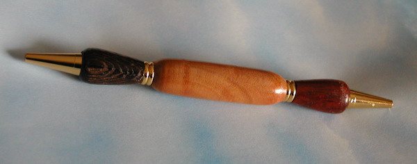
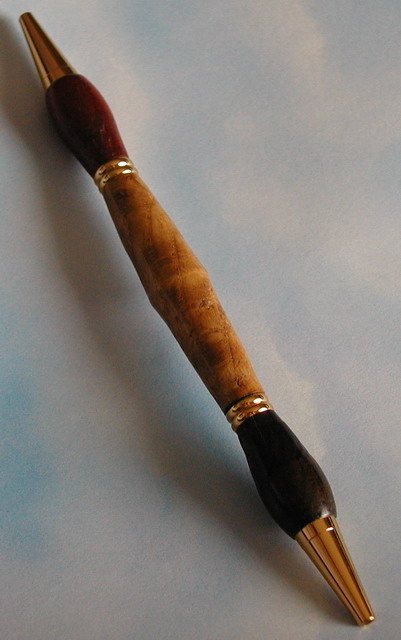
In the bottom one, it looks like the middle of the center section comes to a definite point. Since the rest of the pen has nice, smooth lines, that just seems out of place to me. The end of the center closest to the camera also looks a bit "proud", but that might be the angle. Also, I'm not sure if it was intentional, but the red and black ends look to be different sizes (may have been done to more easily judge one side versus the other by feel). It may also be a result of the angle at which the picture was taken.
On the top one, I think the center is a little too thick on the ends for the way the other two parts are shaped; you have a soft angle from the "nib" ends, but a much more severe angle for the center part (the rest of them have more consistent lines, IMHO).
The shapes of the nib portions on the middle two seem to vary significantly, like the bottom one. Again, this may have been intentional, but I think they might have looked better if they were more closely matched.
PLEASE don't take my criticisims as saying these are horrible pens; nothing could be farther from the truth! (Heck, if my comments make you disappointed with them, you're welcome to send them to me, I have several teachers in my life who would love one! [

]) At the same time, please don't take the comments as implying that I could do any better! I see a lot of these same kinds of things after I get my pens off the lathe, assemble them, and have them sitting around for a while.
Oh, and on the plus side, the finish looks great on all of them! They have a nice, warm look to them.


