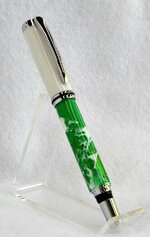
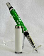
...most folks like to match the cap and the barrel and I find a bit more interesting to Mix~N~Match. Both the upper and lower are Brooks blanks. I also added a new finial to tie it all together. That little bit of extra time , I find, pays big dividend in the looks department! I really like the depth in the lower barrel, thanks Jonathan! It was actually a freebie w/my order. :big grin: This is Caballero hardware from Mr. Smith! Be well...Jan

You are using an out of date browser. It may not display this or other websites correctly.
You should upgrade or use an alternative browser.
You should upgrade or use an alternative browser.
Somewhat different...
- Thread starter Janster
- Start date
Signed-In Members Don't See This Ad
See more from Janster


Signed-In Members Don't See This Ad
southernclay
Member
Ditto what Jim said, that finial really ties it together. Freebies are sweet but when they are that good looking really sweet!
Nice job!
Nice job!
Charlie_W
Member
Great job on this one!
Normally, I am not a fan of mixing blanks but this one with the finial works wonderfully!
Normally, I am not a fan of mixing blanks but this one with the finial works wonderfully!
OZturner
Member
Jan, You have converted me.
I love the fresh clean different colours of the Pen and Cap.
As commented by others earlier, the Finial really sets it off and ties it together.
Love the Caballero Kit, looks fantastic.
Quite a change from your Patina Shell Pens.
Great work,
Brian.
I love the fresh clean different colours of the Pen and Cap.
As commented by others earlier, the Finial really sets it off and ties it together.
Love the Caballero Kit, looks fantastic.
Quite a change from your Patina Shell Pens.
Great work,
Brian.
..thanks all for the nice comments. The more I look at the lower section the more intriguing it appears. The depth of the separation is really cool. The clear allows one to "see" into the blank down to the tube! Maybe someday,...just maybe Jonathan! Thanks.....Jan
Brooks803
Member
Very cool! I really like the combo of blanks and the finial is sweet.
walshjp17
Member
Very nicely done. I have made several of these with different blanks. Some work well, others ....
BJohn
Member
Nice job, love the colors.