Positioning of cross?

Signed-In Members Don't See This Ad
See more from lwalden

lwalden

Member
Joined
Nov 3, 2005
Messages
1,238
Location
Trophy Club, Texas, USA.
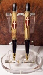
Well, the customer who had me make the Texas Flag sierra and Eagle style Cross sierra for her last week asked me to make a second Cross sierra for her, and asked if in the new one I could move the placement of the oval/cross up on the barrel. Now she's thinking she wants three more of the Eagle style cross sierras, but is waffling on which positioning she likes better. I'm including a picture of the two pens with the different positioning- one has the oval/cross centered on the half-way point of the barrel, the other has the oval centered 2/3rds of the way up the barrel. I don't see where either one of the placements looks materially better than the other, so thought I'd solicit feedback from the (cough, cough) professionals..... Do you think placement of the oval/crosses makes one appear more aesthetically pleasing than the other? And if so, can you provide feedback on why it might seem that way to you?
Thanks-
Lyle
 

Attachments

  • Eagle cross sierras.jpg
    Eagle cross sierras.jpg
    30.7 KB · Views: 428
Signed-In Members Don't See This Ad
Lyle, the golden mean concept places items of interest off center. (Yes, I know that is not a decent description of the concept.) In the spirit of the golden mean, I feel that the off-centered placement of the cross is much better.
 
Going to go Fibonacci on me, Cav?

That is an excellent point, and may be just the piece of data she needs in order to feel comfortable. Thanks!

Lyle, the golden mean concept places items of interest off center. (Yes, I know that is not a decent description of the concept.) In the spirit of the golden mean, I feel that the off-centered placement of the cross is much better.
 
I personally like the 2/3. It looks better to me.

SWMBO said she likes the 1/2 because it is more symmetrical but thinkes the 2/3 is more logical to be more likely seen while writing.
 
Lyle: I like the off-center placement(not sure why); but it is "NOT" a strong preference. I think it is probably a personal thing and you are going to find that different people have different preferences. Just keep a couple of both in stock and you will have it covered.
 
Good eye, John... yes, the crossbar of the cross is centered 2/3rds of the way up the oval, another good data point for going with the 2/3rds up the barrel configuration.
I too vote for the 2/3rds placement. It mimics the cross, I believe the cross bar on the cross is also at 2/3rds, no?
 
2/3 is close, but why not go one further and do like Visconti - go with Leonardo's divine proportions, add a specially made caliper to the box and up the price.
 
They both look great but I'll throw my "me too" in with the 2/3 crowd.

When I look at the centered version it makes me think of heraldry in that the cross looks like a device on a knight's shield more than it looks like a religious symbol. Or maybe I'm just weird....

Cheers!

Gary
 
FWIW:
No doubt in my mind: off-center. I'll expand on what Cav said: try to make it 5/8ths off-center to impose the Golden Mean effect.
I believe that if you measure an absolutely traditional Cross, you'll find the whole thing is based on Golden Means; the transects form a Golden Mean; the horizontal members are 5/8ths as long as the vertical and the horizontal member intersects the vertical member 3/8ths of the way down.
Every cross I make for folks is based on the golden mean. I believe they look better that way than any other ratio.

Cheers,
G
 
I feel right at home going against the flow - the centered one looks well balanced and different. The other looks too common. For me, it is great to see something different once in a while, especially if it looks great.

IMO, if it were a "desk pen" without the clip, it would be perfectly balanced.
 
Gary beat me to it. 3/2 is close to the golden ratio; but 5/3 is better and 8/5 is about as close as you can get without going to crazy decimals which would be 1.6180339887.

If you really want to nail it down, Lyle, why don't you try one at 8/5 and see if it is more pleasing to you>
 
I like the 2/3 also. I think in this situation you have a cross and a cross is a symbol that needs to raised and in the 2/3 thing you are doing this. If I am not mistaken you look at Eugenes stained glass crosses for the sierra pens he has them 2/3. Any other decal or inlay center would probably be appropriate but the cross needs to be raised. My opinion.
 
I will go with 2/3. I feel the centered one pulls my eye to it not allowing me to focus on the entire pen. The 2/3 one I can visually see the entire pen with the cross. Just my thoughts though. I also like photos that are off centered better for the same reason.
 
Stick to the "Golden Ratio". It's nature's choice and most people don't know why they prefer it. (Not quite 2/3 but it's better than 1/2)
 
Well, since you asked, my (cough, cough) "professional" opinion agrees that the offset cross is more pleasing: at least to my (cough, cough) "professional" eye.
 
Signed-In Members Don't See This Ad
Back
Top Bottom