Photo Repair

Signed-In Members Don't See This Ad

gketell

Local Chapter Leader
Joined
Dec 15, 2006
Messages
2,772
Location
Pleasanton, CA, USA.
This is a picture of my wife's grandparents that has seen better days. I've been working on it for a long time now; As I learn new techniques I go back and enhance it a little more. At this point, unless I can learn how to smooth out the strong "texture" without losing any detail, I think I'm done.

attachment.php


What do you all think? Anyone have any good ideas for smoothing out the "grain"?

GK
 

Attachments

  • Koell-Comparison.jpg
    Koell-Comparison.jpg
    263.9 KB · Views: 267
Signed-In Members Don't See This Ad
I think it looks great. If it was absolutely 'modernley' perfect then it wouldn't look real. Nicely done Greg
 
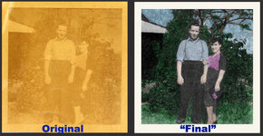
Yea, that looks fantastic, I'm not sure you're going to get it much better. As for the texture, I've done a fair amount of work trying to remove things like that and in the end they often look overly fake in the end (think fashion magazine cover skin-tone (or lack of...) It's an old photo, and while you've brought it up to a good looking representation of the original, too much more will make it end up looking overly fake.

Some of the things I have tried is running a blur filter to soften the texture, then stepping back in your history to before the blur filter and using the history brush, paint back in the blur, but use different mode settings for the history brush (i.e. when you have dark areas of the image, set the brush mode to darken and it will soften the lighter areas, smoothing out the texture in the dark areas, opposite for the light areas, and try some of the different settings in the mid-tones (soft-light is one that I often find works well...)

Now on a personal opinion/nit-picking point (i.e. don't take this as TOO harsh a criticism, but offered as another point of view...) If it were me, I would tone down the purple a bit. The blue shirt is perfect, and the green of the foliage and blue sky look very natural. The purple just seems over-saturated by comparison to those...
 
Now on a personal opinion/nit-picking point (i.e. don't take this as TOO harsh a criticism, but offered as another point of view...) If it were me, I would tone down the purple a bit. The blue shirt is perfect, and the green of the foliage and blue sky look very natural. The purple just seems over-saturated by comparison to those...

I was going to suggest the same thing.. while it might even be accurate,
sometimes you need to tone down the colors in older photos. Photos
rarely fade equally in all dye layers.. usually one layer fades more than the
others and you can lose contrast or saturation in that layer. It's common
enough that you don't really WANT to correct it.. otherwise it would look
strange.

I haven't used CS5, but I think you can set the Saturate/Desaturate level
on the Sponge tool.

Nice job .. I'm surprised you could pull up that much detail
 
Back
Top Bottom