Help Me

Signed-In Members Don't See This Ad

jttheclockman

Member
Joined
Feb 22, 2005
Messages
20,308
Location
NJ, USA.
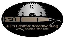
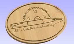
After some time of searching for a design for my logo and a few people here stepping up and submitting an idea I have come down to one that I kept going back to. First I would like to thank all those that submitted an idea and it was really appreciated. But the biggest thanks goes to Ryan Flowers ( RFTURNER) It was his basic idea that I worked from and came away with this.

My problem though is I am very bad with colors and would like abit of help from you as to help me decide on what colors to use if any. I have to say this logo will be used on my web site, eventually my business cards and also shirts and maybe some other trinket. Pay no mind to the colors used to post this. Thanks for the help.


Bestlogo.jpg
 
Signed-In Members Don't See This Ad
For ease of duplication why not go for black background and silver or white for the alternate colour,( same as the sawblade), and the writing...
 
John,

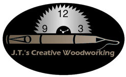
The name needs to be bigger. It is more important for the name to stand out better than for the rest of it. It is also recommended to use a font that is easier for more people to read, IMO. Prinit it out at about 1" wide and see what I am talking about. I also think the black area is too much. It needs to be smaller so that everything is in better proportion to the name.

Here is a quick change I made. Take it for what it is worth and what you paid for it!!

attachment.php
 

Attachments

  • Bestlogo2.jpg
    Bestlogo2.jpg
    21.9 KB · Views: 392
Wow Curtis. Now that is what I am looking for. Great suggestions. Anyone else??? The more ideas the better. I am feeling better about asking this here. :smile:
 
John, Curtis is right somehow if you print that logo in small version that black is too much on eye, and he is definitely correct about the fonts. You got to remember that there are soem people that would have problem making out the letters due to their eye sights.
I think if you can copy Curtis's version and play with the background colors then put it up here again and this time ask us to vote on it and see the results.


I wish I could do that but i do not know how to change colors. This is the main reason I asked for help on the whole project because I am not computer literate at all. :smile:
 
John, get together with Curtis. His ides are right on and he is very helpful. The fewer colors you insist on, the less the final cost for printing. Every color = another pass through the press = more money. Simplicity is your friend in this case. Good clean open font easy to read and from a greater distance. Curtis has your best interest at heart on this.
Charles
 
OK... I guess I'm odd duck out. I tend to think a lot of logos get way to complicated with a lot of colors that muddy up your message. "I" think we need a very clean image that is easy to use across all the areas we might want , biz cards, shirts, letter heads, ect...

in the example above I tend to think the black is way to intense. it takes a way from the main thought, and that's Johns Woodworking.

a nice clean Line drawing could convey the idea much better and you would reduce cost with no color.

as we have already seen, we all come at it from our own way. no right or wrong, just different. think clean


Erik
 

Attachments

  • johns woodworking.jpg
    johns woodworking.jpg
    10.8 KB · Views: 107
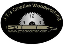
Another version

attachment.php


This is the logo I like the best. Now as far as colors go. I am still looking for suggestions. I would not mind trying different color combinations if I knew how. The programs I have are Gimp, Photoshop3, Open office, and picture it. If someone would explain how to do the color thing in anyone of those programs I would appreciate it. Thanks.
 
Photoshop3 will have a flood fill tool. It will most likely look like a bucket with something coming out of it. You should be able to choose a color and then click on the area you want to change and it will change. I am guessing here sine I do not have photoshop3 but most good photo programs have this basic feature. Or, you can tell me the colors you are interested in and I will change them for you.
 
I was able to do this


gold-logo.gif


green-logo.gif


blue-logo.gif


I do not know how to change the background color. Leaving the saw blade a silver. Change the black to the colors of the letters and have the letters black. Also was thinking is it possible to make the black a wood grain texture and have the letters and pen a green or a blue or a black. Still keeping the saw blade silver. See this is what I would love to be able to do but do not know how.
 
Back
Top Bottom