Do you hate this pen?

Signed-In Members Don't See This Ad
See more from timdaleiden

Status
Not open for further replies.

timdaleiden

Member
Joined
Mar 17, 2004
Messages
616
Location
Wausau, WI, USA.
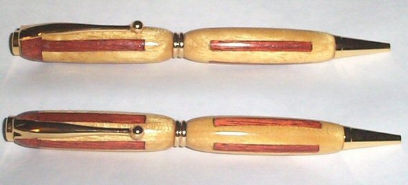
I already posted a pic of this pen on the Yahoo group, but I wanted some input here too.

Image Insert:
200481934150_Copy%20of%20Untitled-Stitched-01.jpg

27.98KB

I personally find the pen unsightly. It was a difficult glue up to do. I used a scroll saw, a bastard file, and a lot of effort to make this pen, but I think it just sucks.

It is currently getting a major facelift, but I just wanted to see if anybody likes it here. If you hate it, tell me so...really.
 
Signed-In Members Don't See This Ad

PenWorks

Member
Joined
Aug 18, 2004
Messages
5,186
Location
Scottsdale, AZ
Tim, I like the inlay and can appreciate the time you put into it. But it is ugly. Only because of the way it was turned. I think it would look really nice on a larger pen platform, like a Gentlemans pen. You wanted honest, you got it. I have one of the largest collections of ugly ducklings. Anthony
 

timdaleiden

Member
Joined
Mar 17, 2004
Messages
616
Location
Wausau, WI, USA.
on
Originally posted by penworks
<br />Tim, But it is ugly. Anthony

I am glad I am not the only one that doesn't like it.

The original design was to have both barrels like the lower one. I was a bit too forcefull when inserting one of the tiny slabs in the upper barrel and the yellowheart split, so I added the oops ring. I think it may have looked ok that way.

After the facelift is done, I will show it again, unless it is even worse.

Thanks for the honesty.
 

paleydp

Member
Joined
Mar 24, 2004
Messages
88
Location
Lake Forest, CA, USA.
You really seem to want others to dislike this pen (I read your yahoo posts) so I'll chime in. I'm also not a fan of the 'wasp' waist, and the overall shape seems too bulbous, esp. at the clip end. The inlays seem to small for the overall diameter of the 2 pen sections. If it were mine, I might think about parting off the other 3 tops and bottoms up to the inlay, then adding matching (is that purpleheart) ends, leaving out the CB (make up for it with the p'heart), and changing the overall shape to a thicker center (thicker than the existing centerband, not thicker than the existing barrels) with more of a taper at both ends. The inlays might appear more balanced in size relative to the pen that way. Post the revised edition so we can see it :)
 

timdaleiden

Member
Joined
Mar 17, 2004
Messages
616
Location
Wausau, WI, USA.
Actually, I just finished doing, almost word for word, what you suggested. I also added a Yellowheart CB. It's still on the mandrel, but it does look very nice now. BTW, that's not purpleheart...it's bloodwood. Thanks for the honest critique, and suggestions.
 
G

Guest

Guest
If you didn't like this pen,why did you make two?
Ironically I have been thinking of doing the same type of glue up.
I have disliked using the center bands from teh first pens I ever made.
Actually just the slimlines.
 

timdaleiden

Member
Joined
Mar 17, 2004
Messages
616
Location
Wausau, WI, USA.
Originally posted by paleydp
<br /> Post the revised edition so we can see it :)

Well, here is how it turned out. I really like the way it looks in person. I am not sure the photo shows it well.


<b>Image Insert:</b><br />
200482423642_ylbld.jpg
<br /> 9.14&nbsp;KB
 

its_virgil

Member
Joined
Jan 1, 2004
Messages
8,126
Location
Wichita Falls, TX, USA.
Tim,
Nice redo! It looks totally different and 100% better. It's just a personal choice, but I have never been a fan of the large barrels and tiny CB, or as someone else called it the "wasp" waste or stuffed sausage. The More Bloodwood and less yellowheart looks more "comfortable" than the more yellow heart and less bloodwood. Wow, did I just say that? What did I just say? Now I'm confused. Like the new old pen.
Do a good turn daily!
Don
 

timdaleiden

Member
Joined
Mar 17, 2004
Messages
616
Location
Wausau, WI, USA.
Thanks Don,

I like it a lot better too. It could still be a bit better, but considering it was a salvage job, I'm pretty pleased with it. BTW, it has a Watco/CA finish on it.

I followed your directions a bit more closely, and it really made a big difference. I sanded to 600 and used a swirl mark remover...sweet...and quick. [:D] No MM, no sprays, very nice finish.

Thanks for your kind words; it means a lot more than you think.
 

timdaleiden

Member
Joined
Mar 17, 2004
Messages
616
Location
Wausau, WI, USA.
Originally posted by Eaglesc
<br />If you didn't like this pen,why did you make two?

LOL. That would be odd wouldn't it???

Actually, it is just one pen. It is a composite photo. I just stuck two different views together with photo editing software.

If I wanted to toy with you, I could say that I make all of my unsightly pens in sets. [}:)]
 

timdaleiden

Member
Joined
Mar 17, 2004
Messages
616
Location
Wausau, WI, USA.
Originally posted by daledut
<br />I hate this pen...[:D] just kidding. I liked the first version and this one is even better. Way to go.

LOL. I am sure somebody will prefer version 1, but I was not happy with it. I was trying to make something a bit more mainstream for my PMG album. I was really dissatisfied with the results of my first attempt.

Thanks for the encouragement. [:D]
 

Daniel

Member
Joined
Jan 1, 2004
Messages
5,921
Location
Reno, NV, USA.
Tim,
Thanks for this great example of what small changes can do for the apperance of a pen. I for one didn't dislike the original with the exception of the nib end, I was thinking it needed to be tapered.
but the rework makes it look extremely different.
 
Status
Not open for further replies.
Top Bottom