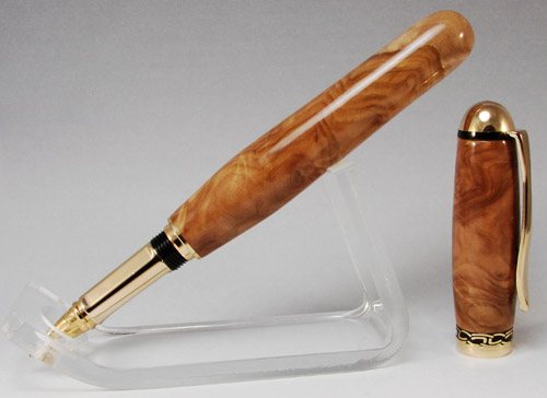
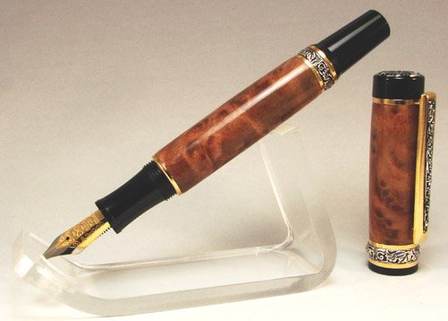
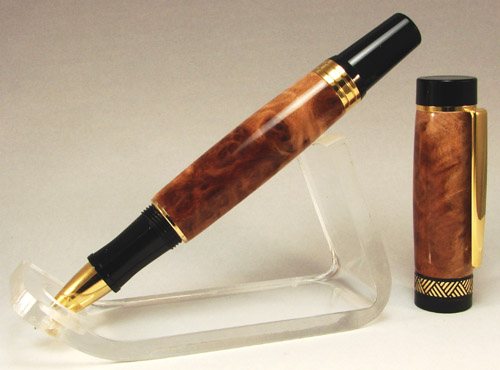
Holy crap, great looking pens! Your photos are great, just a little washed and could be a little sharper, but overall you're in the 90th percentile I'd say!
I monkeyed around with your photos a little bit in Paint Shop Pro. They're all very different in color balance; the ultimate goal is obviously to keep your white background as white as you can. When needed, I mess around with the color balance until I get the white as close as I can to looking gray scale at least.
It's a bit rough working on images that have been compressed already because there's a couple of steps that I do before I reduce, but here's some options that you have using software to adjust color balance, brightness, contrast and sharpness. They get a bit grainy trying to sharpen them when they're this small, but you get the idea:
Original:
Edited:
-------------------------------------------------------------------------------
Original:
Edited:
-------------------------------------------------------------------------------
Original:
Edited:
I'm no expert, but I'm learning. So far, I've been sticking to a set of rules that help me get faster at editing because I always follow the same formula. It's easy for me to get kind of confused if I just start editing the bazillion things you can do without a plan of action. The steps I take when I have to use software to adjust a photo are in this order, although I don't always do every one of them, just those that I think it needs:
1) Crop to frame without compressing/reducing image size
2) Adjust brightness/contrast as desired - doing this now gives you the best blend of any color changes, as there's more pixels to work with between color changes
3) Adjust color balance as needed
4) Adjust to final image size - this is where it blurs the picture a little bit, which seems to help with blending any color changes from the last step
5) Adjust sharpness to bring focus back to the redrawn lines and colors
One thing I can see that you can try straightaway, if you've got the room in the booth to do it - bring your pen and prop farther forward to get some longer depth of field between your pen and the background. This should make it easier for the camera to focus on the foreground (your pen) instead of picking up texture from the background.
Hope that helps a little!


