Blue Cowrie Custom FP

Signed-In Members Don't See This Ad
See more from Robert111

Robert111

Member
Joined
Apr 12, 2011
Messages
1,127
Location
Saratoga Springs, NY 12866
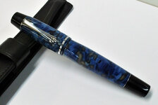
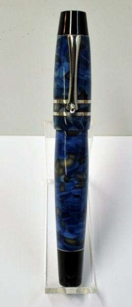
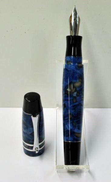
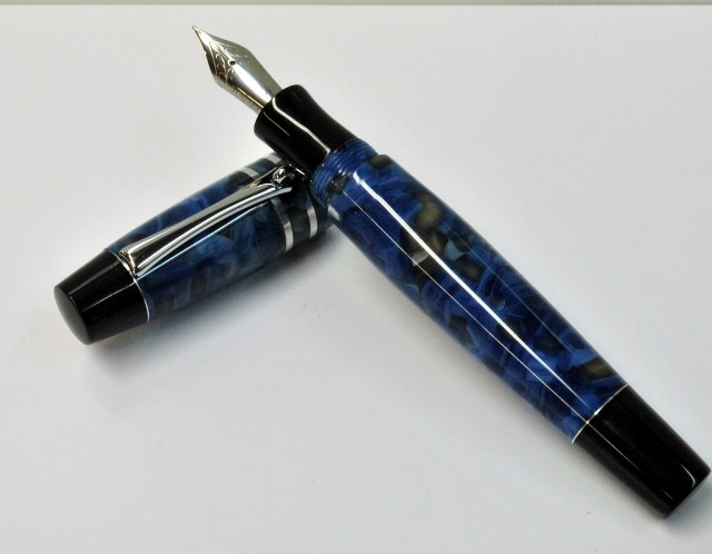
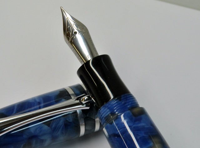
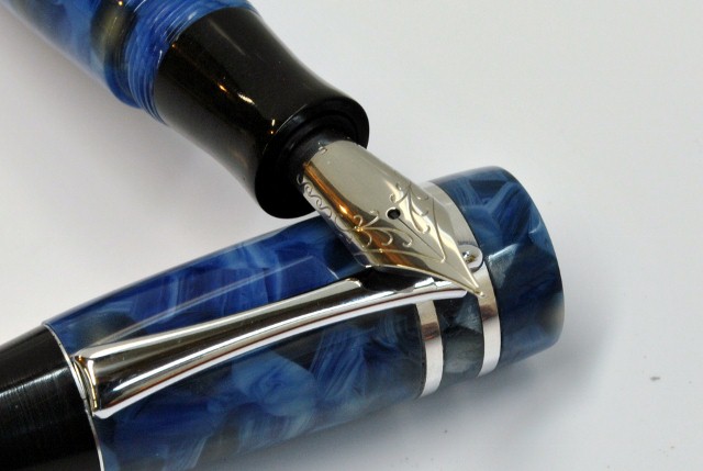
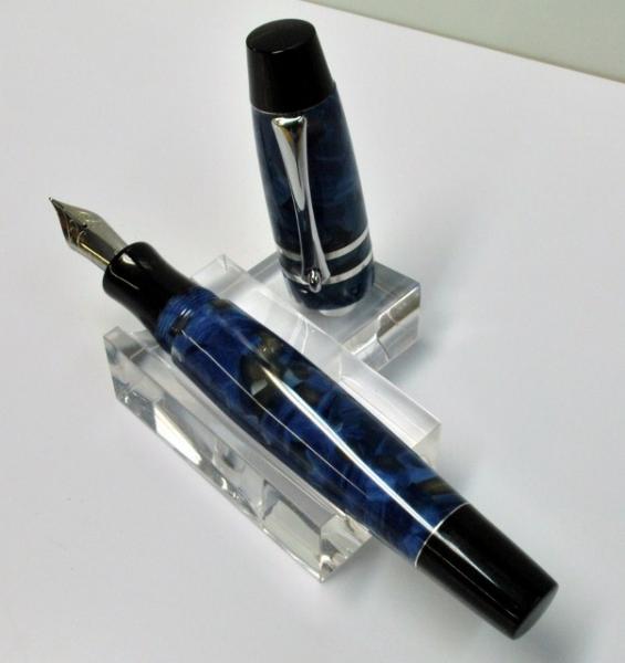
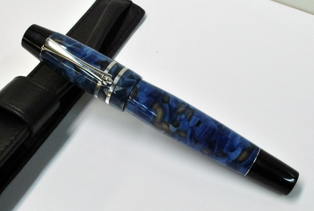
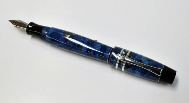
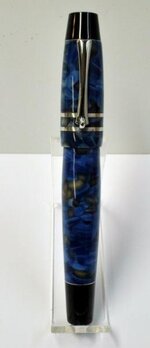
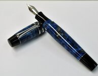
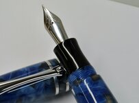
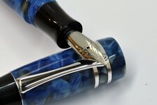
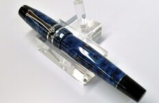
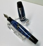
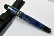
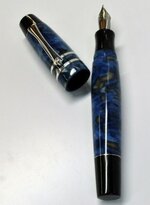
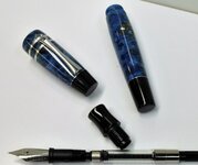
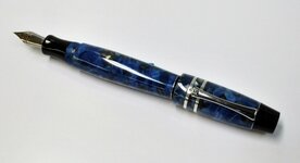
With this pen, I'm going for a shorter, broader style and more curvature. This is the first one too with multiple bands. The imported Italian acrylic from Exotic Blanks is called "Blue Cowrie." The finials and grip section are black ebonite.

I'd very much appreciate feedback on this new style. And thank you for all the comments posted on my pens up to this point. I don't do shows, so your thoughts are very helpful.

Overall length 5 1/8" (132 mm)
Length without cap 4 7/8" (122 mm)
Posted Length 6 1/4" (160 mm)

Cap diameter at widest point 18.4 mm
Barrel diameter at widest point 16.2
Grip section diameter 13 mm

Weight 28 gm (with converter)

attachment.php


attachment.php


attachment.php


attachment.php


attachment.php


attachment.php


attachment.php


attachment.php


attachment.php


attachment.php
 

Attachments

  • Blue Cowrie Custom FP 005 (276x640).jpg
    Blue Cowrie Custom FP 005 (276x640).jpg
    12.6 KB · Views: 744
  • Blue Cowrie Custom FP 006 (390x640).jpg
    Blue Cowrie Custom FP 006 (390x640).jpg
    16.4 KB · Views: 733
  • Blue Cowrie Custom FP 007 (640x498).jpg
    Blue Cowrie Custom FP 007 (640x498).jpg
    95.8 KB · Views: 727
  • Blue Cowrie Custom FP 008 (640x473).jpg
    Blue Cowrie Custom FP 008 (640x473).jpg
    86.1 KB · Views: 715
  • Blue Cowrie Custom FP 010 (640x429).jpg
    Blue Cowrie Custom FP 010 (640x429).jpg
    104.3 KB · Views: 727
  • Blue Cowrie Custom FP 014 (640x417).jpg
    Blue Cowrie Custom FP 014 (640x417).jpg
    99.4 KB · Views: 147
  • Blue Cowrie Custom FP 018 (603x640).jpg
    Blue Cowrie Custom FP 018 (603x640).jpg
    26.3 KB · Views: 737
  • Blue Cowrie Custom FP 021 (640x429).jpg
    Blue Cowrie Custom FP 021 (640x429).jpg
    96.3 KB · Views: 728
  • Blue Cowrie Custom FP 023 (469x640).jpg
    Blue Cowrie Custom FP 023 (469x640).jpg
    19.9 KB · Views: 726
  • Blue Cowrie Custom FP 028 (640x538).jpg
    Blue Cowrie Custom FP 028 (640x538).jpg
    109.1 KB · Views: 733
  • Blue Cowrie Custom FP 030 (640x349).jpg
    Blue Cowrie Custom FP 030 (640x349).jpg
    72.3 KB · Views: 722
Signed-In Members Don't See This Ad
Beautiful pen Robert,
The shape of the two components are nice but for some reason they do not seem to complement each other when they're together, Maybe I just like a different style but
aside from that I love the composition of materials and as always your work always makes me feel that I should return to the Nat'l Hqt. and practice some more.
Mark
 
I think it is a well put together pen. I like the stubby cap look on this one. The blank works well with the design too. Nice job.
 
Robert, your work is always exceptional. Finish is impeccable, execution on the threads, hidden clip looks flawless. As for the design, it's probably just me, but the broader curvature with the squared-edged finials seem to conflict. I think a more rounded edge on the finials may look better with the broader curvature look. Also narrowing the distance between the center bands and lowering the paired bands down the cap looks better for me. Again just my preferences. But I definitely commend you for trying different looks on these custom pens. Thanks for sharing.
 
Beautifully executed as always Robert. I go along with Mark, the body on it's own looks beautifully proportioned, but to my eye the cap doesn't quite work to complete the pen. I can't justify my opinion cos I'm not sure what it is that throws the balance out. But then as always aesthetics are a very personal thing.
 
Beautiful pen Robert,
The shape of the two components are nice but for some reason they do not seem to complement each other when they're together, Maybe I just like a different style but
aside from that I love the composition of materials and as always your work always makes me feel that I should return to the Nat'l Hqt. and practice some more.
Mark

I think it is a well put together pen. I like the stubby cap look on this one. The blank works well with the design too. Nice job.

Robert, your work is always exceptional. Finish is impeccable, execution on the threads, hidden clip looks flawless. As for the design, it's probably just me, but the broader curvature with the squared-edged finials seem to conflict. I think a more rounded edge on the finials may look better with the broader curvature look. Also narrowing the distance between the center bands and lowering the paired bands down the cap looks better for me. Again just my preferences. But I definitely commend you for trying different looks on these custom pens. Thanks for sharing.

Beautifully executed as always Robert. I go along with Mark, the body on it's own looks beautifully proportioned, but to my eye the cap doesn't quite work to complete the pen. I can't justify my opinion cos I'm not sure what it is that throws the balance out. But then as always aesthetics are a very personal thing.

Excellent! This is just what I was hoping for. Your constructive feedback is very helpful. There's lots of good stuff to think about here. That's why I love this board.
 
I'd like to retain the same overall length--about 5 1/8 inches. I 'd also like to retain the diameters--about 18 mm and 16 mm.

What can I do to make the cap and barrel more compatible? I agree that the cap is too stubby, but I need to keep the length as is. How about using just one band and putting it closer to the edge? Wouldn't that tend to make the cap LOOK longer?

I like the curvature of the barrel coming into the threads, and of course it's necessary to avoid a huge shoulder above the threads. At the same time, the cap has a slight curve coming down from the last band to the edge. And the diameter of the cap bands has to be around 18 mm because of the construction. I don't see any way to avoid the "ledge" where the cap and barrel join. I could ease the cap edge a little more than I have. Would that be good or bad for the whole design?

Would the whole design look better with shorter finials at each end? longer? none--and therefore no thin bands at the ends either?

And last, what about Mark's suggestion to round over the finials a little more?
 
Last edited:
I really like the pen, but like others, I think the cap isn't quite right. I think the taper at the top is too severe. It almost looks like you are trying to match the diameters at both ends. Maybe if the barrel taper matched the cap taper it would work better together. But over all, I think it's a beautiful pen. A bit big for my tastes, but that's just me. I know many others like the larger pens.
 
Holly cow Robert!! This one really gets it! Maybe a straight cap, maybe not...either way it belongs in my pocket!!
 
That is absolutely beautiful! I don't make fountain pens very often or even use them for that matter, but this one really speaks to me. That is very fine craftsmanship!
 
If I felt qualified to comment on your work (I am Not Worthy ) LOL:) I might try to leave the body and change the cut only on the cap keeping the same dimensions,
What if you were to cut a slight waste into the cap and add a slight flair to the top
I think it might complement the skirt of the cap and give it less of that bell look.
kind of like that Septre look only more Robertish.So the top has more of a baby moon
profile.
Just a thought
Mark
 
Thanks for offering something unique Robert. Certainly is interesting to look at, and I'm sure it's quite the same to use. Love the blue material, and bands.
 
I like the thickness and spacing of the double bands. They offset the blue/black very well without over powering the acrylic. The narrowing of the cap top reduces the black cap and leaves the viewers attention on the blue/black where it belongs. The curvature of the main body looks comfortable to hold. Beautiful design and execution.
 
Was wondering about the amount of room available for the tip of the nib? Can't be much....or does the cap just look shorter in the photo?


I like the color of the blank with the bands of silver-ish stuff against the black ends/pieces!


Scott (what's a cowrie?) B
 
Although I can only aspire to such work, I've been in design for a few years and Photoshopped a couple of different options. I think that having one band further towards the end gives the cap a lengthened look and works well proportionally.
 

Attachments

  • Cowrie1.jpg
    Cowrie1.jpg
    141.5 KB · Views: 142
  • Cowrie2.jpg
    Cowrie2.jpg
    143 KB · Views: 146
Was wondering about the amount of room available for the tip of the nib? Can't be much....or does the cap just look shorter in the photo?


I like the color of the blank with the bands of silver-ish stuff against the black ends/pieces!


Scott (what's a cowrie?) B

I think it's a sea shell.

Although I can only aspire to such work, I've been in design for a few years and Photoshopped a couple of different options. I think that having one band further towards the end gives the cap a lengthened look and works well proportionally.

I hope others will comment on these. These photos really help.
 
Robert, Gorgeous pen as usual with your trademark attention to detail !! You really matched the Blue Cowrie well with the black ebonite and silver accents. You've already gotten so much feedback...not sure I could add anything... I really like the dual bands..but I think the clip overlaying them detracts from the esthetics of the bands...just a thought. However...I'm using my fountain pen collection with the conventional band and clip placement as a measure...... and I'm not sure that is fair to this beautiful and original pen. Regards, Doc:smile:
 
Robert i love it, and theres a good chance i would buy it if i were to walk past it.

I think the issue you have with the cap is that your eyes follow the curvature of the body of the pen, which tapers in towards the cap. This flow is then interrupted by a step out to a wider diameter line, I may be off base here, as im sure everyone has their own opinion, but perhaps if the lid had the same or very close to external diameter as the end of the pens body closest to the cap, your eye would follow the lines all the way through.
 
Overall, I think it looks really nice. I agree with those who say it might look better with only one trim ring at the bottom of the cap. I"d also cut the finial down by about half, and keep it flat. I don't think it needs any more curves. The blue and silver go so well together!
 
Back
Top Bottom