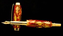
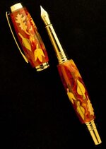
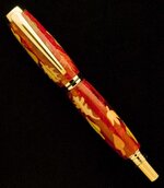
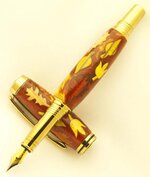
Doc I have said this before and will say it again. The black background is taking away from the real beauty of your pens. There is something with your setup that just does not show your pens in the right light. I bet if you took photos in your lighter background setup that pen would look a whole lot different. I and not sure anyone else wants to say it but the colors don't show up well. Now this is just once again my opinion and you do what you want. As always you do some very fine work and you have brought Jeff's creation to life. Thanks for showing. Hope you don't mind the critique.
John,
I welcome the critique. I have started and have used lighter backgrounds with darker colored pens and didn't really like the photos that much with the gray in the picture. If you get a chance look at the photos withmy Black Tru-stone with pyrite post and let me know what you think. I have more in my members album.I'm just trying to find a way to use a altogether white background by adjusting the white balance or to eliminate the background altogether making it blend into the page. Regards, Doc
Doc
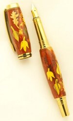
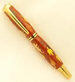
I am by no stretch of the imagination qualified to give photo pointers so take my thoughts with a grain of salt. But from what I see your light source has a yellow tint to it. Now is that the camera or the lamps I do not know. But it makes your wood and fittings look yellow and washed out. Also when you lay the pen right on the black felt the light is so absorbed, it again washes out the definition of the pen and fittings because of the glare on them. They look like half a clip or nib or cap was used. I think if you would stand the pen off the felt the light can now wrap around the pen better and maybe giving a better definition. But as I said I think a color such as grey has such a neutral effect on the light source and you camera is able to distinguish colors better. Using white as a background to me is too generic and sterile. It will help pick up every light shine line if you are after that. A light blue is also a nice background color that will allow the camera to focus better. On the leaf pen the wood has such a yellow tint and I know for fact it is more brown and also the leaves are a maple color not yellow. Take a photo with your light background and post them side by side and you will see the difference. Some times monitors will see photos differently and sometimes our eyes see it differently also. You have taken so many photos now with the black background your eye is trained on that look. Swith it up and you may see what I see.
Like I said others probably do not agree with me at all and love your photos and they are good don't get me wrong but I think they can be better and your work can be even nmore appreciated.