You are using an out of date browser. It may not display this or other websites correctly.
You should upgrade or use an alternative browser.
You should upgrade or use an alternative browser.
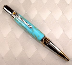
Art Deco in Turquoise
- Thread starter broitblat
- Start date
Signed-In Members Don't See This Ad
See more from broitblat
Signed-In Members Don't See This Ad
MarkHix
Member
I think it is a combination of a busy kit and a busy blank. Try the blank on a kit that is not as ornate. It does not work for me either. Maybe a kit that is not as shiney? Sometimes I assemble one and it just says...nope, not quite.
Brooks803
Member
To me it looks like the gold from the kit is overwhelming the gold matrix of the trustone and making it look "dumbed down". I like both the kit and the blank and what you've done with it, just doesn't seem to fit together.
jskeen
Member
Well, I agree, it don't work for some reason, but I almost think it's because the blank don't stand up to the kit, not because it's too busy. I would try something bolder, like the black with gold web, or the crystacola or arizona jade. I think that kit demands a dark blank, not a pastel. It's the pale color that's working against you, not the amount of activity. But hey, that's just my opinion, and you know what they say about opinions.
Jim in Oakville
Member
I agree....busy...what kit is this??
PenMan1
Member
The not working is certainly not your fault Barry. This deco pen kit is SO busy that it looks overdone even on the simplest black blank. IMHO, it has TOO many lines and stones, etc going in all directions. Well executed, though!
I bought on of these along with one of the Majestic Squires. I had the same results as you.
I bought on of these along with one of the Majestic Squires. I had the same results as you.
PenMan1
Member
I am not bashing David Broadwell. He certainly has done a lot for the penmaking world. The Art Deco stuff just does not see to be as tastefully done as his earlier work with the Neavue Septre. The Septre was somewhat sutble and delicate. The Deco just beats you over the head with gawdy.
Jim in Oakville
Member
I think I like the kit, but would like to know where to get it, I am thinking a solid colour rather than a figured or blended design of busy blank, etc, I am thinking deep red's or green's, even man made ivory and yes, black
PaulDoug
Member
Okay, here is my opinion. It's the clip. Take that clip off and put and a plain silver (chrome) clip on and you have a pretty pen. To me those clip distract from the rest of the pen. When I glance at that pen my eyes go directly to the clip and not the pretty turquoise.
broitblat
Member
Rfturner
Member
The Art deco kits demand attention to the kit itself rather then the pen as a whole. The turquois blank competes with it, I cant quite put my finger on it but it is something about it that I don't like, I think that it does look good with the darker blanks. You could pull off the black matrix with the Gold or a straight up dark blank, the lighter colors don't look good on this kit


