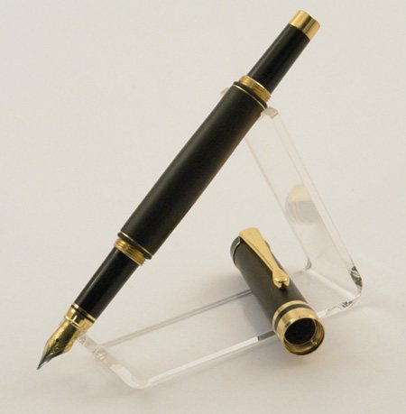
please comment

Signed-In Members Don't See This Ad
Joined
Feb 10, 2008
Messages
98
Location
Earls Colne, essex, United Kingdom.
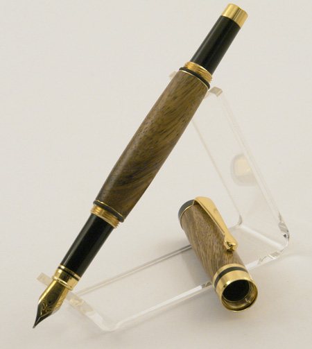
I'm happy with these shots look great on my site now but if I can improve anymore let me know.
exposure time 1/10 sec
F-STOP F14
exposure program: manual
ISO 800
W/B set to tungsten

Comments please.
Regards Mervyn
2008311174744_pic-forum.jpg


200831117487_pic-forum1.jpg
 
Signed-In Members Don't See This Ad

gerryr

Member
Joined
Sep 22, 2005
Messages
5,353
Location
Billings, MT, USA.
Are you actually using tungsten lights, 3200 or 3400K, can't remember which now? They look like they're under-exposed just a hair. Try changing the shutter speed to 1/8 or the aperture to f/11 and post another one. The photos just look kind of "flat."
 

gketell

Local Chapter Leader
Joined
Dec 15, 2006
Messages
2,772
Location
Pleasanton, CA, USA.
I agree with Gerry, they are a little dark. Also, on my machine they look a little bit blue. They are also a bit soft. Try sharpening them a bit, either in the camera or in software afterwards.

GK
 

aurrida

Member
Joined
Jan 12, 2008
Messages
139
Location
Germany.
i think the composition does justice to the pen but not the cap. not sure what would be better, maybe standing up?
 

toolcrazy

Member
Joined
Dec 23, 2006
Messages
5,408
Location
Port Orchard, WA
Depth of field is a bit off. Increase your f stop to f19 or f22 and slow down your shutter speed to compensate. I always leave my ISO on auto.
 

Daniel

Member
Joined
Jan 1, 2004
Messages
5,921
Location
Reno, NV, USA.
They look dark to me also, but everything looks dark on this computer. the light background with make it hard to get a good exposure for the pen. You can overexpose in steps until you get one that comes out best for the pen. the background will get more and more washed out as the detail in the pen gets better and better.
 

Hello

Member
Joined
Dec 27, 2007
Messages
185
Location
Brattleboro,VT, USA.
I don't know anything about cameras...well, I know that you push the button on the top and it takes a picture...and hopefully the picture isn't of the lens cap.... but here's my thought.
The pens look nice....the photo seems well "staged" (is that a good term?), but the phot, or rather, the pen in the photo doesn't "pop" out and grab your attention. What I mean by "pop" is...well.... you know how when you take a picture of someone with really brilliant blue or green eyes, even with a disposable camera, their eyes always immediately draw your attention?...that's "pop".
I hope I'm not just making a big mess.... :D
 

W3DRM

Member
Joined
Oct 22, 2007
Messages
218
Location
Minden, NV, USA.
Originally posted by aurrida

i think the composition does justice to the pen but not the cap. not sure what would be better, maybe standing up?

I agree about the cap. It needs to be standing up or in a different position. For some reason my eyes keep being drawn to what is inside the cap...

Focus is not crisp and as others have said, the image is a little under-exposed resulting in loss of pen detail.
 
Top Bottom