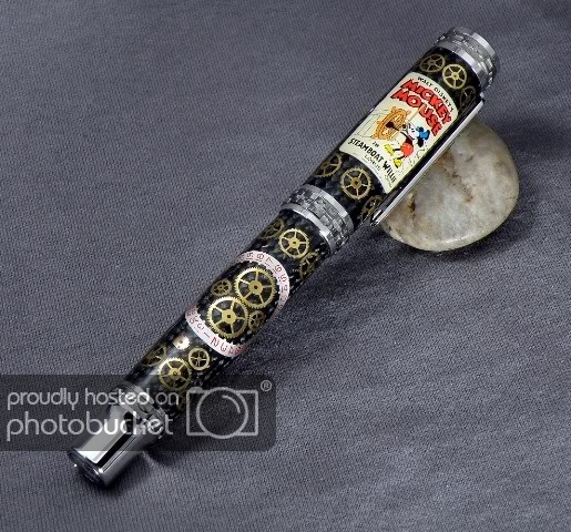
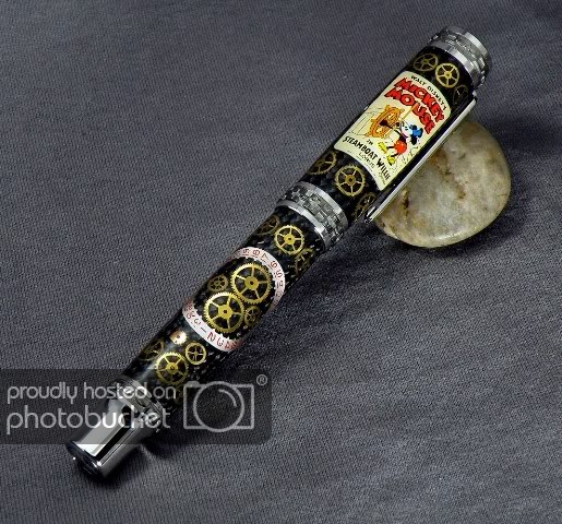
Eric, on my monitor, your background is in near perfect focus while the pen appears to be in just slightly less focus.
As to background choice, the world is full of choices, colors, textures, the list goes on. Myself, I am 'color challenged', meaning I have a bride that picks out all my necessary colored clothes when they have to match. Ask yours for her help in locating the correct background color. Explain to her first that the background must not be subject and clash with the pen. If the second photo is more correct in color, then you are on the right track in PS. As far as the focus, the depth of field of nearly all lenses works to 1/3 in front of point of focus and 2/3 past the point of focus. If your camera is auto-focus and you can adjust the selected area of focus, chose a point and have it on the front surface of what you want to be sharpest in the photo.
This is in no way a criticism of the quality of your work. Your pens and photos have always been top notch. None of are perfect and I am far from that point.
Charles