Pic Test - opinions please

Signed-In Members Don't See This Ad

InvisibleMan

Member
Joined
Feb 13, 2011
Messages
716
Location
San Jose, CA
Hi all,

I'm working on my photo skills and would like feedback on this pic. I shot in RAW, so should be pretty workable (I hope!) I'm a complete novice. The shot was taken in my make-shift light tent with plain white paper as the backdrop:
 

Attachments

  • Amboyna Burl Aero Pic Test.jpg
    Amboyna Burl Aero Pic Test.jpg
    39 KB · Views: 479
Last edited:
Signed-In Members Don't See This Ad

ghostrider

Member
Joined
Feb 3, 2011
Messages
952
Location
Grand Rapids, Michigan
That looks pretty good to me.

I've been struggling with photographing pens myself, and that doesn't look to bad. I'm sure some of the more knowledgeable can give you some better feedback.
 

avbill

Member
Joined
Oct 18, 2007
Messages
1,973
Location
San Bruno, CA, USA.
There is little separation between the white background and the pen. Are you using 2 lights / or are you using three lights. The third light from the back side of the tent will help separate the subject from your background.
 

InvisibleMan

Member
Joined
Feb 13, 2011
Messages
716
Location
San Jose, CA
There is little separation between the white background and the pen. Are you using 2 lights / or are you using three lights. The third light from the back side of the tent will help separate the subject from your background.

No light behind, buy I had the two side lights angled facing front to back. I moved them back and here's the result. I think better. I'll try to re-work my setup to get more light behind to see what happens.
 

Attachments

  • Amboyna Burl Aero Pic Test 2 IAP.jpg
    Amboyna Burl Aero Pic Test 2 IAP.jpg
    40.8 KB · Views: 260
Last edited:

Rick P

Member
Joined
Apr 30, 2011
Messages
1,686
Location
Palmer Alaska
That seperation is why I prefer a dark or black back ground when shooting against a solid back ground. Believe it or not you need more light to get the same effect with a light/white back ground. But ya did good!
 

seamus7227

Member
Joined
Mar 18, 2009
Messages
6,220
Location
Wichita Falls, TX
That seperation is why I prefer a dark or black back ground when shooting against a solid back ground. Believe it or not you need more light to get the same effect with a light/white back ground. But ya did good!


I agree with a darker or black background! Nice picture either way though, thanks for sharing!
 

InvisibleMan

Member
Joined
Feb 13, 2011
Messages
716
Location
San Jose, CA
OK, next step - darker background. Might be a touch over exposed now?
 

Attachments

  • Amboyna Burl Aero Pic Test 3 IAP.jpg
    Amboyna Burl Aero Pic Test 3 IAP.jpg
    54.6 KB · Views: 276

Rick P

Member
Joined
Apr 30, 2011
Messages
1,686
Location
Palmer Alaska
Better but use a fabric with a very tight weave. On a purely aesthetic level I too place the clip up, better represents the over all pen, doesn't interrupt the line of the pen and often gives it a bit of flash. You might be a touch over exposed, are you bracketing your pics?
 

InvisibleMan

Member
Joined
Feb 13, 2011
Messages
716
Location
San Jose, CA
Better but use a fabric with a very tight weave. On a purely aesthetic level I too place the clip up, better represents the over all pen, doesn't interrupt the line of the pen and often gives it a bit of flash. You might be a touch over exposed, are you bracketing your pics?


Yep, I'll get a better fabric. Just trying to figure out the mechanics for now - I'm using t-shirts for these:rolleyes: Clip up would be better - I think I can handle that one.

What's bracketing?
 

Rick P

Member
Joined
Apr 30, 2011
Messages
1,686
Location
Palmer Alaska
Bracketing is letting the camera pick one variable like the exposure time, take a pic. Then take a pic at one f stop bellow and one f stop above the settings the camera picked. Or you can use the same f stop and adjust exposure times, that might actually work better as f stop can effect the depth of field. Thing to do is play a bit with the settings, all cameras are slightly different.....do you have a program like photo shop? You can do the same with most photo programs.

I bracket exposure times for my Northern lights shots, these were 20 second exposures. The camera wanted a 15 secound exposures, they were a bit dark. I did not use photo shop on these at all, they are a accurate representation of what was going on in the skies above our home.
 

Attachments

  • 6191162607_838a501222_z.jpg
    6191162607_838a501222_z.jpg
    93.5 KB · Views: 162
  • 6191669206_2c1deafa2b_z.jpg
    6191669206_2c1deafa2b_z.jpg
    107.8 KB · Views: 137
Last edited:

InvisibleMan

Member
Joined
Feb 13, 2011
Messages
716
Location
San Jose, CA
OK, I think I may be onto something. I've monkeyed around a bit.

3 lights - one to each side and one overhead. Natural light from behind through a window - all diffused by a white bed sheet.

ISO 400; f/s 5.6; exposure 1/40; notebook paper back for a base:

well, looking at it now, it looks kinda dark.

And a matching Electra with the same camera settings:
 

Attachments

  • Amboyna Burl Aero AIP Test.jpg
    Amboyna Burl Aero AIP Test.jpg
    47.5 KB · Views: 201
  • Amboyna Burl Electra AIP Test.jpg
    Amboyna Burl Electra AIP Test.jpg
    24.1 KB · Views: 175
Last edited:

InvisibleMan

Member
Joined
Feb 13, 2011
Messages
716
Location
San Jose, CA
The wood now looks darker than the other pic. So now the question is "what is an accurate representation of the true color?"

The last pic is maybe very slightly dark, but I think the colors match up pretty well with the real thing. The blue background photo was definitely light.
 

Rick P

Member
Joined
Apr 30, 2011
Messages
1,686
Location
Palmer Alaska
Thats what makes a photoshop type program really nice. I very slightly lightened mostly the fore ground of your pic.
 

Attachments

  • Amboyna%20Burl%20Aero%20AIP%20Test.jpg
    Amboyna%20Burl%20Aero%20AIP%20Test.jpg
    39.3 KB · Views: 182
Last edited:

Rick P

Member
Joined
Apr 30, 2011
Messages
1,686
Location
Palmer Alaska
Keep at it photoshop has lots of ways to get to the same result and 90% of it is just playing with images and the program. You have to start with a good image to being with and move in tiny steps.
 

sbell111

Member
Joined
Jan 16, 2008
Messages
3,465
Location
Franklin, TN
OK, I think I may be onto something. I've monkeyed around a bit.

3 lights - one to each side and one overhead. Natural light from behind through a window - all diffused by a white bed sheet.

ISO 400; f/s 5.6; exposure 1/40; notebook paper back for a base:

well, looking at it now, it looks kinda dark.

And a matching Electra with the same camera settings:

If those last pics were taken with the pen sitting on white paper, then you need to pop back over to photoshop and correct the color.
 

jbswearingen

Member
Joined
Dec 10, 2008
Messages
752
Location
Bowie, MD
Show us a pic of your light box so we can get a better idea of what you're working with.

For my backdrops, I prefer inexpensive poster board. You can swap colors easily and it's cheap and easy to replace if damaged.

My light box is a heavy duty cardboard box with windows cut into it on the top and the two sides. I bought some inexpensive white fabric from Joann Fabrics (on sale for $2yd). It's thin, so I can layer it if needed for more muting.

I only shoot outdoors when the sun is out. It *does* limit my shooting, but I don't have to store lights or stands for them, and I ALWAYS get perfect white light.

I shoot at f20 almost always, and let the camera choose shutter speed. ISO is usually at 400, but I shoot each pic in -2/3 stop, normal stop, and +2/3 stop on the sensitivity setting. More often than not, the -2/3 stop with a little "brightening" in Canon's image software gives me the lighting I like. I also "sharpen" at 250 on a 500 scale in the same software.

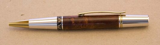
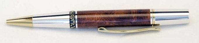
I took this pic yesterday evening, just before dusk, in the shade of my house. Even with no direct light, you still see reflections in the finish, but the light is very soft, preventing hot spots. This one finished up at 0 stop with a bit of brightening to bring out the colors.

DPP_0390Medium.jpg


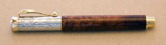
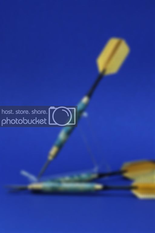
Here's a pic showing a mistake--using a blue background for a blue subject. I should have pulled out the black or grey sheet.
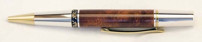
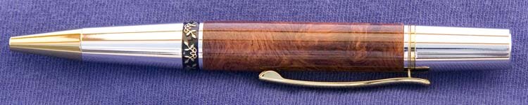
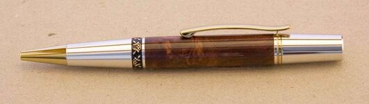
DPP_0373Medium.jpg
 

toolcrazy

Member
Joined
Dec 23, 2006
Messages
5,408
Location
Port Orchard, WA
OK, I think I may be onto something. I've monkeyed around a bit.

3 lights - one to each side and one overhead. Natural light from behind through a window - all diffused by a white bed sheet.

ISO 400; f/s 5.6; exposure 1/40; notebook paper back for a base:

well, looking at it now, it looks kinda dark.

And a matching Electra with the same camera settings:

ISO, should be as low as your camera can go. 100 or 200. 400 can introduce noise. F stop should be at least f/18 to maximize depth of field.
 

jbswearingen

Member
Joined
Dec 10, 2008
Messages
752
Location
Bowie, MD
I'll beg to differ on the ISO setting. Much of it depends on your camera. Canon's machines are known for exquisite performance at high ISO settings; I never shoot lower than 400 on mine.
 

76winger

Member
Joined
Aug 30, 2009
Messages
2,784
Location
Lebanon Indiana
You're real close with both lighting and focus. I agree with most of what's been said about the background already. Changing the position of the pen to an angle would help give it more of a 3 dimensional effect, so the whole photo doesn't feel flat.

One thing I try to do is get as good a photo as I can with the camera because I'm not yet that much of a wiz with post processing. Photoshop (which there's lots of good tips for) is not in the budget and I've not found similar good tips for Gimp yet.

But regardless, going back to the days of using film, it's always better to get a good a quality photo out of the camera as you possibly can. That most importantly means good focus, good lighting and good framing/perspective on the subject being photographed. If you get all that right, there's usually very little post-processing to do anyway.
 
Top Bottom