Sylvanite
Member
The human eye is an amazing thing. It has an extremely wide field of view, with tremendous clarity and depth-of-field. In person, we see a bigger, sharper image than any camera lens can resolve, across a wider tonal and dynamic range than a photo can capture.
Right?
Well, not really. The eye is amazing, but not optically better than a quality camera lens. In fact, it has a very narrow angle-of-focus, and short depth-of-field. The eye resolves only a small region in our field-of-view at one instant. The truth is that the mind is astonishingly good at combining multiple images into a wide, clear panorama.
That may not seem applicable to "fill light", which is the topic of this tutorial, but the eye does something similar in high-contrast situations. That is, just as the eye changes focus when panning and the mind constructs a single picture, it also changes pupil diameter when looking at darker or lighter objects - and the mind creates a seamless image with incredible dynamic range.
Suppose you make a pen with barrels from dark and light woods. When viewing that pen in person, you can see the contrast as well as the grain in both. Your eye will adjust without you even noticing.
A camera, however, is not adaptive like the human brain. It can only take a single image in whatever light is present. When you photogaph a pen, you often have to make a trade-off between exposing for the shadows, or the highlights. It's very difficult to see the detail in both the light and the dark areas. A professional photographer will use additional "fill" lights, or reflectors on the dark areas, but most of us lack the equipment or expertise to do as good a job.
Fortunately, this is one of the things that Photoshop is good at correcting.
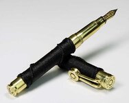
Here's a sample photo. It doesn't feature contrasting woods, but exhibits the same issues with black thread against bright brass. This exposure is a compromise, yielding both dark shadows and slightly blown-out highlights.
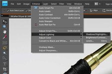
These problems can easily be corrected by clicking "Enhance->Adjust Lighting->Highlights/Shadows"
Adjust the values for "Lighten Shadows" and "Darken Highlights" until you can make out the detail in both the light and dark areas. You can tweak the "Midtone Contrast" as well. For some reason, Photoshop (and I'm using Photoshop Elements 8 here) picks a default value of 25 for "Lighten Shadows", which is almost always way too much. I rarely go up to 10. I don't usually darken more than 5. Changing the midtone contrast much usually messes up the image, so be very frugal with that setting.
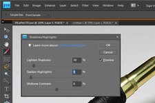
In essence, the "lighten shadows" setting is much like adding a fill light to the dark areas. It's really useful in getting the character of a dark pen barrel to show up against bright hardware. "Darken Highlights" can help tame harsh reflections and light backgrounds.
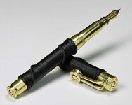
Here is the result.
I hope that helps,
Eric
Right?
Well, not really. The eye is amazing, but not optically better than a quality camera lens. In fact, it has a very narrow angle-of-focus, and short depth-of-field. The eye resolves only a small region in our field-of-view at one instant. The truth is that the mind is astonishingly good at combining multiple images into a wide, clear panorama.
That may not seem applicable to "fill light", which is the topic of this tutorial, but the eye does something similar in high-contrast situations. That is, just as the eye changes focus when panning and the mind constructs a single picture, it also changes pupil diameter when looking at darker or lighter objects - and the mind creates a seamless image with incredible dynamic range.
Suppose you make a pen with barrels from dark and light woods. When viewing that pen in person, you can see the contrast as well as the grain in both. Your eye will adjust without you even noticing.
A camera, however, is not adaptive like the human brain. It can only take a single image in whatever light is present. When you photogaph a pen, you often have to make a trade-off between exposing for the shadows, or the highlights. It's very difficult to see the detail in both the light and the dark areas. A professional photographer will use additional "fill" lights, or reflectors on the dark areas, but most of us lack the equipment or expertise to do as good a job.
Fortunately, this is one of the things that Photoshop is good at correcting.
Here's a sample photo. It doesn't feature contrasting woods, but exhibits the same issues with black thread against bright brass. This exposure is a compromise, yielding both dark shadows and slightly blown-out highlights.

These problems can easily be corrected by clicking "Enhance->Adjust Lighting->Highlights/Shadows"

Adjust the values for "Lighten Shadows" and "Darken Highlights" until you can make out the detail in both the light and dark areas. You can tweak the "Midtone Contrast" as well. For some reason, Photoshop (and I'm using Photoshop Elements 8 here) picks a default value of 25 for "Lighten Shadows", which is almost always way too much. I rarely go up to 10. I don't usually darken more than 5. Changing the midtone contrast much usually messes up the image, so be very frugal with that setting.

In essence, the "lighten shadows" setting is much like adding a fill light to the dark areas. It's really useful in getting the character of a dark pen barrel to show up against bright hardware. "Darken Highlights" can help tame harsh reflections and light backgrounds.
Here is the result.

I hope that helps,
Eric
