dkarcher
Member
Wow! Those are really on Fire!
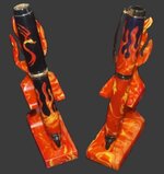
Pic #1 for me!
Pic #1 for me!


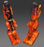
Thanks Greg...that makes perfect sense. The dark background lets the colors live,
but the black blends out the black in the pens. I need to do some more investing..what a surprise.