Black Pearl Custom Kitless

Signed-In Members Don't See This Ad
See more from Robert111

Robert111

Member
Joined
Apr 12, 2011
Messages
1,127
Location
Saratoga Springs, NY 12866
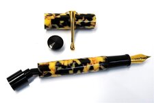
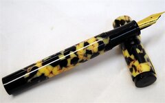
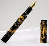
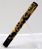
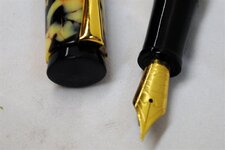
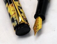
I'm looking for comments on the shape of the cap finial, in particular. I think I like it with a vintage-style material, but otherwise I think this pen is too stubby at 5 1/8 inches--the wide bottom finial unfortunately contributes to the "stubbiness." I think the vintage look of the blank is really nice though.

By the way, the bottom finial unscrews to permit operation of the converter.

Any comments, suggestions, or questions are welcome and appreciated.

5 1/8" overall length
5" uncapped
5/8 diameter at the clip
24 grams with converter

Threading
cap-barrel -- 14 x .8
section-barrel -- 9 x .75
cap-finial -- 7/16 x 24
barrel finial -- 9 x .75
 

Attachments

  • Black Pearl Custom Kitless 010 (Small).JPG
    Black Pearl Custom Kitless 010 (Small).JPG
    83 KB · Views: 366
  • Black Pearl Custom Kitless 014 (Small).JPG
    Black Pearl Custom Kitless 014 (Small).JPG
    57 KB · Views: 362
  • Black Pearl Custom Kitless 016 (Small).JPG
    Black Pearl Custom Kitless 016 (Small).JPG
    49.8 KB · Views: 416
  • Black Pearl Custom Kitless 011 (Small).JPG
    Black Pearl Custom Kitless 011 (Small).JPG
    65.9 KB · Views: 236
  • Black Pearl Custom Kitless 004 (Small).JPG
    Black Pearl Custom Kitless 004 (Small).JPG
    78.6 KB · Views: 348
Signed-In Members Don't See This Ad

The Penguin

Member
Joined
Dec 21, 2009
Messages
2,134
Location
Houston, TX
very nice - but I think a little detail at the bottom finial to mimic the top finial would be a nice addition.
 

InvisibleMan

Member
Joined
Feb 13, 2011
Messages
716
Location
San Jose, CA
I see stuff I like. It's cool, it's a bit funky. It's different. Nice material. I like the shape. The cap finial is really neat. I don't really get a "stubby" feel when I look at it. I like it a lot. Good job.

Yeah, looking and thinking more, I like the wide barrel finial. I think it offsets the small cork-like cap finial and adds sort of a sturdiness. It's like a toy soldier. Yep, toy soldier. I like it.

edit again: your last photo is awesome. I really like the composition I guess.
 
Last edited:

Robert111

Member
Joined
Apr 12, 2011
Messages
1,127
Location
Saratoga Springs, NY 12866
DUDE! That little cap finial is AWESOME! Friggin cool Robert!

very nice - but I think a little detail at the bottom finial to mimic the top finial would be a nice addition.

I see stuff I like. It's cool, it's a bit funky. It's different. Nice material. I like the shape. The cap finial is really neat. I don't really get a "stubby" feel when I look at it. I like it a lot. Good job.

Yeah, looking and thinking more, I like the wide barrel finial. I think it offsets the small cork-like cap finial and adds sort of a sturdiness. It's like a toy soldier. Yep, toy soldier. I like it.

edit again: your last photo is awesome. I really like the composition I guess.

Great looking pen! I like the finial, it adds a nice touch.

AK

Wow! Nice surprise. Thanks very much guys!
 

Brooks803

Member
Joined
Sep 13, 2009
Messages
5,632
Location
Aiken, South Carolina
I like it Robert. I personally am drawn to the boxy shape. Guess that's why I usually turn my kitless pens with similar shapes. I'm torn on the cap finial. In all the pics but one it looks great, the pic with it free standing is the one that looks off to me. Could just be the angle, but it looks much smaller in that one pic. What could be cool on a future project is do a similar cap finial, but then turn a dome of the pen material on top of it, kinda like a retro cap. Anyhow, awesome work! The finish is outstanding.

Oh, forgot to ask....what size is the nib? #5 or #6?
 
Last edited:

Robert111

Member
Joined
Apr 12, 2011
Messages
1,127
Location
Saratoga Springs, NY 12866
I like it Robert. I personally am drawn to the boxy shape. Guess that's why I usually turn my kitless pens with similar shapes. I'm torn on the cap finial. In all the pics but one it looks great, the pic with it free standing is the one that looks off to me. Could just be the angle, but it looks much smaller in that one pic. What could be cool on a future project is do a similar cap finial, but then turn a dome of the pen material on top of it, kinda like a retro cap. Anyhow, awesome work! The finish is outstanding.

Oh, forgot to ask....what size is the nib? #5 or #6?

Yup, a dome over the angles coming into the cap, kinda like an ice cream cone. I can see that, maybe a shallow dome, I think. Thanks.

The nib is a #6, Jonathan.
 

OKLAHOMAN

Member
Joined
May 17, 2006
Messages
10,228
Location
Costa Rica
Now that's one fine looking retro. I like how you used the black finial, cap and section to bring out the black in the blank. I also am a fan of the boxy shape and disagree with Johnathan a little on the dome made from the blank material as I think it would throw off the balanced look of the pen. I really like it as is. If's it's not broken why fix it?
 
Last edited:
Joined
May 1, 2012
Messages
217
Location
Destin, FL
I'll be honest....I have been looking at all these componentless pens lately and you all have really set the bar. I'm quite frankly so impressed with the quality and imagination in producing these pens, that I am fully ready to dive in and get started doing these! Maybe a couple more days of research and hopefully some help from you guys and I can be posting some of my own.
 
Joined
Oct 31, 2011
Messages
300
Location
Columbia, SC
I really like the finial! To be frank, I usually prefer a finial that is the same size as the rest of the cap and then has a slight taper to the top. Yours is either the only pen or one of the only that is not that way that I have liked. To be more specific, I like that instead of just a small cylinder on top of the pen, you tapered it Towards the cap along with the smaller diameter and that is what I think makes it unique. Great Job!:biggrin:

David
 

BSea

Member
Joined
Dec 28, 2009
Messages
4,628
Location
Little Rock, Arkansas
I'm with Jonathon on the retro cap look with the dome. But I also really like the simplicity of your cap. Yet it still adds some character. If I'd do one thing different, it would be to try a silver clip & nib. The gold seems to clash a little with the yellow in the blank. But I'm not a big fan of gold anyway, so it may just be me.
 

wizard

Member
Joined
Aug 27, 2009
Messages
3,569
Location
Houston, Texas
Robert, I like it as is..it has a very retro look to it particularly with that material and cap finial. I like the profile of the pen and think the "stubbiness" that you mention gives contrast to the cap and overall gives the pen the uniqueness indicating you are not trying to copy a vintage pen rather going forward with a neo-retro look...if that makes sense. Really like the contour and distinct profile of the section.
The only comment I have...more a combination of musing and personal preference... as some one else indicated... maybe try a silver/chrome/rhodium clip and a polished nib. If you do..add a pic to thread would love to see it.
Awesome pen Robert!! LOL..I've got to try and keep up with you!!:)
Regards, Doc
 

bluwolf

Member
Joined
Oct 2, 2008
Messages
995
Location
SW Florida
I'm not even sure I like the retro look. But I know I like where you're going with the whole finial thing. Something about that inset look is very slick. I'm sure it will start being copied very soon, perhaps even by me, if someone else doesn't beat me to it:biggrin: Well done.

Mike
 

Robert111

Member
Joined
Apr 12, 2011
Messages
1,127
Location
Saratoga Springs, NY 12866
Okay! That's a clear consensus. The finial is good, and the shortness works for most of those expressing an opinion. Thanks very much for the feedback. I will do another with rhodium clip and polished nib in another week. I have the material on hand.
 

Andrew_K99

Member
Joined
Feb 17, 2011
Messages
1,571
Location
Waterdown, ON, Canada
Robert I like that the responses have surprised you, means you put yourself out there thinking outside the box. This thinking will help advance the 'kitless' movement and hopefully inspire others to so the same.

When my taps/dies get in I have a few ideas I'm going to try, hopefully I get a similar response.

AK
 
Last edited:

IPD_Mr

Member
Joined
Jun 27, 2007
Messages
3,707
Location
Zionsville, In
The cap finial looks great. I think the best way to kill the stubby look of the pen would to be to start a tapper on the body about 2/3rds of the way towards the body finial. It also might help the balance a bit. Other than your concerns about the stubbyness of the pen I really like the look.
 

Texatdurango

Member
Joined
Apr 23, 2007
Messages
4,649
Location
Show Low, Arizona
Well, let's see. The way you did your cap finial is very clever and looks really sharp and totally custom, I really like it!

The black and yellow blank is horrid, but that's just my opinion.

Excellent job on the section from the angles I can see.

If I were to change anything, I would probably put a bit of a taper on the lower body.

Man, some of you guys are really starting to put out some really nice pens!
 

Robert111

Member
Joined
Apr 12, 2011
Messages
1,127
Location
Saratoga Springs, NY 12866
Thanks to all for the comments and suggestions. Mike and George, your suggestion for adding taper to the barrel sounds right on the mark. When I do another with a rhodium clip, I'm going to try it.
 

Robert111

Member
Joined
Apr 12, 2011
Messages
1,127
Location
Saratoga Springs, NY 12866
Well, let's see. The way you did your cap finial is very clever and looks really sharp and totally custom, I really like it!

The black and yellow blank is horrid, but that's just my opinion.

Excellent job on the section from the angles I can see.

If I were to change anything, I would probably put a bit of a taper on the lower body.

Man, some of you guys are really starting to put out some really nice pens!

LOL! Now that you mention it, George, it is. But it just seemed like good retro pen material to me.
 

drgoretex

Member
Joined
Aug 14, 2010
Messages
543
Location
Winnipeg
An awesome piece of work there.

I also like the finial. I think with finials, you either make it as close to seamless as possible, or make it stand out. You have done the latter with excellent finesse.

The overall shape of the pen is superb. I really like the conservative shape of the barrel and cap (apart from the cool finial).

The material seems to be less popular, but I have to say rather like it.

Well done, deserves the front page most definitely!

Ken
 

Robert111

Member
Joined
Apr 12, 2011
Messages
1,127
Location
Saratoga Springs, NY 12866
An awesome piece of work there.

I also like the finial. I think with finials, you either make it as close to seamless as possible, or make it stand out. You have done the latter with excellent finesse.

The overall shape of the pen is superb. I really like the conservative shape of the barrel and cap (apart from the cool finial).

The material seems to be less popular, but I have to say rather like it.

Well done, deserves the front page most definitely!

Ken

Thanks, Ken. I'm a drgoretex fan, so I'm really pleased by your comments. Been to your photo gallery for inspiration.

I'm loving the pen, but alas I'm late to the party....again.

Hey, Cris! Thanks, and good luck with your school fundraiser project pens. Be sure you post some pictures!

I'm loving the pen, but alas I'm late to the party....again.

Ditto!

What a great looking pen Robert! And a big congrats on the front page!!

Thanks, Dawn! Carry on with the battle against them critters!

Personally I just like the name. I think you should send it to me for a closer examination.

Really nice.

Thanks, Cliff. Appreciate it.

That's one outstanding pen. Nothing to not like there.

Gary, thank you for the kind words.

Beautiful Robert! I really like the cap finial. The fact that it is inset is what makes it I think, and think it is better without the dome.
Fantastic photography too!
Congrats on the cover page!

Appreciate it, John. Haven't seen much of your good work lately.
 
Top Bottom