Black and White

Signed-In Members Don't See This Ad
See more from Jim in Oakville

Status
Not open for further replies.
Joined
Aug 9, 2004
Messages
2,195
Location
Oakville, Ontario, Canada.
Something New for me.

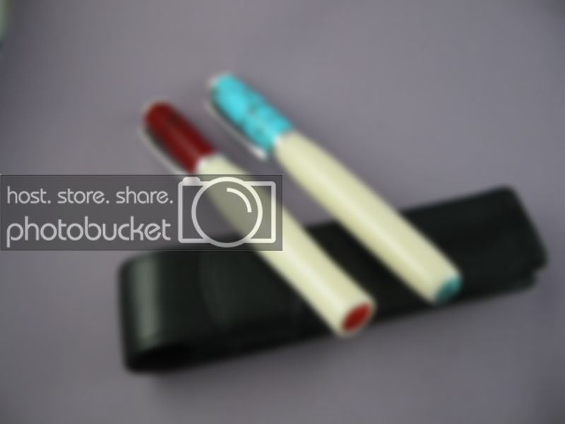
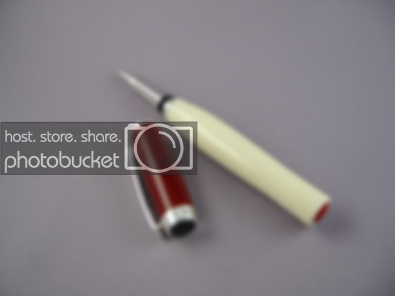
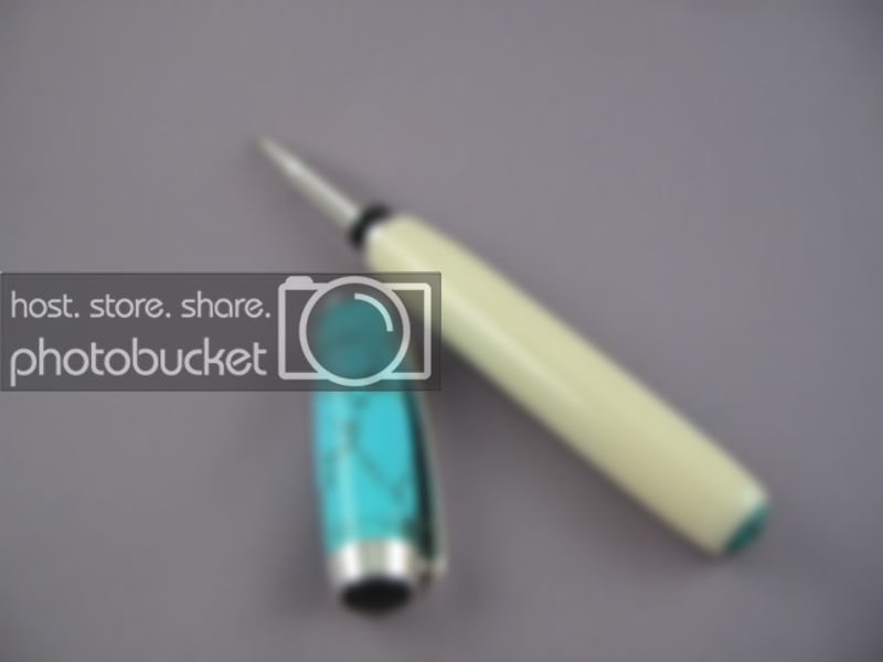
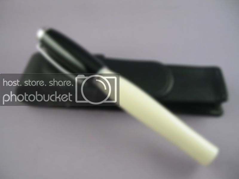
I have been turning two materials now for a few years that I really like, the alternate ivory from Craft Supply and the black acrylic from William Wood Write.

I had an idea on a design and tried it out today. Taking some inspiration from pens I have seen with cabochons I combined a few Barons with black acrylic caps and solid end alternate ivory.
IMG_8853.jpg


IMG_8839.jpg


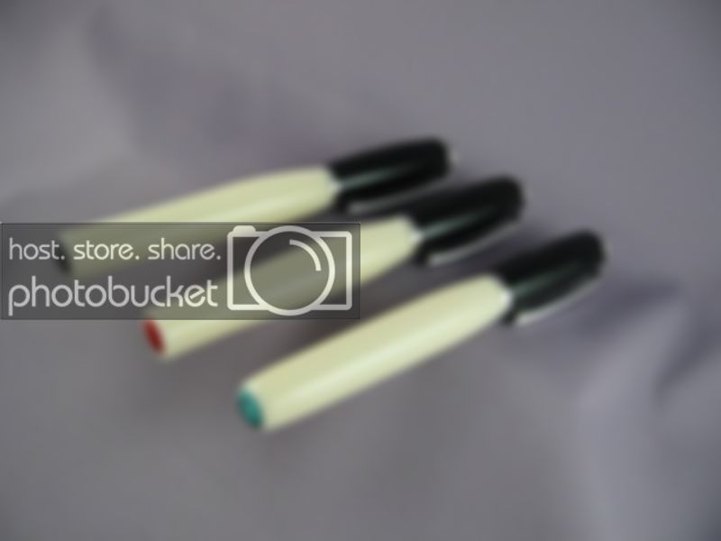
I used cabochons from Fire Mountain Gems, 10 mm black onyx, aquamarine and red coral.
IMG_8845.jpg


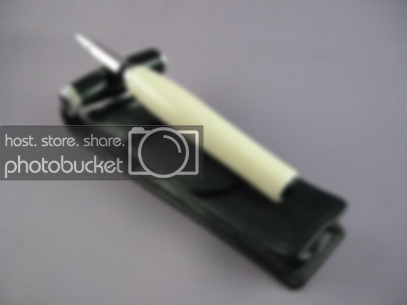
I like the black onyx cabochon pen, I am not sure about the combinations of the other two, perhaps Trustone caps of similar colours.
IMG_8848.jpg


Critiques are welcomed please.

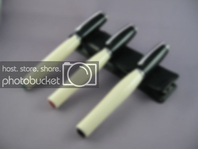
These are going with me this week to the hospital..I'll be giving them away to people who help me..:)
 
Signed-In Members Don't See This Ad

LanceD

Member
Joined
Oct 3, 2005
Messages
1,590
Location
Houma, La, USA.
They came out real nice. I think you're right about a turquiose cap on white with a turquoise cab would be a nice combination.
 

fiferb

Member
Joined
Mar 20, 2006
Messages
2,440
Location
Ninety Six, SC, USA.
I love them. The black one is a great match. I like the colored cabachons as well because they add a touch of color. I like the way the red one is inset a little deeper than the turqoise. Makes the color a little more of a pleasant surprise when you see it. Does that make sense?
 
Joined
Aug 9, 2004
Messages
2,195
Location
Oakville, Ontario, Canada.
Originally posted by thewishman
<br />Beautiful and classy! Your embedded cabochons add an extra nice touch, I'm trying to figure out how you get them in there.

Top quality work as usual.

Chris

Hi Chris,

I use a pen mandrel to hold the blank and I chucked a 10 mm forstner bit in a Jacobs chuck, placed it it the tail stock and carefully drilled into the end of the pen body for the recess.
 
Joined
Aug 9, 2004
Messages
2,195
Location
Oakville, Ontario, Canada.
Originally posted by fiferb
<br />I love them. The black one is a great match. I like the colored cabachons as well because they add a touch of color. I like the way the red one is inset a little deeper than the turqoise. Makes the color a little more of a pleasant surprise when you see it. Does that make sense?


Hi Bruce,

I do understand and felt the same way as you described it..The turqouoise one is too proud for my liking and also I was not happy with the ivory shape at the inset..
 

Tanner

Member
Joined
May 17, 2006
Messages
2,307
Location
Peoria, Arizona, USA.
Beautiful Jim, I think these look outstanding! You could even match the caps to whatever color cabochon. Great idea with what you have done here.
 

rhahnfl

Member
Joined
Jan 27, 2007
Messages
1,211
Location
Fleming Island, Florida, USA.
They are stunning!! I like the shape of the one with red. Would be nice if you could make matching end caps... though certainly not a necessity. Good job with your photography also.
 
Joined
Feb 18, 2004
Messages
4,130
Location
Grosse Pointe Woods, mi, USA
as said above, very classy. Actually I like the closed end design of the third pen with the granite like cabachon the best, though all are very nice. Just send me the one you like least and all will be fine.
 
Status
Not open for further replies.
Top Bottom