Amboyna Burl Emperor

Signed-In Members Don't See This Ad
See more from pctechmgr

pctechmgr

Member
Joined
Feb 10, 2011
Messages
26
Location
Lakemoor, IL
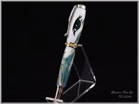
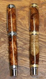
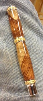
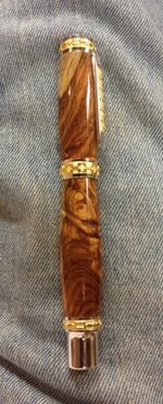
Gotta love these big pens that can show so much figure and color. Someday I'll learn to take better pics on my SLR camera, but for now I'm using the 'ole I-phone. Feedback is welcome as I take it seriously to improve. Thanks.

Heck, I'd even welcome negative criticism. Lol
 

Attachments

  • 010.jpg
    010.jpg
    41.1 KB · Views: 479
  • 011.jpg
    011.jpg
    42.4 KB · Views: 380
Last edited:
Signed-In Members Don't See This Ad
My only neg observation is that it looks like the cap was assembled "upside down", meaning I would think the sap wood should line up and touch without the break in it.Might just be me and feel free to ignore it.

Landon
 
Nice Timber. I agree a pen of that size and of that type should be bushing to bushing turned with no fat bulges. Does not look proper. Those kits are large enough that you do not need to add weight and bulkk to them by making a bulge. But looks like the finish is well done from what we can make out. Thanks for showing and take the remarks as you see fit.
 
I made 24 of these in Amboyna Burl for a freind who took them to the Middle East. Got rave reviews. Your pen looks fabulous!
 
I,M NOT EVEN A GREAT AMITURE(SPELLING),BUT I KNOW WHAT I LIKE.EVERY TIME I OPEN THIS THREAD TO CLEAR IT I GET EXCITED TO SEE IT.BEAUTIFULL PEN,GORGEOUS WOOD AND FINISH.A LITTLE MORE BULGE THAN I USE,BUT IT SURE DOES SHOW OFF THAT WOOD AND FINISH.
 
I was not sure if that was a bulge or if it was an illusion? One side looks a bit large but the other seemed straight? I know sometimes my images can be less than complimentary!
 
Thanks all. I'll try another one with less mass to it. I personally prefer the fatter pens since it shows off the grain better and I have very large hands.
 
I'm not opposed to some curve in a pen. Some curves just don't seem to flow right like I see a lot of Sierra style pens where the curvature of the barrel clashes with the curves of the hardware. Below is actually one of my favorite pens I've made and it's probably got more curve than any other pen of mine. I think I left the cap with that amount of curve because a nice pattern had formed and you know how things like that can disappear if you cut in any deeper. But this is what I mean about my preference to have the body have a little less curve than the cap. Just something to consider. If your pen wasn't really nice I wouldn't bother commenting at all.
 

Attachments

  • DragonEye4.jpg
    DragonEye4.jpg
    140.6 KB · Views: 99
Second try with the emperor based on feedback

So based on feedback, I made a second Emperor, left side, thinner and ensured the grain was in-line.
 

Attachments

  • 2 emperors.jpg
    2 emperors.jpg
    42 KB · Views: 94
So based on feedback, I made a second Emperor, left side, thinner and ensured the grain was in-line.

The first seems a bit out of proportion. The second is much more balanced. B2B turning better suits straight line hardware like the emperor. It deserves its own thread.

Have you considered dissassembling the cap on the first, and flipping it over to align the grain?
 
Last edited:
Back
Top Bottom