If it was me, I would have entered that one in the Kitless Contest. That's a good looking pen (not that the one you entered wasn't good looking, it's just that this one really looks sweet to me).
It doesn't look like African Blackwood to me though....
Ed
You see what I meant about deciding between 2 pens before.The Robusto really came out nice.Looks like it was dipped in glass.
The decision came down to weight and difficulty.The redwood was far more challenging to work with.I did try to do a front section but the wood was simply too soft and brittle to be sucessful.So I went with some curly maple.I tought it would compliment the soft tones in color.
Also the spirit of the contest is to push yourself,try new things,challenge ones own ability.The Robusto came easy,I didn't feel challenged.
Thankyou for your feedback.
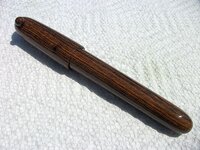
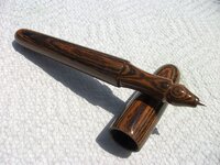
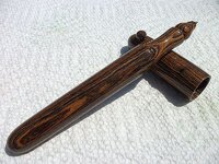
The shape of the front end is my kind of style. Has a comfortable balanced look to it. The wood resembles Bocote. The balck and brown goes well and the anti-roll ball on the cap is a nice touch. I would have made the area going toward the pen tip taper in a little more as to not (hide) the point. I would definetly buy this one. Very artistic.
I thought the unlabled lumber was either Bocote or Blackwood.Looked at alot of pics of lumber of both species until I found one that was a identical match.
Thin it down a little more riight at the point of the nib?I thought about that but I just didn't have confidence that it would hold up with the ogee shape to the tip.The teardrop shape I used on the other I was able to taper it right to the ink nib.
How much would you buy this for?I may put it in a gallery,it is only my second try though,so I should probably make a few more to dial in some consistency,Flyin by the seat of my shorts on each one at this point.
Thankyou for your feedback.