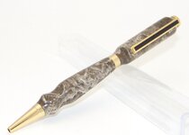
Of the two, I lean towards the first one, with the clear acrylic because the pen is the highlight of the photo, but I still find the distortion of the acrylic a slight distraction.
I would first ask myself "What is the purpose of the photo?"
If your purpose is simply to show off the pen, then I would challenge you to try a third alternative, where you come up with a prop that's complementary in color and smaller than the pen so it doesn't take away from the attention that the pen deserves.
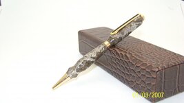
If your purpose is to sell the pen, then I'd still apply the above thought, but then an extra photo of the pen with the box becomes a good idea if you're including the box with it in your offering. If you're not doing this, then I see the second photo as a good photo of the box and a pen prop showing what the box holds (in a selling perspective still). Also from a selling perspective, you wouldn't want the date on there, aging the product, especially if it didn't sell quickly.

")