Looking for your opinion

Signed-In Members Don't See This Ad

itsonlychris

Member
Joined
Apr 30, 2013
Messages
7
Location
Syracuse New York
The critique is not of the "simple" pen but I am wondering about the structure of the photograph. My thoughts are to show the pen in the hand of the artist to give it perspective size and a warm human feel. I created a focal point of just the pen and blurred the rest. What do you see and a negative or a positive?
 

Attachments

  • hand1.jpg
    hand1.jpg
    50 KB · Views: 316
  • hand2.jpg
    hand2.jpg
    42.9 KB · Views: 291
  • hand3.jpg
    hand3.jpg
    23.1 KB · Views: 291
Signed-In Members Don't See This Ad

Tage

Member
Joined
Dec 1, 2010
Messages
279
Location
NJ
I struggle with photographing pens - both composition and mechanics; so I won't comment on the pics. But it reminds me of a member here who used to post pictures of Retro rollerballs held in his hand (haven't seen him post in a bit, but I think it was within the last year). He would blurr out the hand so it didn't distract from the pen. I am imagining that was done on Photoshop.
 

Sylvanite

Member
Joined
Jul 18, 2006
Messages
3,113
Location
Hillsborough, North Carolina, USA.
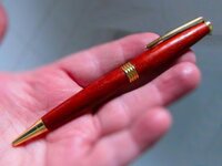
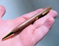
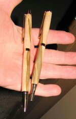
Umm, I'm sorry to be negative, but compositionally, these pictures don't speak to me. I think if you want to use a hand as a prop, it should be writing with the pen. Just cupping the pen in the palm doesn't tie it to the hand thematically. Also, the perspective seems too close. It appears as if you're holding the pen about 1 foot from the camera. The photo would look more natural if shot from 2 feet away.

Although selective focus is a useful tool for emphasizing the subject, too much blur in the same focal plane can look unnatural. In this case, I think you've overdone it. Remember that a good photoshop job shouldn't look like a photoshop job.

More importantly, that is simply and solely my opinion. If you (or more importantly, your customer) like(s) the look, then stick with it.

Most importantly, you're working to improve. Keep trying. Experiment with different poses and different lighting - and your photos will get better.

Regards,
Eric
 

OOPS

Member
Joined
Feb 6, 2010
Messages
674
Location
Spokane, WA
Sorry, but I too must say that the use of the hands is distracting, and the out-of-focus part just bothers my eye. It prevents me from focusing on what you want me to see, which is the pen. It doesn't work for me.

My two cents.
 

76winger

Member
Joined
Aug 30, 2009
Messages
2,784
Location
Lebanon Indiana
I'm not for the hands either. Eric pretty much summed up what I was thinking as I looked at them. I also think the color (white balance) on each is off as every photo has differing levels of too much red/pink/magenta in them.

Stepping back to take in the overall view of the pen writing would come closer to working. I think if the hand was holding the pen in a more natural writing position it might look better, even going so far as to pose it on a journal with writing in it.

Keep experimenting and trying various ideas and let us see what you come up with. Asking for opinions is a sign you're looking to improve and we'd love to help you with that!
 

ed4copies

Local Chapter Manager
Joined
Mar 25, 2005
Messages
24,528
Location
Racine, WI, USA.
Depending on the sophistication level of your software, you might keep the pen in color and bring the rest of the photo to monochrome. Keep the hand in focus, just grey.
The pen will then "pop" (I hope).

WEPYPFI,
Ed
 

kooster

Member
Joined
Sep 12, 2012
Messages
197
No Hands !!!! A suggestion . . . purchase a jointed/moveable wooden hand used by artists (Amazon or Ebay, etc.) and buy a pair of white or colored female gloves. Put the hand into the glove and you can pose it to hold/accommodate any pen. I also bought some museum putty to help hold the pen if needed without damaging the finish. White glove makes any pen really pop but subtle color(s) also add a really nice accent. Again, just a suggestion.
 

HamTurns

Member
Joined
Jul 25, 2012
Messages
273
Location
Madison, Wisconsin, USA
How about both?

I'm in the "no hands" boat. But I understand why you want to show a pen in a hand for sizing sake.

How about a "regular" pen shot with a small "pen in hand" inset in one of the corners of the overall shot. That would show the pen and how it fits in the hand.

Just a thought.

Tom
 

airborne_r6

Member
Joined
Oct 28, 2008
Messages
279
I don't think that hands necessarily provide any perspective of size because you have no idea how big the hands are. If you want to provide perspective for size you need to include something that is standardized and consistent.

I also agree that the hands detract from the overall feel of the picture and draw the eye away from the pen. This is why so many of the pen pictures are of just the pen. Anything else can tend to draw attention away from the subject which is the pen.
 

mmayo

Member
Joined
Jan 12, 2013
Messages
2,959
Location
Tehachapi, CA
I know how you feel and I think I know what you were trying to do. You seemed to be looking for a way to make your pens look unique and you gave it a shot. You might keep working to find something else, but I appreciate the effort. It is hard to find a NEW way to show pens that makes your look special.
 

farmer

Member
Joined
Jun 16, 2012
Messages
807
Location
NV
justis

The critique is not of the "simple" pen but I am wondering about the structure of the photograph. My thoughts are to show the pen in the hand of the artist to give it perspective size and a warm human feel. I created a focal point of just the pen and blurred the rest. What do you see and a negative or a positive?

Chris do me a favor, if You hire a photographer how much are you will to pay for the hand job :wink:

That's what I was thinking too.

You are shooting still photo's That means everything is still.

farmer
 

Floridadude

Member
Joined
Jun 13, 2013
Messages
3
Location
Orlando, Florida
I would suggest using another prop besides the hand. Your skin is white, and your eye tends to go to the hand rather than the pen. If you want to show scale use another object to show that scale. I do think that most people know what size a pen is, so that may not be necessary.

I often use a piece of driftwood, or rough wood for contrast as the pen usually is very smooth and shiny.
 

Attachments

  • Pen1.jpg
    Pen1.jpg
    277.9 KB · Views: 129

its_virgil

Member
Joined
Jan 1, 2004
Messages
8,126
Location
Wichita Falls, TX, USA.
I'm not a fan of props of any kind in pen pictures. (just my opinion). Props tend to draw attention away from the pen. I find myself inspecting the prop. Same goes (for me, at least) for patterned backgrounds…distracting. Also, pen pictures should have the pen fill the frame. A pen image 2 inches long in the center of an 8x10 canvas does little to show the pen. Good luck with your pen pictures.
Do a good turn daily!
Don
 
Top Bottom