Made a "good" pen, but don't like it

Signed-In Members Don't See This Ad

Tn-Steve

Member
Joined
Dec 8, 2008
Messages
271
Location
Clarksville, TN
Hey Gang,

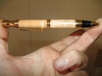
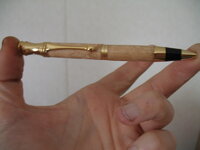
I just finished a Retro Pen (always liked that look), gold and Birdseye Maple. Turning was great, fit is as good as I can do, the finish reflects crisp clean reflections, the wood has a beautiful glow and movement.

I hate it. :eek: I think it's the combination of the Gold and the light wood, it just doesn't look right. Maybe I should have done it in something dark so that the top and bottom would pull together.

I've put it on the counter, maybe I'll like it better in the morning, but I'm not sure. Not sure of the point of this post, I think I just wanted to vent my frustration. Maybe I need "GerAnimal" tags for pens, so I can make sure that style, wood and hardware all look good together.

Ok, I'm feeling better now. Think I'll go chase the cats around until one of us tosses up a hairball.

Steve
 
Signed-In Members Don't See This Ad

Dario

Member
Joined
Apr 14, 2005
Messages
8,222
Location
Austin, TX, USA.
I know what you mean. One reason I prefer platinum...it is more versatile (more forgiving) than gold IMHO.

Seems like darker blanks are also easier to match with most kit plating. (my personal taste)

Hang on to it...someone will like it.
 

nava1uni

Member
Joined
Mar 30, 2008
Messages
4,936
Location
San Francisco, CA, USA.
Show us a picture. Sometimes new eyes can see things and maybe it would be helpful to know what others see. Your description sounds nice, but I have certainly made pens that by all rights I should be pleased, but something is just not right.
 

Tn-Steve

Member
Joined
Dec 8, 2008
Messages
271
Location
Clarksville, TN
Hey Gang,

Here are a couple of quick snaps of the pen in question. I liked it a "bit" better this morning, but still doesn't trip my trigger as far as looks. To me the top and bottom look too separated, the light wood doesn't seem to help the eye flow from one end to the other.

As always, any comments are greatly appreciated.

Steve
 

Attachments

  • Retro1.jpg
    Retro1.jpg
    31.9 KB · Views: 298
  • Retro2.JPG
    Retro2.JPG
    82.1 KB · Views: 220

jimofsanston

Member
Joined
Jan 6, 2009
Messages
762
Location
Sandston, Va
Platium or silver or TI i think would be a better contrast. The gold is battling with the light pitina of the upper wood. still looks ok though.
 

JimB

Member
Joined
Mar 18, 2008
Messages
4,682
Location
West Henrietta, NY, USA.
I know what you mean about the light wood and the gold. I don't really like that combination either but I have sold a few like that. Take Dario's advice and hold on to it. Everyone has different tastes and you will find someone who likes it.
 

jttheclockman

Member
Joined
Feb 22, 2005
Messages
19,148
Location
NJ, USA.
I am not a big fan of that kit. The shape has too much going on and that black piece is either not enough to compinsate with all that gold. i do not think it is the light wood conflicting, I think it is the black piece. Maybe if it had dark wood or a dark acrylic it would help in that it would add to that black piece. But anyway nice fit to the kit. I am sure you will sell it.
 
Joined
Sep 24, 2006
Messages
8,206
Location
Tellico Plains, Tennessee, USA.
Hey Gang,

Here are a couple of quick snaps of the pen in question. I liked it a "bit" better this morning, but still doesn't trip my trigger as far as looks. To me the top and bottom look too separated, the light wood doesn't seem to help the eye flow from one end to the other.

As always, any comments are greatly appreciated.

Steve

Hi Steve,
You did an excellent job on the pen, very nice wood, good fit and form... but I don't like it.
I don't like that particular pen kit.... I've looked at them several times, but always decided not to buy any because I just don't care for the kit. That's just my opinion which probably isn't worth all that much anyway.:)
 

pbrad1313

Member
Joined
Oct 28, 2008
Messages
2
Location
Garden Grove, CA.
Hi Steve
I recently made a slimline out of pieces that I had left over from earlier projects. The top was bright blue acrylic with straight sides the bottom was Olivewood shaped like the bottom of a Woodcraft cushion pen. The finish turned out very nice but I thought the pen was just short of being ugly! I brought my case of pens to work and one coworker saw the pen grabbed it and said, how much?
What you may not care for someone will love.
 

John Eberly

Member
Joined
Nov 3, 2008
Messages
84
Location
Grand Haven MI
Woodcraft "Retro" pen

I've made this kit about 4 or 5 times. Three were given away, never sold one.

I liked the kit initially - it was one of the first few I made. I still think that it has a lot going for it - two way twist, Parker refill, small size.

My observation is that there is not much wood/acrylic to balance the rather busy details of the pen. I think that this pen needs a very figured wood to come off well. I think that I used a tightly figured and spalted beech for three pens and cherry burl for another. All were very presentable. Another that I made using aromatic cedar is pretty plain.

My ideal wood to pair with the gold metal would be a warm color (love my beechwood) with some black grain or spalting to set off the black trim on the pen. I think the wood oon your pen is well turned but too plain.
 
Joined
Oct 3, 2008
Messages
655
Location
Indep, MO
... i do not think it is the light wood conflicting, I think it is the black piece. Maybe if it had dark wood or a dark acrylic it would help in that it would add to that black piece. But anyway nice fit to the kit. I am sure you will sell it.


+1
I also think it is the black piece. I printed one of your pics and folded it over to hide the black piece. Looks great without that. Another alternative would be to make the next one with some BOW. The light wood with dark lines in it would set it off nicely IMHO.
 

Tn-Steve

Member
Joined
Dec 8, 2008
Messages
271
Location
Clarksville, TN
Well, I was down at the WoodCraft shop this morning to pick up some stuff, and noticed that they had a big thing about "Turn for the Troops", and how they contributed 1700 pens last year. Since I had that pen, and a second one in the car I decided that somewhere in the sandbox there would be a troop that would like it. So that pen and a blue/white slim will end up a LONG way from where they started life.

I truly appreciate all the comments. I learned a lot about what works and what doesn't from this pen, and from your feedback. I may not do another for a while, but when I do I've got some ideas that I can play with. It may be a case of painting racing stripes on Yugo's, but it's a plan.

Now, to get working on my Newbie pen.

Steve W
 

Daniel

Member
Joined
Jan 1, 2004
Messages
5,921
Location
Reno, NV, USA.
Some combinations definitely have a snap to them that all the rest do not. The bad news about this is as more of what you make has that edge. it becomes less and less an edge.
Take the treasures as they come.
 
Top Bottom