Flame pen/stand

Signed-In Members Don't See This Ad
See more from workinforwood

workinforwood

Member
Joined
Mar 1, 2007
Messages
8,173
Location
Eaton Rapids, Michigan, USA.
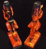
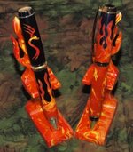
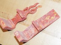
I was making a few flame blanks for my own inventory and it occurred to me that I should whip up a couple flame stands too. They are pretty cool, just scroll cut Alumilite stands. Please tell me which picture you like better.
 

Attachments

  • flame1.jpg
    flame1.jpg
    30.7 KB · Views: 504
  • flame2.jpg
    flame2.jpg
    39.2 KB · Views: 439
Signed-In Members Don't See This Ad

skiprat

Passed Away Mar 22, 2022
In Memoriam
Joined
Oct 19, 2006
Messages
7,812
Location
In a Skip in Wales
Jeff the colours on those two pens are outstanding!!! :eek: I love them both!!! :biggrin:

oh....first pic for sure:wink:

EDIT; LOL, so busy checking out the pens I didn't see those fantastic stands. I'm trying to figure out how you did the stand fork around the mid point....
 
Last edited:

bitshird

Member
Joined
Aug 27, 2007
Messages
10,236
Location
Adamsville, TN, USA.
Jeff, any one ever call you a smart @ss, if not, please allow me that opportunity at this time, :biggrin::biggrin:, I like the second pic best, the background on the first seems too severe for the colorful pens and stands, the second also seems to add dimension to them.
 

workinforwood

Member
Joined
Mar 1, 2007
Messages
8,173
Location
Eaton Rapids, Michigan, USA.
You cut the stand from the side view first Steve. Then you draw in the flames and cut those. You draw the arc in that little arm by tracing a Jr Statesman band. Then you simply grab a rotary tool and carve out the arc. Finally you place the pen in the stand to determine how far in or out the pen should be in the bottom and use the drill press/forestner bit to drill a base hole. Very simple. Oh, and you don't polish the bejesus out of the pen stand unless you are extremely motivated. It is alumilite, so if you simply sand it real good to 320 grit making sure there are not big scratches, then you can just spray the stand with polyurethane...1-2 coats is plenty. The poly will fill the 320 grit scratches and the stand will look almost like it was poured that way.
 

Phunky_2003

Member
Joined
May 18, 2009
Messages
1,470
Location
Bonham Texas
I like the first pic. The background is too busy in the 2nd pic. If you rotated the dragon pen slightly in the first pic it would be even better. Great work on these. Your work is inspirational.

James
 

mrcook4570

Member
Joined
Mar 27, 2005
Messages
4,098
Location
Mason, WV, USA.
Fantastic work. I prefer the second pic. The tops of the pens look a little washed out in the first pic and the dragon is not centered as well as it is in the second pic. That said, the background in the second pic is a little busy.

Also, there is not much contrast with the black background and black pen.
 

bgibb42

Member
Joined
Jun 6, 2009
Messages
642
Location
Hull, GA
I like the first pic better. The second just seems too busy. Nice pens, too, but I like the one on the right a little better.
 

workinforwood

Member
Joined
Mar 1, 2007
Messages
8,173
Location
Eaton Rapids, Michigan, USA.
Here's what it looks like before it was finished. This is one of the pictures for the article..of course there'll be a mag article or how would I pay for more toys?!:smile-big:
 

Attachments

  • flamesample1.jpg
    flamesample1.jpg
    24.9 KB · Views: 128
Joined
Dec 17, 2008
Messages
286
Location
Canada
Both look good Jeff and I would have thought the black would be best but it has a little too much contrast on my monitor. Soooooo, I've got to vote for the second shot because it's a little easier on the eyes.
Love them stands.
 

CaptG

Member
Joined
Jan 3, 2007
Messages
2,686
Location
Otsego, Mi, USA.
Awesome Jeff. If you did all that since I was there Tuesday, when do you find the time to work?? First picture gets my vote.
 

OKLAHOMAN

Member
Joined
May 17, 2006
Messages
10,228
Location
Costa Rica
Jeff, they are both awesome pens and stands, as to the pictures have you thought of using a white background the flames then would contrast nicely IMNSHO.
 

Mr Vic

Member
Joined
Aug 11, 2008
Messages
1,865
Location
Falcon, CO
Simply awesome pens and stands. I prefer the first picture by far....the second background detracts way too much...A black or navy blue velvet would have looked great also and would prevent the reflections at the bottoms..
 

CSue

Local Chapter Leader
Joined
Jan 16, 2007
Messages
2,368
Location
Laveen, AZ, USA.
I think the solid background kind of washes out the upper parts of the pens in the first picture. That, in my opinion, is why the lighter background helps in the second picture. And though the positioning of the pens is better in the second, the background is too busy. You would do better with a solid, lighter background.

In any case . . . those are way too coooooooool!
 

Attachments

  • j0395729.gif
    j0395729.gif
    5.3 KB · Views: 155

rjwolfe3

Member
Joined
Feb 12, 2008
Messages
8,352
Location
Mansfield, Ohio, USA.
I can decide on which photo I like best but the pens are smoking.

I would love to get your name in a pen swap someday but I would not be produce a comparable pen. You are true master.
 

workinforwood

Member
Joined
Mar 1, 2007
Messages
8,173
Location
Eaton Rapids, Michigan, USA.
Wow..thanks everyone! I'm still trying to work out my photo's..takes time, and I get so busy that there isn't any fiddle around time. I had a white background and it didn't look good. I feel that the white backdrop makes the pen look 2 dimensional and the hardware blends into the white a little bit. I have to get some more backdrops. My black is too shiny, and using quilting pieces sucks because they are busy and have folding seams on them.

Gary...I have accomplished far more than this since Tuesday! Thanks for the crash metal course.
 

alphageek

Former Moderator
Joined
Jul 19, 2007
Messages
5,120
Location
Green Bay, WI, USA.
I'm assuming you are saying you want one Dawn? That's no problem..I have two and I don't mind giving one to you for all you do for me. Let me know when that next package come in so I know it made it safely.

LOL... Wow did dawn phrase that right!!! I'm pretty sure that she meant PICTURE 1 (ie the black)... Which is my choice too... I agree with some of the comments that the black is a little extreme, but better than the other one.

Those are Very cool! Let us know when the article is due out :)
 

PR_Princess

Member
Joined
Jun 1, 2007
Messages
2,384
Location
Sturtevant WI, USA.
Ooops my bad Jeff!! Pic IS supposed to be PICTURE!! Too early in the morning I guess. LOL I never even thought of it being read the other way!!!!:redface::redface::redface:

Your box came in yesterday afternoon. Geez Eat your Wheaties is right!! :eek:
I know what I am going to be doing today!!:tongue::biggrin:
 
Signed-In Members Don't See This Ad

Bree

Member
Joined
Jun 19, 2009
Messages
1,736
Location
Buffalo, NY
Totally toxic! Wow those are good! I prefer PIC #1. That's a great idea for the stands!!
:biggrin::biggrin::biggrin:
 
Top Bottom