
TimS124
Member
My wife's side of the family keeps the cost of Christmas reasonable by drawing one name each from amongst the adults. Beats the heck out of buying (and especially shipping) the dozen-ish gifts we'd otherwise be doing for various in-laws!
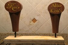
This year, I drew one of my brother-in-laws' name. He's a tough one because he pretty much has everything he needs and almost no hobbies. He's done a bit of home-brewing...and a couple years ago, he modified the fridge in his garage to house a couple mini-kegs, each with their own tap sticking out of the fridge door.
So, I whipped up a couple of custom tap handles to replace the generic plastic ones that came with his tap kit. It's a fairly simple shape in a nice piece of Philippine Mahogany (which was cheaper than Cherry or Maple at a local supplier and looked much nicer as well). I cut them on a small CNC router (ShopBot Desktop).
They're finished with a few coats of dewaxed shellac (it's all I had time to let dry before having to ship it cross-country).
The taps screw on via a 3/8"=16 threaded insert which is fairly easy to track down (though the ones I found at a local big-box store were really cheap...ended up getting much better quality ones from Woodcraft).
Attachments
Last edited:
")