Working on Pictures

Signed-In Members Don't See This Ad

jd99

Member
Joined
Dec 14, 2010
Messages
764
Location
Ontario, CA United States
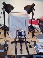
Been putting this off long enough and I need to get the web site done, so I'm trying this picture thing again.

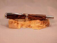
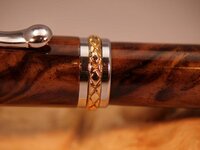
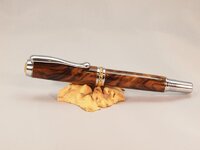
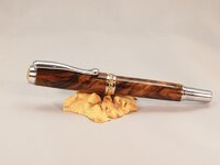
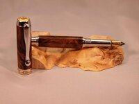
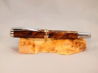
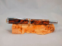
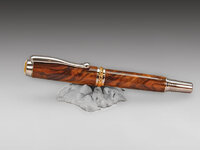
What do you see wrong or right with the pictures of this pen?
Other then the fact I didn't clean or polish it before I tried this sequence of shots.

Thanks in advance.
 

Attachments

  • Turk walnut 1-resize.jpg
    Turk walnut 1-resize.jpg
    34 KB · Views: 247
  • Turk walnut 2-resize.jpg
    Turk walnut 2-resize.jpg
    34.5 KB · Views: 211
  • Turk walnut 3-resize.jpg
    Turk walnut 3-resize.jpg
    29.5 KB · Views: 203
  • Turk walnut 4-resize.jpg
    Turk walnut 4-resize.jpg
    34.4 KB · Views: 204
  • Turk walnut 5-resize.jpg
    Turk walnut 5-resize.jpg
    37.4 KB · Views: 188
Signed-In Members Don't See This Ad

Sylvanite

Member
Joined
Jul 18, 2006
Messages
3,113
Location
Hillsborough, North Carolina, USA.
First of all, your white balance is off. Check your camera instructions on how to manually set the white balance. Secondly, the depth-of-field is extremely shallow. Use a smaller aperture (higher f-stop) with a longer exposure (and possibly move the camera farther away). The software that resized the images may also be making them softer. Sharpening would help some, but will not correct the depth-of-field. Third, you could use some fill light from the lower right. More lights and/or reflectors may be better.

Once those technical issues are resolved, you can work on composition.

I hope that helps,
Eric
 

jd99

Member
Joined
Dec 14, 2010
Messages
764
Location
Ontario, CA United States
what about this one, I'm not sure on the white ballance, but this one matches what the pen looks like and I didn't merge this one like the others.
 

Attachments

  • P8182810.jpg
    P8182810.jpg
    30.5 KB · Views: 210
Joined
Jun 28, 2010
Messages
1,830
Location
Pineville, Louisiana
I aint no photo pro but they look nice to me other then the first 2 being a little out of focus. Picasa is what I use and it is free for adjusting. My wife hates it I love it.
 

Sylvanite

Member
Joined
Jul 18, 2006
Messages
3,113
Location
Hillsborough, North Carolina, USA.
what about this one.

That's better. The white balance is closer, and the depth-of-field isn't quite so shallow. It's still quite soft though. A couple of minutes in Photoshop yielded this:

attachment.php


Colors vary quite a bit from one monitor to another, but does this look better to you?
 

Attachments

  • P8182810a.jpg
    P8182810a.jpg
    43.6 KB · Views: 405

76winger

Member
Joined
Aug 30, 2009
Messages
2,784
Location
Lebanon Indiana
I agree with Eric, the original photos are way off on the color balance. Even the corrected versions look a little pinkish.

Also agree with his recommendations for increasing Depth of Field.

I'd also recommend, if you goal is to highlight the pen, to go with a simpler prop. What you've used is larger than the pen and draws attention away from it. Important to consider if you're going to set up a website to sell the pens.
 

azamiryou

Member
Joined
Aug 14, 2010
Messages
1,015
Location
Silver Spring, MD USA
what about this one.

... does this look better to you?

In my opinion (and on my monitor), jd99's looked better.

It's really hard to tell, though, since we don't know what the original background color was. jd99, what's the background color you're using? If you can tweak the photo (either with the camera or post-processing) so that the background is the right color, then you'll have found the right color balance.
 

jd99

Member
Joined
Dec 14, 2010
Messages
764
Location
Ontario, CA United States
The background is a black cloth, and a white cloth on top of that, if I try to use just the white, it's so thin that it shows everything behind it, Ill play around with it some more today, and post what I get.

Thanks for all the advice, I'm no photo wiz, If ya need something made to close tollerances that I can do, but pictures arent my thing, plus the fact i'm color deficient doesn't help.

I'll take a picture of my set up so you guys can tell me if it looks right to you.

Thanks again.
 

oneptbuk

Member
Joined
Feb 8, 2012
Messages
57
Location
Seattle, WA
The second one does look better, I agree with Eric on getting some additional light on the lower half of the pen. Reflectors should help with that. Getting the whole pen sharp can be a challenge depending on the camera and lens you're using.

I would suggest, like others have, to remove the prop. The wood adds a lot of yellow to the shot which takes away from the pen.

Regardless of the shot, that pen's a real beaut!
 

azamiryou

Member
Joined
Aug 14, 2010
Messages
1,015
Location
Silver Spring, MD USA
The background is a black cloth, and a white cloth on top of that

In that case, in your photo the color is a little off, the background is a little bit pink/yellow.

the fact i'm color deficient doesn't help.

If you have trouble seeing whether the background looks right, software can help. Most paint/photo programs will have some sort of "eyedropper" tool that lets you find out exactly what color each pixel is. In some programs, it's displayed somewhere in the status bar whenever the mouse cursor is over an image. It may be displayed as red/green/blue, in which case you are looking for the three numbers to be about the same. Or it may be displayed as hue/saturation/brightness (HSB), in which case you are looking for saturation (S) to be near zero (1 or 2 is probably more realistic.)
 

jd99

Member
Joined
Dec 14, 2010
Messages
764
Location
Ontario, CA United States
Here is the setup I have, maybe one of my problems is that I didn't turn off the lights in the room, they are all high intentisy (sp) track lights, that could be a problem also correct?

The two big lights are CFL that I got with my larger tent and the two smaller ones are the ones that came with this smaller tent. I think I got both of them from Cowboy studios or something like that..:confused:

Thanks Guys
 

Attachments

  • P8190034.jpg
    P8190034.jpg
    39.8 KB · Views: 101

jd99

Member
Joined
Dec 14, 2010
Messages
764
Location
Ontario, CA United States
took a couple more

lets see how they look on here, they look good on my monitor??:confused: Hmmm they don't look as sharp after I upload.
 

Attachments

  • P8192830.jpg
    P8192830.jpg
    27.1 KB · Views: 96
  • P8192829.jpg
    P8192829.jpg
    27.1 KB · Views: 101
Last edited:

Haynie

Member
Joined
May 20, 2011
Messages
3,516
Location
Page Arizona
Are you doing any post shot manipulation? A little sharpening would work. Colors of the pen look great. I would choose a different color for the background. Raid the linen closet and play. Brown is a muddy orange so maybe purple.:biggrin:
 

jd99

Member
Joined
Dec 14, 2010
Messages
764
Location
Ontario, CA United States
Are you doing any post shot manipulation? A little sharpening would work. Colors of the pen look great. I would choose a different color for the background. Raid the linen closet and play. Brown is a muddy orange so maybe purple.:biggrin:
I think the pictures get modified on the upload, the orignal pictures on my pc are sharp, on this thread they are softer.
 

ironman123

Member
Joined
Dec 8, 2011
Messages
1,817
Location
Central Texas
JD, those last couple look real nice on the pen but there is something with the background that holds back the "pop". The pen itself is great to me.
(My cent and a half)

Ray
 

Ed McDonnell

Member
Joined
Oct 20, 2008
Messages
2,294
Location
Melbourne, FL
My opinion (and it's just an opinion, everyone has one) is that the color of your prop is overwhelming your pen.

Here's a photoshopped version of one of your pictures with your your prop desaturated (and some background tweaking). This allows the pen to really stand out and be the center of attention. Whether this is better or not will be matter of personal opinion.

Ed
 

Attachments

  • JDPS01.jpg
    JDPS01.jpg
    51.4 KB · Views: 97

jd99

Member
Joined
Dec 14, 2010
Messages
764
Location
Ontario, CA United States
Are you doing any post shot manipulation? A little sharpening would work. Colors of the pen look great. I would choose a different color for the background. Raid the linen closet and play. Brown is a muddy orange so maybe purple.:biggrin:
Yea but I'd like to get a netural background and setting I can use for all the shots, I have over 200 pens I need to shoot and get on the web site, and changing for colors and such will take me forever...:frown:

At least with my other two sites the wholesale guy or the manufacture sends me the photos for their products to put on my sites and they are taken by profesionals. I just resale the stuff.

Don't have that with this. :wink:
 
Top Bottom