Two different takes on the same pen

Signed-In Members Don't See This Ad

mmayo

Member
Joined
Jan 12, 2013
Messages
2,959
Location
Tehachapi, CA
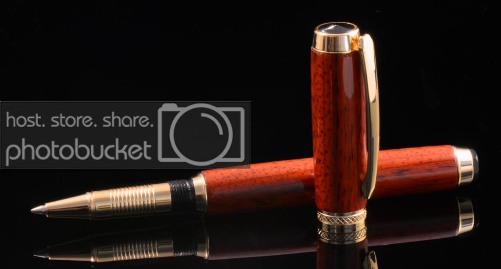
Here is my usual setup.

PenOrionPaduakinGold_zps5ee34f29.jpg


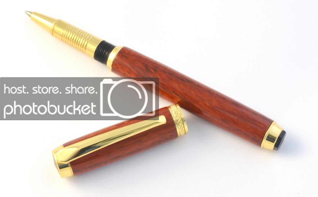
Here is my new setup with a folding light tent.

DSC_0119better_zps948985a3.jpg


Comments and suggestions?
 
Signed-In Members Don't See This Ad

JohnU

Member
Joined
Jan 31, 2008
Messages
4,951
Location
Ottawa, Illinois
While the dark background really gives it an elegant look, especially with the darkness and mirror, the white background shows off the color and character of the wood, guessing Paduak from here, and the true color of the wood and plating.
 
Last edited:

StuartCovey

Member
Joined
Oct 2, 2013
Messages
568
Location
Rogers, AR
Those are some big differences! You can hardly tell its a gold pen in the first pic, plus you can see the grain a lot better in the second.
The second is defiantly a better photo!
 

eranox

Member
Joined
Sep 12, 2012
Messages
322
Location
Killeen, TX
I'm not a photograph expert by any means. That said, the color of the hardware is difficult to discern in the first photo. I had thought it to be chrome, but your second pic makes it clear. It seems like the colors in the second photo are much more true (truer?). Just a layman's perspective.
 

Tom T

Member
Joined
May 12, 2012
Messages
1,883
Location
Sanford Florida
If they are the same pen. Tithe second one shows it off truer and better.
It is a very nice pen. Great job. And thanks for sharing the two photos, what a diffrence.
 

ossaguy

Member
Joined
Jan 3, 2010
Messages
1,370
Location
San Diego
I think they both look great!

I wish I could take photos like that.

Can I ask what pen kit that is? I like the elegant & clean lines.

Outstanding job on both the pens and the photos!


Steve
 

mmayo

Member
Joined
Jan 12, 2013
Messages
2,959
Location
Tehachapi, CA
I think they both look great!

I wish I could take photos like that.

Can I ask what pen kit that is? I like the elegant & clean lines.

Outstanding job on both the pens and the photos!


Steve

I used an Orion kits from WoodTurningz in gold. It is simple, but elegant and writes well thanks to the rollerball.
 

mmayo

Member
Joined
Jan 12, 2013
Messages
2,959
Location
Tehachapi, CA
Light balance

I like #1 better. I wonder if the camera was set for "AWB". If so the picture might benefit from a tweak in the contrast to account for the fact that the first pic has almost no "light" tones

I used a small 18% gray card and determined this white balance using it. I have very cheap lights at this point and will perhaps purchase matched daylight balanced lights soon.
 

SteveG

Member
Joined
Dec 21, 2009
Messages
2,988
Location
Eugene, Oregon 97404
I am not an accomplished photographer. That said, I agree, in general, with the critique so far. Both are very nice photos, but the first one lies about some aspects of the pen's appearance. So if you just want to present a dramatic photo as part of your presentation, it is great. But if you wanted to sell (or give) this specific pen to someone who is selecting based on the picture, you could have trouble.

I am hopeful that I will some day be able to take photos as nice as these two.
 
Top Bottom