Thanks for the tips. I noticed that under turning and when I checked, the nib needed to be pushed further into the rest of the pen.
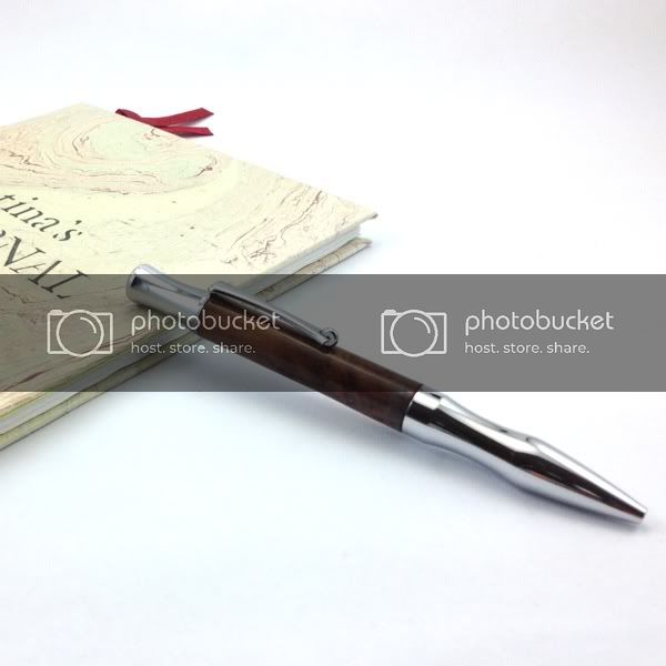
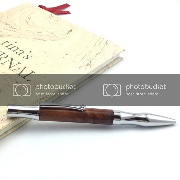
I've been reading stuff about product photography and a major theme seems to be that you should always try for an action shot. Cloths on a person, necklace on a neck, pen in in its environment etc...
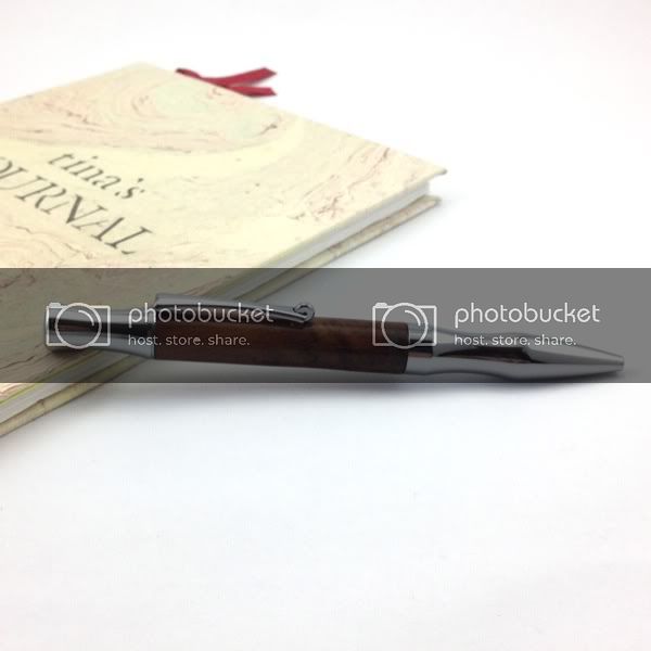
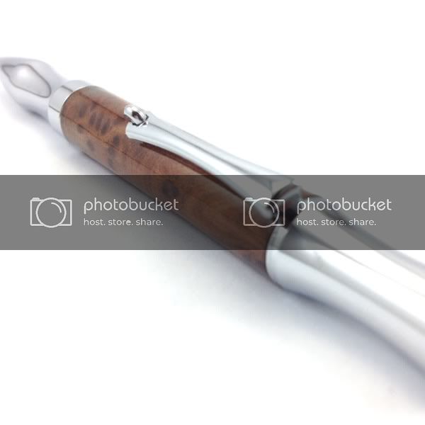
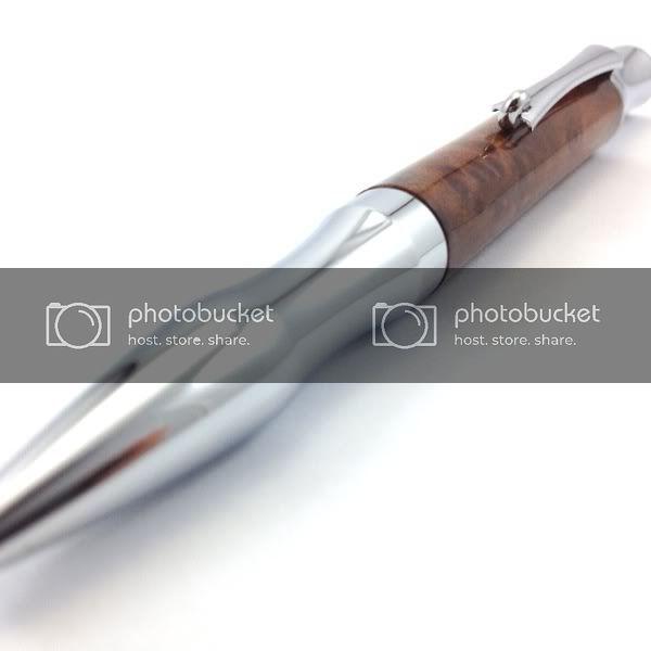
The last two are my attempts to play with "depth of field" I think its called. It's to highlight the blank.
I agree with the premise of showing an "action shot" of the pen. Here's an example of what I was describing for one:
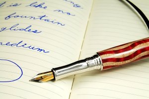

By opening up the journal and writing something out on a page, you can give the impression of what the pen can do. In this particular example I wrote out a page full of writing with this pen before cleaning it back up for the pose. There's some other pages written with rollerball pens to pose them against and even a ballpoint written page or two. Hopefully this will give you an idea or two. :wink:
As for
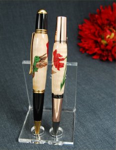
depth of field, if you're wanting to show off your pen, you really want to have the depth of field set to all of the pen is in focus and any distracting background becomes blurred and obscured so it doesn't distract from the main subject (your pen). I don't have any really good example already uploaded this sort of expresses it. Notice the pens are both up front and clearly in focus, while the flower in the back is somewhat blurred out, thus it adds some color to the photo to make it pop overall, but the main attraction are still the two pens up front.
If you're trying to highlight the material in the body, your best bet is going to be a side view, maybe angled slightly to show depth, and then getting your lighting adjusted to where you get the glow of the wood grain or glimmer of the acrylic, without the brighter metal parts washing out. This is a hard thing to accomplish and where you'll see a lot of talk about HDR photography which helps out for those circumstances. You can pull it off without HDR, but you'll have to experiment and play around with your lighting and camera settings until you find just the right mix for your setup.
Keep up with the thinking, questioning and evaluating and trying different things. That's how you'll figure it out and be creating some AWESOME photos before you know it!