Still Tweaking photos

Signed-In Members Don't See This Ad

Randy Simmons

Member
Joined
Jun 28, 2012
Messages
395
Location
Cary, NC
For those of you who haven't been following, you might want to see my last post to understand where I'm referencing.

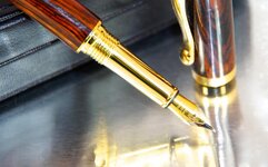
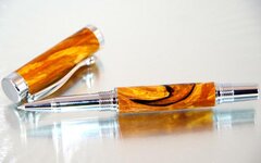
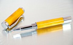
Anyway, one of the criticisms mentioned frequently was that the mirrored reflection sort of played tricks on your head. I fixed it a little with a glass partition between the subject and mirror, but still wasn't really satisfied.

I hunted around for other shiny things. Aluminum foil is my next best attempt, again using a glass partition.

This seemed to favor gold pens, not sure why, that's just my perception. I had to avoid certain angles to prevent the flash from reflecting off of the foil.

What do you think?

Left to right: Cocobolo/gold ti spalted alder/chrome cypress/chrome, all atrax
 

Attachments

  • IMGP2621.jpg
    IMGP2621.jpg
    52.6 KB · Views: 241
  • IMGP2635.jpg
    IMGP2635.jpg
    36 KB · Views: 269
  • IMGP2642.jpg
    IMGP2642.jpg
    32.8 KB · Views: 230
Signed-In Members Don't See This Ad

Randy Simmons

Member
Joined
Jun 28, 2012
Messages
395
Location
Cary, NC
An added note: both of the pens using this photo technique I added to my site got favorited within an hour of my posting them. I will put more up like this and see if the trend continues
 

islandturner

Member
Joined
Jul 17, 2009
Messages
376
Location
Victoria, BC
If you're a PS user, there are routines to make reflections exactly the way you want them, without shooting the pen on a reflective surface. This one is on a black background but you can do them just as easily on white, too.

9173778853_a920a072a4_b.jpg


This pen was shot in a light box, then isolated/separated, placed on a pure black background, and the shadow image created/added. You could have more of the pen in the shadow; it's just a question of what you like the looks of, while you're doing it.

Outstanding pens, BTW -- quite stunning....

Steve
 
Last edited:

JohnGreco

Member
Joined
Dec 9, 2011
Messages
740
Location
Sewell, NJ 08080
I think there is too much blowout in the reflections. Steve's picture above looks good because the pen is sharp and crisp, and the reflection is equally sharp and crisp, but muted so it's not standing out. Eyes should go to the pen imho.
 

Randy Simmons

Member
Joined
Jun 28, 2012
Messages
395
Location
Cary, NC
Steve, I can't see your picture.... attach as thumbnail maybe?

Unfortunately I don't have photoshop, and when I did, I was awful at it.
 

islandturner

Member
Joined
Jul 17, 2009
Messages
376
Location
Victoria, BC
Steve, I can't see your picture.... attach as thumbnail maybe?

Unfortunately I don't have photoshop, and when I did, I was awful at it.

Randy, Sorry about that... Flickr have radically changed their site -- the pic was there for a while and dissappeared. I've uploaded it to photobucket -- hopefully this will work... Steve

trustonereflectedonblackbackground_zps7ff78545.jpg
 

BSea

Member
Joined
Dec 28, 2009
Messages
4,628
Location
Little Rock, Arkansas
I think there is too much blowout in the reflections. Steve's picture above looks good because the pen is sharp and crisp, and the reflection is equally sharp and crisp, but muted so it's not standing out. Eyes should go to the pen imho.
I agree with this. I followed the last post, and thought that the photos looked better with just the mirror. With the glass, the reflection is too distorted, and I think it takes away from the pen. But you got some positive feedback on the photo's, so what do I know?:question:

I also agree that the depth of field could be better so the focus would cover the complete pen. That might help the reflection too.

Oh, and great picture Steve. I'm not a PS person, so that's a little beyond me. Although it does look like the cap is floating since the reflection is below the cap whereas the reflection at the nib touches the nib.
 
Last edited:
Top Bottom