Playing around with staging

Signed-In Members Don't See This Ad

Carl Fisher

Member
Joined
Jun 7, 2011
Messages
2,761
Location
Cape Coral, FL
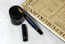
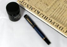
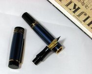
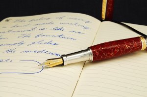
Playing around with staging for photos.

The sharpness is another issue but that's more of a lighting issue at the moment (note the direct lighting since I don't have anything strong enough to evenly light the sides of the tent)
 

Attachments

  • 1-IMG_0010.JPG
    1-IMG_0010.JPG
    108.3 KB · Views: 254
  • 1-IMG_0011.JPG
    1-IMG_0011.JPG
    99.1 KB · Views: 198
  • 1-IMG_0013.jpg
    1-IMG_0013.jpg
    52.6 KB · Views: 211
Signed-In Members Don't See This Ad

D.Oliver

Member
Joined
May 10, 2011
Messages
3,531
Location
Faith SD
Well here is my opinion (keep in mind its coming from a South Dakota hayseed). I think the tablet is too much. It detracts from the pen. I think the bottle of ink and the pen would be fine, but I would lose the tablet. If you really want to use a tablet or book I would maybe use something lether bound with no lettering. That's a great pen by the way.
 

jttheclockman

Member
Joined
Feb 22, 2005
Messages
19,131
Location
NJ, USA.
My opinion is do not shoot from top down. Always shoot 3/4 way looking at the pen. It gives it depth. Top down flattens everything out and you rely on the eye to add the 3d look. Put the pen on the pad if wanting to use pad. Also closeups make a pen look better. Use Macro setting.
 

Carl Fisher

Member
Joined
Jun 7, 2011
Messages
2,761
Location
Cape Coral, FL
Point taken on the book. I was looking for an overall setting more so than just a pure featuring of the pen. But that book is a bit strong.

Just trying to get ideas of what works and what doesn't and you guys have definitely given me a few things to think about.

Thanks!
 

76winger

Member
Joined
Aug 30, 2009
Messages
2,784
Location
Lebanon Indiana
How about something depicting the pen in use like this. Then you could add an ink bottle in the background if desired as well.

 
Joined
Feb 25, 2010
Messages
1,799
Location
webberville, mi
Carl - I really like your work (both pens AND pics). The pics you have on your web site show the pens well. And they're also great to just look at. Love the idea of multiple shots of the same pen.

The pics you have here are different from the ones on your site. I'm going to side with Dave Herrmann on showing the pen in use. Also agree with JT that an oblique shot adds depth and interest to the pic.

Bottom line - tighten up the shot a bit and elevate some. Make it a feature shot that makes you click on the other ones that show the details of the pen (like the ones on your site).
 
Top Bottom