You are using an out of date browser. It may not display this or other websites correctly.
You should upgrade or use an alternative browser.
You should upgrade or use an alternative browser.
Photo Critiques Please
- Thread starter Brooks803
- Start date
Signed-In Members Don't See This Ad
Signed-In Members Don't See This Ad
Brooks803
Member
David Keller
Member
I think the pics look good, but the resolution seems a bit low... That may be due to the constraints of the site software. I'd hit up turbowagon for some photo tips... He posts some of the better pen photos IMHO.
CharlesH
Member
Hey there,
I would say a pen is a high touch product. Most customer wanna feel the pen before it is bought. Since you cannot let the visitor of your site touch the product, you have to make all the efforts possible for him to see what he is going to get. Your pictures are good but as mentionned above, they are resized, I would go with a higher resolution for sure. Your pen are top quality.")
My approach is probably not the best, but the pictures I have on my site are high resolution enough to be full screen on a 24" monitor, the pictures are big and slow to load, it's the tradeoff but as a user this is what I would want.
During my university online marketing class I learned that you basically want to create is a mood, an atmosphere where the user is losing his perception of the time and his spending time on your page. On my photos I do not adjust any colors so it is as close as possible to the reality but on the other hand I do modify the background where I remove the saturation and I blur it. The point doing that is to keep the user focused on what you want to show him, the wood, the finish, the beauty of the pen. The more details you have regarding the construction and material is important, you have to educate him on the construction to show how unique is the pen.
Most of those advices are not applied yet on my site but this is how I plan modifying mine!!
My 2 cents,
Charles
I would say a pen is a high touch product. Most customer wanna feel the pen before it is bought. Since you cannot let the visitor of your site touch the product, you have to make all the efforts possible for him to see what he is going to get. Your pictures are good but as mentionned above, they are resized, I would go with a higher resolution for sure. Your pen are top quality.
My approach is probably not the best, but the pictures I have on my site are high resolution enough to be full screen on a 24" monitor, the pictures are big and slow to load, it's the tradeoff but as a user this is what I would want.
During my university online marketing class I learned that you basically want to create is a mood, an atmosphere where the user is losing his perception of the time and his spending time on your page. On my photos I do not adjust any colors so it is as close as possible to the reality but on the other hand I do modify the background where I remove the saturation and I blur it. The point doing that is to keep the user focused on what you want to show him, the wood, the finish, the beauty of the pen. The more details you have regarding the construction and material is important, you have to educate him on the construction to show how unique is the pen.
Most of those advices are not applied yet on my site but this is how I plan modifying mine!!
My 2 cents,
Charles
turbowagon
Member
The photos are definitely a good starting point. I'm far from an expert, but here's a few things I would do to try and improve them:
1. The photos look a little grainy... this could be from a number of things:
- the software used to resize/compress the images
- the camera settings to high compression
- the ISO setting of the camera
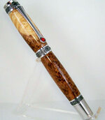
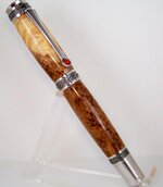
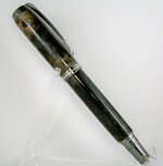
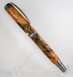
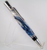
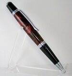
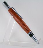
2. Try to improve the balance of light in the photos. Many of them are a bit dark in the front. The best-lit pic is the HRB Majestic. The lighting looks great on that one!
3. Post-processing. Bumping up the contrast a bit can do wonders to brighten the background and make the pens pop. Watch the bright highlights in the metal components and don't add too much or they'll be washed out.
4. Pen presentation. This is more of a personal/artistic thing. But you might try experimenting with different angles. I prefer the pen to be angled a bit more away from the camera.
1. The photos look a little grainy... this could be from a number of things:
- the software used to resize/compress the images
- the camera settings to high compression
- the ISO setting of the camera
2. Try to improve the balance of light in the photos. Many of them are a bit dark in the front. The best-lit pic is the HRB Majestic. The lighting looks great on that one!
3. Post-processing. Bumping up the contrast a bit can do wonders to brighten the background and make the pens pop. Watch the bright highlights in the metal components and don't add too much or they'll be washed out.
4. Pen presentation. This is more of a personal/artistic thing. But you might try experimenting with different angles. I prefer the pen to be angled a bit more away from the camera.
Brooks803
Member
The photos are definitely a good starting point. I'm far from an expert, but here's a few things I would do to try and improve them:
1. The photos look a little grainy... this could be from a number of things:
- the software used to resize/compress the images
- the camera settings to high compression
- the ISO setting of the camera
2. Try to improve the balance of light in the photos. Many of them are a bit dark in the front. The best-lit pic is the HRB Majestic. The lighting looks great on that one!
3. Post-processing. Bumping up the contrast a bit can do wonders to brighten the background and make the pens pop. Watch the bright highlights in the metal components and don't add too much or they'll be washed out.
4. Pen presentation. This is more of a personal/artistic thing. But you might try experimenting with different angles. I prefer the pen to be angled a bit more away from the camera.
Thanks Joe and everyone else!
I do think it's the resizing that's making them grainy. I've been looking through an ancient CRT monitor and just today setup my new LCD and everything looks totally different and better. I opened the pictures on here and the originals to compare and the originals are crystal clear. I'm using Photoshop 3 to resize the images to IAP standards. Is it better to use someone like photobucket to upload a larger file size and then post?
These pictures I did play with the contrast a bit. Again, with my old monitor I couldn't really tell if I was doing any justice so I'll retry them and see if they improve. I'm using a Kodak Easyshare Z1012 IS with auto setting and a homemade lightbox. I'm shooting in total darkness with no lighting other than the preflash for focus and then the flash (diffused) for the only lighting source. I think thats why they are darker in the front bc I'm not letting the flash hit the front much at all and it's bouncing off the walls of the box. I'll play around with some settings and see what happens.
Thanks for the help! I'll be needing much more :bulgy-eyes:
gketell
Local Chapter Leader
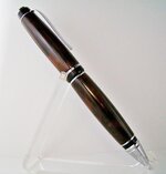
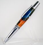
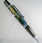
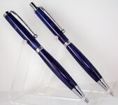
All the dark pens need more light coming from the top. You are lighting the sides OK but the top is dark.
What color is your background? If it is white then your overall lighting is too dark too.
On your web site if you can use PNG file formats they photos will look better than JPGs. But if you have to use JPGs then resize them with software you can control well. A medium compression level (8 of 12 in my software) works without artifacts. Make sure the full size images are around 600 pix on the longest side so they fit nicely on anyones browser yet are still big enough to show full detail.
Good luck.
JD Combs Sr
Member
Another thing to watch: If these are typical of what you will be putting on your site be sure that you are very careful about your cropping. In my opinion you are cropping too close and as a matter of fact a couple have pieces or corners of the pens cropped off. To me this is a big no-no. If I see this on someone's site I immediately think "amateurish". Again this is just my opinion.
There are a lot of comments about too soft of a focus. If you feel that the focus is too soft you can offset it a little in your editing software. Look for an adjustment called "Unsharp Mask". Sounds counter intuitive but it is actually a sharpening feature in most editing software. It will surprise you in how much crisper your photos will look, even ones that appear to be in good focus.
There are a lot of comments about too soft of a focus. If you feel that the focus is too soft you can offset it a little in your editing software. Look for an adjustment called "Unsharp Mask". Sounds counter intuitive but it is actually a sharpening feature in most editing software. It will surprise you in how much crisper your photos will look, even ones that appear to be in good focus.
Sylvanite
Member
The photos look a little soft to me, so I took one and did a little more processing on it. I adjusted the levels, shadow light, contrast, color cast, and sharpened it. Before and After versions are below.
For those who say the pictures look grainy, try clicking on the thumbnail and then clicking again on the popup photo. That will bring up a full-size view. The popup window scales the photo to fit (if necessary) and can distort the image.
I hope that helps,
Eric
For those who say the pictures look grainy, try clicking on the thumbnail and then clicking again on the popup photo. That will bring up a full-size view. The popup window scales the photo to fit (if necessary) and can distort the image.
I hope that helps,
Eric