
You are using an out of date browser. It may not display this or other websites correctly.
You should upgrade or use an alternative browser.
You should upgrade or use an alternative browser.
Which photo is better?
- Thread starter Sylvanite
- Start date
Signed-In Members Don't See This Ad


Signed-In Members Don't See This Ad
seamus7227
Member
photo b appears to be more crisp
Dan26
Member
I agree...photo B. It's a sharper and brighter picture.
ianjwebster
Member
I must be getting old - I can't see a difference.
I have to agree with Seamus, but the difference, in my opinion, would be no more than 5 units of contrast or Gama Correction (whichever way you do your P/S), to the average viewer. In other words, "who's gonna notice"? Dang it! Going back and looking at it, I think A has a little more power in the highlight area than B. Sylvanite, are you screwing with our minds???:biggrin::biggrin::biggrin::biggrin::biggrin:
Last edited:
I prefer the darker background in A
seamus7227
Member
one of the ways i saw a difference was by looking at the nib on both pics
one of the ways i saw a difference was by looking at the nib on both pics
Is your monitor HD?
longbeard
Member
Gonna have to agree with Seamus and Dan, i think B is alittle more crisp and clear.
Ironwood
Member
Viewing on my lower quality monitor at work, I like the first one better. Because its showing the highlights a little less. But its very negligable.
I will have a look on my 27" Mac tonight and see if my opinion changes.
I will have a look on my 27" Mac tonight and see if my opinion changes.
OKLAHOMAN
Member
The hell with the photos, tell me about the pen.
cwolfs69
Member
i think "B" as well. i cant tell a significant difference in sharpness but i do think it looks that way because is is a little lighter. "A" seems a bit dark.
Pioneerpens
Member
I like A better. B seems to add a little too much brightness and 'washes' the color out a bit.
Marc
Member
I first did not notice a difference, but as I looked closely at the reflection lines I decided B had a slightly less fuzzy reflection than A. Keep in mind that I wear tri-focals so....
peterborough66
Member
I also think B, a little crisper
mikespenturningz
Member
I went back and forth between them and cannot see any difference here. They both look great! I have to agree though the pen is awesome.
Last edited:
seamus7227
Member
Is your monitor HD?
Actually it is!
JD Combs Sr
Member
I had to put them side beside, even then I can see very little difference, they are both outstanding photos of an outstanding pen. If I absolutely had to choose one I couldn't, however if pressed I would have to say that "A" is a little "warmer" then "B", there seems to be a slight reddening of the back ground in "A".Here are two similar pen photographs:
Picture A:
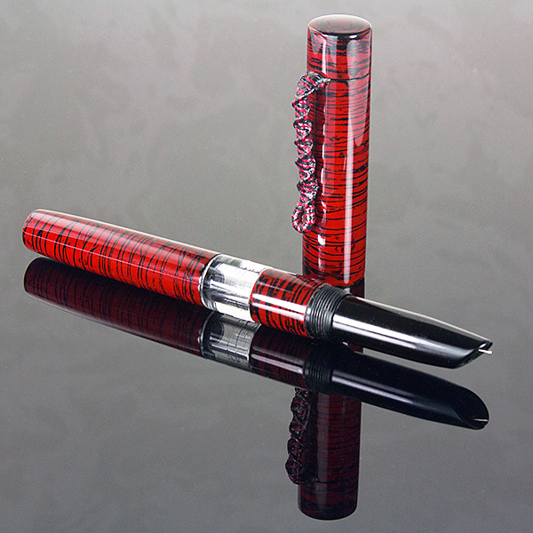
Which one do you think is better and (if you have a preference) why?
Edit: they were side beside in the preview pane but went back to over and under after I posted.
Last edited:
avbill
Member
B b/c detail in the highlighted areas
76winger
Member
I don't know. Either it's my old CRT monitor that hasn't died yet (and generally still looks good) or my new progressive lens that's a pain to get used to (especially on the computer), but I can't tell the difference. :frown:
turbowagon
Member
Venturing a guess --- one was taken with a ~$600+ macro lens, and the other with a < $100 kit lens (or perhaps even a point-and-shoot camera) to prove a point???
lorbay
Member
B
Lin
Lin
jttheclockman
Member
Venturing a guess --- one was taken with a ~$600+ macro lens, and the other with a < $100 kit lens (or perhaps even a point-and-shoot camera) to prove a point???
This was my thought also. To me there is no difference and if there was it is not even worth mentioning it. Use whatever setup you did to take either photo. Works for what we do here.
Last edited:
AnachitlPut
Member
Wow both are great. B looks sharper to me. Thanks for the good photo haven't seen that pen since the CCc contest. Glad I got a hand in making it.
LarryDNJR
Member
Plot Twist: He forgot to upload the alternate picture and these are both the same. ")
triw51
Member
I must be getting old - I can't see a difference.
I could not say it any better
Carl Fisher
Member
If I had to guess, I would say there is just a touch of contrast difference between the two, but not much else. Of course it's going to vary on everyone's monitors depending on how well or even if they are calibrated.
Either picture is fantastic though.
Either picture is fantastic though.
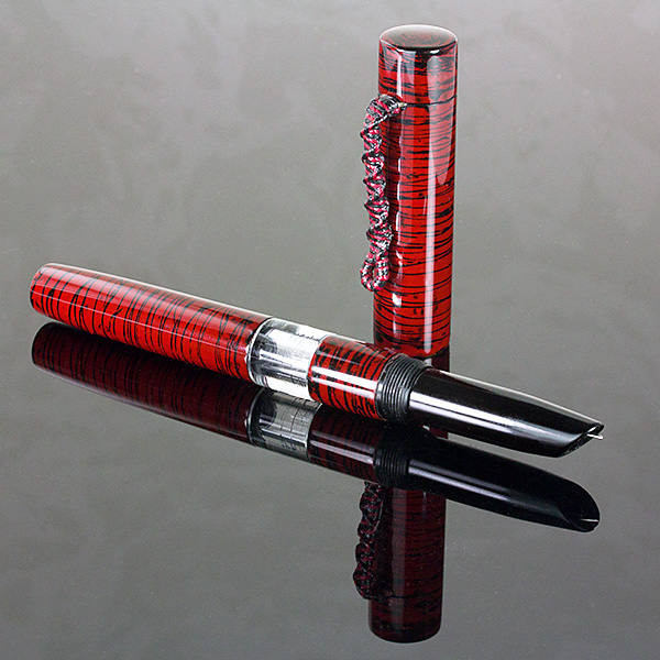
Sylvanite
Member
Just for grins, let's try this. Which is better now?
Picture B:
Picture A:
Picture B:
Picture A:
Carl Fisher
Member
I really can't find anything that stands out as different. I think the contrast difference I'm seeing is just where the picture falls on my monitor relative to my viewing angle. If I scroll them to the same place they look identical.
Last edited:
nativewooder
Member
I don't know that A or B is better, but I prefer A.
A seems a bit darker....other than that not much to choose but side by side I like b a little better.
John Den
Member
IMHO
Sharpening artifacts would indicate very, very small amount of increased sharpening to picture B.
Color balance on both pictures is the same to a close degree and a fairly neutral gray.
There is a approx 5% decrease in brightness in picture B.
I have interpreted this as Both pictures are the Same.
And yes this is visible - only just - on my color calibrated 22" monitor and my color calibrated 17" Laptop.
Both pictures are vastly better than 99% of the posted images on this site.
Comparison was done using the color picker tool.
Was this a joke?
Regards,
John
Sharpening artifacts would indicate very, very small amount of increased sharpening to picture B.
Color balance on both pictures is the same to a close degree and a fairly neutral gray.
There is a approx 5% decrease in brightness in picture B.
I have interpreted this as Both pictures are the Same.
And yes this is visible - only just - on my color calibrated 22" monitor and my color calibrated 17" Laptop.
Both pictures are vastly better than 99% of the posted images on this site.
The first thing I did was load both pictures into Gimp and combine them into a side by side pictureJust for grins
Comparison was done using the color picker tool.
Was this a joke?
Regards,
John
Last edited:
Sylvanite
Member
When the poll is over...
Ok, the poll has expired (in hindsight, I should have done just a 1 week poll, as nobody voted after the first week) and the results are now visible. They aren't what I expected. I had thought that "neither" would far outweigh either preference.
I don't think that's due to a significant difference between the photos though - rather I think it's due to the psychology of perception. Almost everybody who expressed an opinion preferred one because it was "brighter", "darker", or "crisper" than the other. In fact, the two photos are nearly identical in both brightness and contrast. They do have a gradient background (meaning the background is darker at the bottom and lighter at the top). When viewed one above the other, the mind interprets that the top photo is darker and the bottom is brighter. Because it seems brighter, the bottom photo also appears to have greater contrast - which we interpret loosely as "crisper" or "sharper".
That is why I made the additional post with the two images in reverse order - so people could see that although B looks brighter in the first, A looks brighter than B in the second. If I view them side-by-side, whichever one is on the left looks a little warmer to me (I see colors a bit differently in each eye). I flipped a coin to determine which picture to post first, but am confident that had I swapped them, the poll results would still show preference for the one on the bottom.
When viewed side-by-side at regular display size, I can't tell a difference. When enlarged, I see aliasing differences from the resampling (but neither is "better" than the other), and a very small difference in "purple fringing" (a form of chromatic aberration).
So, why did I post two nearly identical photographs? Joe hit the nail on the head (spoilsport :biggrin. One was taken with a Canon EF-S 60mm f/2.8 Macro lens I just purchased, the other with a Canon EF 28-135mm f3.5-4.6 IS lens, which is about 2 generations old and came bundled as a "kit" lens with a camera I bought 6 years ago. Both images were shot with the same camera settings (camera position, framing, shutter speed, aperture, white balance, shooting style, focus point, etc.). Both were post-processed the same (crop, levels, fill-light, brightness, contrast, resampling, sharpening, etc.) except that one lens produced significantly warmer images than the other, so I color-corrected them both to neutral. Either picture could be made better with additional post-processing.
My point is that you don't have to spend a lot of money on a fancy lens to take good pen photographs. Although the EF-S 60mm macro lens is a little better (optically), the EF 28-135mm IS lens is plenty good enough. It is also less expensive and far more versatile.
I hope the exercise was interesting,
Eric
Ok, the poll has expired (in hindsight, I should have done just a 1 week poll, as nobody voted after the first week) and the results are now visible. They aren't what I expected. I had thought that "neither" would far outweigh either preference.
I don't think that's due to a significant difference between the photos though - rather I think it's due to the psychology of perception. Almost everybody who expressed an opinion preferred one because it was "brighter", "darker", or "crisper" than the other. In fact, the two photos are nearly identical in both brightness and contrast. They do have a gradient background (meaning the background is darker at the bottom and lighter at the top). When viewed one above the other, the mind interprets that the top photo is darker and the bottom is brighter. Because it seems brighter, the bottom photo also appears to have greater contrast - which we interpret loosely as "crisper" or "sharper".
That is why I made the additional post with the two images in reverse order - so people could see that although B looks brighter in the first, A looks brighter than B in the second. If I view them side-by-side, whichever one is on the left looks a little warmer to me (I see colors a bit differently in each eye). I flipped a coin to determine which picture to post first, but am confident that had I swapped them, the poll results would still show preference for the one on the bottom.
When viewed side-by-side at regular display size, I can't tell a difference. When enlarged, I see aliasing differences from the resampling (but neither is "better" than the other), and a very small difference in "purple fringing" (a form of chromatic aberration).
So, why did I post two nearly identical photographs? Joe hit the nail on the head (spoilsport :biggrin
. One was taken with a Canon EF-S 60mm f/2.8 Macro lens I just purchased, the other with a Canon EF 28-135mm f3.5-4.6 IS lens, which is about 2 generations old and came bundled as a "kit" lens with a camera I bought 6 years ago. Both images were shot with the same camera settings (camera position, framing, shutter speed, aperture, white balance, shooting style, focus point, etc.). Both were post-processed the same (crop, levels, fill-light, brightness, contrast, resampling, sharpening, etc.) except that one lens produced significantly warmer images than the other, so I color-corrected them both to neutral. Either picture could be made better with additional post-processing.My point is that you don't have to spend a lot of money on a fancy lens to take good pen photographs. Although the EF-S 60mm macro lens is a little better (optically), the EF 28-135mm IS lens is plenty good enough. It is also less expensive and far more versatile.
I hope the exercise was interesting,
Eric
edicehouse
Member
Eventhough I do not understand a lot of the camera lingo, not my thing; I really appreciate your demonstration.
johncrane
Member
Eric! the pen is Awesome colors are the best what's going on with the clip by the way i recon the 2nd pic wins.Awesome pen mate.
hard hat
Member
photo B shows the depth and clarity of the clear center piece better as well as the stripes on the body of the pen further back.
either way, they are good photos
either way, they are good photos
jimdude
Member
Picture B has less contrast and is flat.
Jimdude
Jimdude
Signed-In Members Don't See This Ad
Dave Turner
Member
The highlights are a little too bright for me in B with loss of some of the contrast. I prefer A. Fantastic pen!