Looking for quick opinions..

Signed-In Members Don't See This Ad

MatthewZS

Member
Joined
Jul 22, 2010
Messages
482
Location
Georgetown Texas
I just threw this together as a rough idea how to layout photos for a craft site I'm going to try out for selling my stuff. Hows this look? You've seen this pen before, just curious, does the pen take up too much of the picture or anything, or would YOU buy this pen based on this picture?

Thanks
 

Attachments

  • pentrial.jpg
    pentrial.jpg
    85.5 KB · Views: 330
Signed-In Members Don't See This Ad

desertrat

Member
Joined
Jul 2, 2009
Messages
193
Location
Pahrump Nevada
I think the prop takes too much attention away from the pen. A plain white or grey background would allow the pen to be the star of the show. Just my opinion.

desertrat
 

terryf

Member
Joined
Jul 10, 2010
Messages
1,276
Location
Pretoria, South Africa
Agree and the prop also makes the photo look very dark - the pen sorta blends into it.

Also dont think the name brainlint is very apt - too close to brainless :p
 

IPD_Mrs

Member
Joined
Jun 27, 2007
Messages
2,048
Location
Zionsville, Indiana
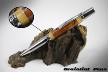
We like this concept and the look is very professional, for this particular pen the wood "pen stand" isn't too bad as far as: clashing with or distracting from the "wood" in the pen. Here are a couple of issues though: unless you know there are strips of aluminum in the blank and that it is segmented it is almost completely washed out in this setting; unless you have multiple pieces of wood that will allow you to change the coloring you are inevitably going to drastically detract from the beauty of a wooden pen by placing it on a piece of wood that is either prettier, more interesting or contrasts with the pen in some negative way - it may just blend to well with the wood you have chosen for that particular pen; it is also somewhat difficult to see the pen's band with it on the wood, the viewer is forced (with the strips as mentioned at the top and if wanting to see the band detail as it is in whole on the pen) to look at your magnification or go to a larger view to see the pen in its totality. Personally, I don't like to have a customer "HAVE" to enlarge a pen photo unless they want to. While I realize that isn't always possible, it is something that I at least "shoot for."
As for your second question "would you buy this pen based on "THIS" picture, (Linda speaking now) I honestly probably wouldn't give this photo a second glance (sorry, trying to be as honest and helpful as possible if you are going to do a whole site!) The reason I say that is - nothing really stands out to me on THIS photo - I can't see the segmenting in the body of the pen and the detail of the rest of the pen is rather washed out so doesn't grab me. I would really like to see MORE of the pen, less of the background if you are going to get my attention when I am shopping to make a "purchase."

Mike & Linda
 
Last edited:

DCBluesman

Passed Away Mar 3, 2016
In Memoriam
Joined
Aug 22, 2004
Messages
7,679
Location
WOODBRIDGE, VIRGINIA
I know I'll get some opposition, but the photo looks like you are trying to sell a picture and not the pen. Leave the art stuff behind and show off what you are selling...the pen. As a reference, visit the websites for Tiffany's or MontBlanc and see how they merchandise. They must be doing something right.
 

MatthewZS

Member
Joined
Jul 22, 2010
Messages
482
Location
Georgetown Texas
The "Brainlint" is just a filler. I'ts my domain name and I haven't thought of anything yet so that'll change.

Now that you've made me kinda stand back and take notice I do fee like I'm making the whole advertisement and not just the photo for the advertisement.

Thanks.
 

Dave_M

Member
Joined
Dec 10, 2005
Messages
769
Location
Clovis, CA, USA.
Yeah I sort of like the pen stand you're using, but... the pic would work for me if the closeup insert was not there. The two together add too much excessive busy detail which detracts from your pen.

Also the closeup insert itself loses me. You're trying to emphasize the center band & segmenting area detail but the closeup insert's background is too busy and too dark to really pull that off. I think a simple background would still look nice and not detract from your work specifically when you add in the closeup insert.

Please take my artistically challenged and amateurish opinion for what it's worth.
 

Smitty37

Passed Away Mar 29, 2018
In Memoriam
Joined
Nov 23, 2009
Messages
12,823
Location
Milford, Delaware 19963
the eye of the beholder

Personally I didn't really notice anything in the photo but the pen. Maybe that's just my way of looking. I didn't start from the standpoint of being a critic for you (not being critical of those who did--that was what you asked for) but just someone looking at a picture.
 

toolcrazy

Member
Joined
Dec 23, 2006
Messages
5,408
Location
Port Orchard, WA
I'm not going to repeat what has been said. But I did notice that the image is a bit out of focus. It may be the compression software that you are using or the forum software and looks to me the Depth of field is, also, off.
 

Flaturner

Member
Joined
Dec 1, 2009
Messages
93
Location
SW Florida
Personally, I like the stand. It says, "This is a wooden pen." Ditch the insert as stated by others. As far as whether the pen takes up too much of the pic. NO! You're selling a pen. It can't take up too much of the picture unless it extends out into blank space and doesn't show it all. The size is pretty near perfect in the set up you have. Enough "white space" around the pen but not too much. I would be more worried about it's not being big enough rather than too big.
 
Top Bottom