i'm struggling...

Signed-In Members Don't See This Ad

ahoiberg

Member
Joined
Apr 10, 2007
Messages
1,763
Location
Ames, IA, USA.
can you guys/gals try and tell me what's the matter with these photos and what might make them better?

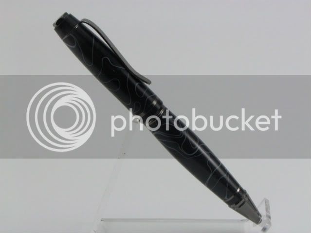
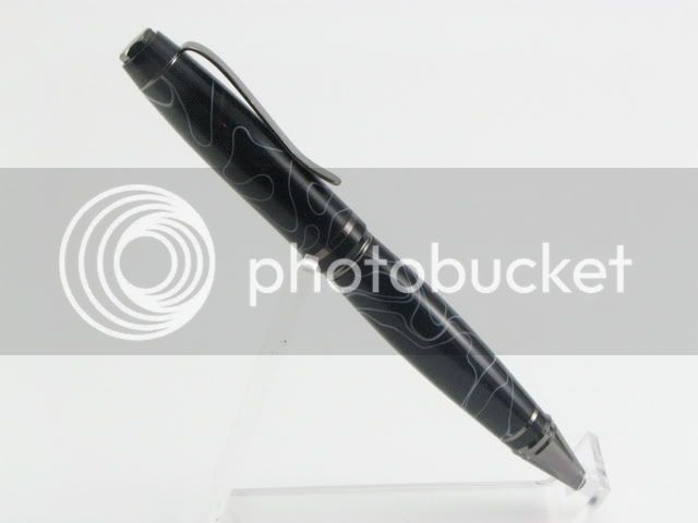
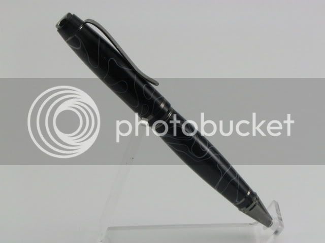
i took them with my canon powershot S1 IS, aperature of 7.1, did the button hold to get that I needed 1/100, went back to manual, switched to 1/100, took a series of them trying different ISO values. Tried 100, 200 and 400. i know the gray card will help, but i should at least be able to get better pics than this i would think...

they are all the same setting except ISO and the order is 200, 400 and 200 again. thanks in advance for any tips or suggestions.

IMG_3178.jpg


IMG_3180.jpg


IMG_3181.jpg
 
Signed-In Members Don't See This Ad

gketell

Local Chapter Leader
Joined
Dec 15, 2006
Messages
2,772
Location
Pleasanton, CA, USA.
If your background is white, then the ISO 400 is closer to what you want. Notice how the backgrounds on the 1st and 3rd are grey, that means they are too dark. But the middle one is just a bit too bright, that is why you are getting "halo" on the pen. It also doesn't help that the higher you go in the ISO range the more grainy the photo will become.

Try leaving it at ISO 200 and going 1/100, 1/80, 1/60.

Now, to my previous post, you have a black blank with dark grey kit parts and bright white background. Hard for you eye to see both properly. If you went to a darker background you would probably like the results better.

Lastly, if you can shorten the pen stand so the pen is closer to horizontal then you will have less background and more pen.

GK
 

ahoiberg

Member
Joined
Apr 10, 2007
Messages
1,763
Location
Ames, IA, USA.
thanks greg. the grainyness is what i was particularly unhappy with. thanks for the advice. i'll give those suggestions a try and repost the results.
 

gketell

Local Chapter Leader
Joined
Dec 15, 2006
Messages
2,772
Location
Pleasanton, CA, USA.
Does the graininess appear on your original pictures? Or just the ones you've shrunk to fit on the web site? Several packages are very ham-handed when it comes to reducing picture sizes. I know I was very unhappy when I tried picassa on the PC. But it was work's machine so free was perfect.

GK
 

ahoiberg

Member
Joined
Apr 10, 2007
Messages
1,763
Location
Ames, IA, USA.
yeah, the graininess appeared on the originals.

here's what i came up with tonight. i shortened the length of the stand and replaced the white with a light gray color backdrop, both as greg suggested. i basically just fiddled around with settings and wrote down what i did. after getting back to the PC, this picture stood out as the best in my mind. i'm sure there's some improvements that i could make, but i'm WAY happier with this photo than the ones from yesterday.

the settings for this photo were:
ISO: 50 f-stop: 4.0 shutter: 1/100 white balance: auto

i suppose those aren't ideal settings, but they seemed to work OK. i still want to mess with the white balance a bit more. anyway, here's the picture. if you have any more tips on how to improve, i'd love to hear them.

50-1100-40.jpg


thanks again. :)
 

gketell

Local Chapter Leader
Joined
Dec 15, 2006
Messages
2,772
Location
Pleasanton, CA, USA.
That looks awesome. With the pen parallel to the camera as it is f4 will be fine. If you turn the pen on an angle then you will want the f7 back to keep the "area of good focus" (depth of field) wider.

Things *I* would do to make it look better *to me*:
* rotate the top of the pen slightly towards the camera so the viewer can partially see the top of the clip rather than just a broadside of it.

* add or move the "front light" (the one over the camera) to add more reflection line to show of your shine better. Just look through the camera as you move the light/line around until it is where you like it.

* Since this pen is monochromatic I personally would use a slightly colored background so the pen pops off the page more. But this one is WAY subjective.


You are getting MUCH better photos than you were even yesterday. Imagine what a week or a month of playing will do for you!!

GK
 

randyrls

Member
Joined
Feb 2, 2006
Messages
4,829
Location
Harrisburg, PA 17112
Originally posted by ahoiberg

yeah, the graininess appeared on the originals.

here's what i came up with tonight. i shortened the length of the stand and replaced the white with a light gray color backdrop, both as greg suggested. i basically just fiddled around with settings and wrote down what i did. after getting back to the PC, this picture stood out as the best in my mind. i'm sure there's some improvements that i could make, but i'm WAY happier with this photo than the ones from yesterday.

the settings for this photo were:
ISO: 50 f-stop: 4.0 shutter: 1/100 white balance: auto

i suppose those aren't ideal settings, but they seemed to work OK. i still want to mess with the white balance a bit more. anyway, here's the picture. if you have any more tips on how to improve, i'd love to hear them.


thanks again. :)

Andrew; I took this photo and edited it with Paint Shop Pro. Applied "Layer", "Duplicate", then applied "Screen" option to the duplicate layer, finally "Flatten (Merge)" the image, and saved the result. I had to compress the image slightly to get it under the 100K limit. Hope this looks better. What say you all?

Original:
50-1100-40.jpg


Edited:
20086613345_andrew.jpg
 

gketell

Local Chapter Leader
Joined
Dec 15, 2006
Messages
2,772
Location
Pleasanton, CA, USA.
Screen causes darks to lighten. In this case it lightened everything. To me, it is just a bit overdone: the halo of the background into the pen is just starting to come back. Maybe fade the screened layer to 75% or so before the merge.

Key here is the "to me" part. What it Should look like is very subjective.

GK
 

ahoiberg

Member
Joined
Apr 10, 2007
Messages
1,763
Location
Ames, IA, USA.
i swear i replied earlier to this... i must have forgotten to log in or something.

i think that modification looks good, i tried a few on photoshop and have in the past but i'm trying to look for something i can use without modification. believe it or not, that picture i posted, other than the crop and border, looks the most like the actual colors. i'll try a few more with different settings and background colors and post the results.

p.s. i ended up hanging out with a few amateur photographers tonight and was able to ask a few questions regarding the basics of photography. hopefully this will help me out! :)

thanks for everyone's help and suggestions.
 
Top Bottom