"reverse paint" examples and "depth" discussion

Signed-In Members Don't See This Ad

ed4copies

Local Chapter Manager
Joined
Mar 25, 2005
Messages
24,527
Location
Racine, WI, USA.
Edit in 1/23/16 noon:
One of the advantages of a forum is the ability to find old conversations that were educational. An appropriate title makes this more easily accomplished. So, I am editing the title in an attempt to encourage the discussion of "depth" which has developed. Years from now, if someone wants to find it, this should make it easier.

We considered moving the "depth" comments to start another thread, as Dawn has several observations she would like to make, but we don't want to antagonize anyone by moving thier entries, so let's "casually divert" this thread to add the "depth" discussion.


Ed

In case you do not get our weekly email, here is a comparison of one pen blank (our Liquid Metal blank), with the drilled hole in the blank painted (reverse paint) a few different colors.

attachment.php


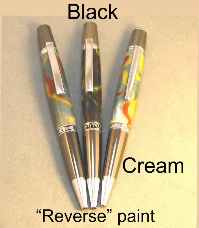
The pen on the far left is reverse painted grey. The picture is a little lighter than real life, cause monitors tend to darken the pic.

Happy to answer questions, if you wish,
Ed
 

Attachments

  • elsierragn-chr.jpg
    elsierragn-chr.jpg
    224.6 KB · Views: 644
Last edited:
Signed-In Members Don't See This Ad

magpens

Member
Joined
Feb 2, 2011
Messages
15,912
Location
Canada
Thanks for your photos of examples, Ed. I do get your Sunday Missives but it is nice to see this again here ... enlarged, I think.
 

H2O

Member
Joined
Dec 24, 2014
Messages
246
If the color is affected that dramatically by the paint color, the blanks have to be very translucent.

When I cast, I ensure that painting will not affect the colors, at least not to that degree.

Maybe it's the pic, but those blanks don't appear to have any depth and look as if solid colors were used in casting.
 

ed4copies

Local Chapter Manager
Joined
Mar 25, 2005
Messages
24,527
Location
Racine, WI, USA.
"Depth" is created by using translucent colors. Opaque dyes will cover the tubes much better.

When I started penmaking, in 1995, acrylic blanks were more expensive ($5. ea range) and they seemed to have more dye in them. Now, most are much more "affordable" (cheaper) and the downside is there is less dye and it is more translucent, since the "penmaking public" seem to look for "depth".

Somebody recently asked for more scientific answers---there you go!

I am considering starting a line of acrylic acetate blanks with more dye content, which could be purchased at a higher price point---I wonder if there is a market?

Anybody who makes a lot of pens (would buy a lot of blanks) care to comment?
 

H2O

Member
Joined
Dec 24, 2014
Messages
246
Depth is created when colors are blended as one color crosses over another color(s) and swirled. That gives the illusion that the colors are deeper and three dimensional. There are the distinct colors used and then there are the blended colors as they cross. That gives depth, not the fact that the tube can be seen.

If depth is measured by the ability to see through the blank to the tube, then why not paint the tube and cast clear resin over it? Because that isn't depth in the color.

IMO, adding more pigment to AA is worthless. AA is only pearly on the faces (i.e. top and bottom of the blank) and has a banded appearance. Look at any AA blank before and after being turned and it is obvious. See for yourself.

On a cast blank, the pearl is continuous around the blank and from any angle.

AA is also much softer than PR and scratches more easily and looses the shine that one works so hard to apply, just from sliding in and out of a pocket or purse.
 

alphageek

Former Moderator
Joined
Jul 19, 2007
Messages
5,120
Location
Green Bay, WI, USA.
If the color is affected that dramatically by the paint color, the blanks have to be very translucent.

When I cast, I ensure that painting will not affect the colors, at least not to that degree.

Maybe it's the pic, but those blanks don't appear to have any depth and look as if solid colors were used in casting.

I've done that blank at one point... I'm pretty sure its the picture.

Ed - I suggest trying another picture for this thread. Focus on the blanks, not the whole pen. Put the 3 pens in a line, clips off to the side (or under) - and get a straight on shot. It would be a terrible picture for showing off the pens (your first one is set up pretty well for that) but I think it will do a better job of showing the color variation in the 3 blanks and the depth of the blanks.
 

alphageek

Former Moderator
Joined
Jul 19, 2007
Messages
5,120
Location
Green Bay, WI, USA.
Depth is created when colors are blended as one color crosses over another color(s) and swirled. That gives the illusion that the colors are deeper and three dimensional. There are the distinct colors used and then there are the blended colors as they cross. That gives depth, not the fact that the tube can be seen.

If depth is measured by the ability to see through the blank to the tube, then why not paint the tube and cast clear resin over it? Because that isn't depth in the color.

IMO, adding more pigment to AA is worthless. AA is only pearly on the faces (i.e. top and bottom of the blank) and has a banded appearance. Look at any AA blank before and after being turned and it is obvious. See for yourself.

On a cast blank, the pearl is continuous around the blank and from any angle.

AA is also much softer than PR and scratches more easily and looses the shine that one works so hard to apply, just from sliding in and out of a pocket or purse.

I completely disagree with your assessment. Your definition of swirling solid colors giving depth makes no sense to me. You're definition is more like painting the tube, its just that your paints are in the resin.

For me, the best blanks have a variety of colors, yes. But there has to be some amount of translucency to them for it to have depth. If you can't see through some of the colored blank to lower colors, there is no mixing. There are many blanks that mix colors, but no depth. Note, that doesn't make them bad - quite the opposite, some are GREAT with no depth. I'm not arguing about any blanks, just the definition of depth.

Examples:
Black pen has good colors, almost no depth.
Red pen has good colors, pretty good depth (see parts of the white lightening the red)
IMG_1127.jpg

This blank (one blank, two painted halfs) has lots of depth.
IMG_5510.jpg

In the 2nd picture, the back paint affects the look, but its definately NOT all you see!
 

ed4copies

Local Chapter Manager
Joined
Mar 25, 2005
Messages
24,527
Location
Racine, WI, USA.
My purpose is to show that painting the hole affects the color you achieve.

The discussion of "depth" was not planned, but since it happened, any definition that relies on several colors immediately precludes a single color blank from having depth. So, a single color blank with a white or colored line (paper) could not, by definition, possess "depth". For that reason, I would find that definition lacking.
 

H2O

Member
Joined
Dec 24, 2014
Messages
246
I don't use solid colors, as most that cast don't.
The original pic, at least as it appears, looks like solid orange and solid yellow colors and have no blending or overlap that gives the illusion of having depth.
I realize it's difficult to get a decent pic to represent the blank as it looks in your hand, but the depth comes from the swirl and overlap with the pearl effect enhancing the illusion.
IMO, when a light colored blank is translucent, and it's painted a darker color, it seems dirty or muted. Not at all vibrant as it should be.

This is an example of one of my blanks. If you look closely, you can see the swirl and overlaps that actually introduce other shades and colors that help the 3D or depth. It's difficult to get the 3D effect of depth on a 2D monitor.
When the blank is moved and rotated, the purple seems to disappear behind the white and as that happens, there are shades of purple and blue along with the white showing darker shadows. It also looks as if there is black in the blank, there is no black. It's created by the colors swirling and overlapping to create a dark shadow in the purple. All of this in combination, creates depth. It seems there is no bottom to the colors.


Maybe I'm not describing it correctly, but if you had this blank in your hand, you would understand what I'm attempting to convey.
 

jttheclockman

Member
Joined
Feb 22, 2005
Messages
19,132
Location
NJ, USA.
I usually do not jump in vendors forums for they usually are talking about their products. But this question is more of a generalized question that I am sure many of us have encountered to some degree. There is somewhat of a 2 part degree to this thread. When you talk about changing the look of a blank you are talking about semitransparent materials and painting the inside of the blank will do this. To me it is nothing to do with depth. here is my example of paint changing the look of a blank. Same blank but one with black paint and one with white paint. That can be altered even further with various other colors.


But now when you are talking depth within a blank I believe you are talking layers of colors or streaks. One layer on top of another and this being pronounced within that blank. I think the colors used produce that look and I am no scientist but certain colors stand prouder when placed on top of other colors such as dark on top of light as opposed to light on light or dark on dark. Has nothing to do with pearlizing per-se. With pearlizing it is just a matter of lighter and darker shades of the color and the way the light reflects off it.

Another example of depth is seen many times in finishing. The use of lacquers is a great example of being able to accomplish this because the layers of finish burn into one another and you are creating a thicker base and the light will reflect better as opposed to using polyurethane. There the layers just lay on top of one another and all you are doing is looking through one layer into the next and this gets a muddy look. You can accomplish the same look with CA if you do not wait so long as to have the CA cure. To me if someone wants to try this example take a blank with some good grain color and do a CA finish without letting the CA cure before adding additional layers. Then take the same blank and do the CA finish and after each layer hit with accelerator and I bet you will see a difference. The first will have greater depth of field than the latter.

Now there is no scientific information within my post as some maybe looking for. It is just observation from doing it for so long and it is my opinion. Others may see to see it differently and disagree. :)
 

SteveG

Member
Joined
Dec 21, 2009
Messages
2,987
Location
Eugene, Oregon 97404
I am not make a large volume pen turner, but my observation is based in the pens I have turned, and excessive amount of blanks I possess. My view is that blanks that are near or fully opaque CAN be very dull from a visual appeal perspective, compared to semi-transparent or translucent blanks which are visually self-interactive, and the "depth" factor offers more visual interest. There are exceptions, such as solid black, some other solid, mono-colors, and blanks where there is just a lot going on, like Jonathon Brook's vintage line. All good. So the high color saturation type blank does have it's place, if done selectively, and with knowledge.
 

Quality Pen

Member
Joined
Feb 2, 2014
Messages
1,403
Location
Lumberton, Texas
I love the depth in some pens.

I'm with Steve Guzy on this.

However, I've said this before, it boggles my mind why some component sets leave room for virtually slivers of resin when it does NOT have to be that way!

Compare the aero to the common sierra... they are both a parker, but the style is different. If you could get a sierra with the "innards" of an aero (ability to have thick resin) you would have a smash hit.

Sorry, if this seems off topic but it is related and solves a lot of the problems we are trying to fix here BUT keeps the benefits of resin depth.
 
Last edited:

edicehouse

Member
Joined
Jun 8, 2011
Messages
3,515
Location
Suffolk, VA
I have backpainted the liquid metal white before. The ends at have washed out and were white. I found this blank silver to be the "best" in my opinion. But as stated experience will teach you how to get different appearances. On thing I have done a couple times is take the "cut off" and drill and turn that down and backpaint that piece.
 
Top Bottom