Your Opinion Counts!

Signed-In Members Don't See This Ad

Your Opinion Counts


  • Total voters
    66
  • Poll closed .

OKLAHOMAN

Member
Joined
May 17, 2006
Messages
10,228
Location
Costa Rica
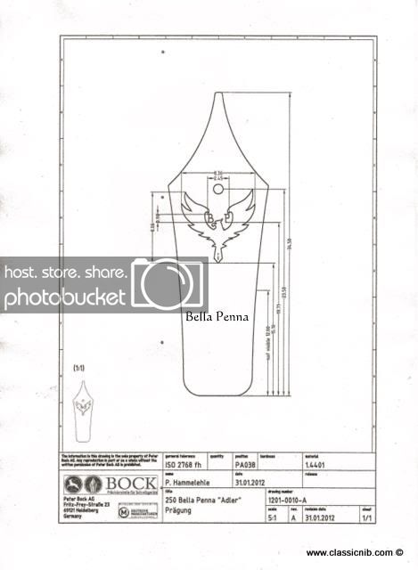
As some of you know I'm a Bock nib Dealer and have been suppling Bock nibs here. I have been working with Bock to develop my own Logo on their Nibs. These nibs will be the same as the nibs that I have been suppling only will have my Logo. The Reason for this is that I am also working on suppling my own component sets that will be distributed through "The Classic Nib". For a number of years my pens have been sold under the Bella-Penna name so it was a natural to name my new line of components Bella Penna and incorprate that into the logo. We have also thought that we might incorprate both the Bella Penna name and the Classi name and change the B P on the logo to C B ( Classic Bella) and the printing at the base to Classic. The next idea was just to leave off all letters and words and just leave the Eagle/Phoenix logo similar to Lou Metcalfs Heritage Nibs who had just the ink well and feather. Here is the proof that Bock has sent me with the B P and Bella at the foot.
Scan-1.jpg
 
Last edited:
Signed-In Members Don't See This Ad

glycerine

Member
Joined
Aug 7, 2009
Messages
3,462
Location
Fayetteville, NC
Cool, I've been wanting to get my own logo on their nibs for some time now, just can't justify the $$$ with my wife yet!! Good job on the logo, I really like it. It reminds me more of a Phoenix than an eagle though...
 

Buzzzz4

Member
Joined
Dec 7, 2008
Messages
2,761
Location
Grand Rapids, Mi
I chose no letters or words, although it would be nice if each were marked in some way to state Fine, Medium or Superfine. For me, the simpler the better.
 

OKLAHOMAN

Member
Joined
May 17, 2006
Messages
10,228
Location
Costa Rica
Eric, I agree 100% but each casting for the stamp runs about $1,500 and I would need 6 stamps 3 for the 5 MM and 3 for the 6 MM one each with F,M,B in each size. and if using extra fine would need 8, would run $12,000:eek: in order to recoup my investment the nibs would be much,:crying: much higher. When I ship my nibs I label each box with the nibs as to size, just keep them in those little boxes until use:wink:.
I chose no letters or words, although it would be nice if each were marked in some way to state Fine, Medium or Superfine. For me, the simpler the better.
 
Last edited:

terryf

Member
Joined
Jul 10, 2010
Messages
1,276
Location
Pretoria, South Africa
with Bella Penna people will be able to find out more about the nib which is important to collectors.

I would also like to see the nib type printed on the nib - B, M, F etc
 

OKLAHOMAN

Member
Joined
May 17, 2006
Messages
10,228
Location
Costa Rica
I agree 100% but each casting for the stamp runs about $1,500 and I would need 6 stamps 3 for the 5 MM and 3 for the 6 MM one each with F,M,B in each size. and if using extra fine would need 8, would run $12,000:eek: in order to recoup my investment the nibs would be much,:crying: much higher. When I ship my nibs I label each box with the nibs as to size, just keep them in those little boxes until use:wink:.

with Bella Penna people will be able to find out more about the nib which is important to collectors.

I would also like to see the nib type printed on the nib - B, M, F etc

I do like it the way you have it pictured but I also agree with Buzzzz4, it should state the nib weight on it.
 

SteveG

Member
Joined
Dec 21, 2009
Messages
2,989
Location
Eugene, Oregon 97404
I voted "Other". My suggestion is to keep the "B" and "P" along with the eagle image, but no additional lettering. The letters do not overpower the image, yet allow a degree of identification that will easily take the internet search back to the Bock origins of the nib. I just lean toward clean and simple for the overall design.
 

Smitty37

Passed Away Mar 29, 2018
In Memoriam
Joined
Nov 23, 2009
Messages
12,823
Location
Milford, Delaware 19963
Whatever

Personally I would keep the name - folks already know it and will gravitate toward the name. Whether you intend to get the letter for the size or not is sort of like this....you aren't a kid anymore so unless you have someone to pass the business along to you might want to take into consideration how long it will take to recover your investment vs how long you expect to be selling the nibs.

I also suspect (but could be wrong) that one size (probably Medium) outsells the others by a wide margin so while it might return your upfront cost rather quickly some of the others probably will take what seems like forever.

I don't have any experience with Fountain Pens or nibs but I do know that when I go to look at ballpoints about 90% of what is offered are medium point (I noticed that because I am a fine/extra fine point person) and I assume that fountain pens would be about the same.

I like your logo in either case.
 

alphageek

Former Moderator
Joined
Jul 19, 2007
Messages
5,120
Location
Green Bay, WI, USA.
Roy,

I'm going to give you a different perspective and opinion. One based on information I've learned here from several people, including you. Don't look at this as a negative, just a different thought train to make you think.

Back when you introduced Bock nibs you said "There are two manufactures in Germany that make 85% of the nibs for your higher end pen manufactures Bock and JoWo. Of the two Bock is the most recognized brand by most pen people."

George posted at one point "When I show my pens to "pen savvy" customers, the first thing most of them look at is the nib and they know what they are looking for! While the Heritance nibs are a step up from the kit nibs and they look nice, they have no name recognition but the Bock nib is considered one of the finest manufacturers of nibs in the world. Fortunately Bock nibs are now readily available and are carried by one of our forum members..."

I havn't dug it out, but I'm pretty sure that you are also one of the people that are all for not using our supplier names on our web sites and selling (IE don't call your pen a Jr Statesman). I know that you have 'named' each of your series of pens.

Therefore when it comes to selling nibs to the rest of us - my suggestion is to keep supplying the bock nibs AS bock. If indeed, you continue with your own line of hardware, putting your own logo on them puts the recognition back a step to 'proving' the nib again vs the Bock recognition.

However, I would say that if you do go forward with a custom logo, I would suggest that either you choose something brand new, or go the no text option. I am still working off my small supply of Heritance nibs (I don't sell many FPs so I don't use them that quickly) - but when it comes time to find more nibs, I wouldn't want Bella Penna on them. The reason for that: google Bella Penna - you have that name clearly marketed as a custom pen maker, not as a supplier. To me that would be like if Brian Grey started selling Edison nibs to other pen makers. It would be confusing the pens with the supplies.
 

MartinPens

Member
Joined
Apr 3, 2010
Messages
1,813
Location
Medford, Oregon, USA
alphageek said:
Roy,

I'm going to give you a different perspective and opinion. One based on information I've learned here from several people, including you. Don't look at this as a negative, just a different thought train to make you think.

Back when you introduced Bock nibs you said "There are two manufactures in Germany that make 85% of the nibs for your higher end pen manufactures Bock and JoWo. Of the two Bock is the most recognized brand by most pen people."

George posted at one point "When I show my pens to "pen savvy" customers, the first thing most of them look at is the nib and they know what they are looking for! While the Heritance nibs are a step up from the kit nibs and they look nice, they have no name recognition but the Bock nib is considered one of the finest manufacturers of nibs in the world. Fortunately Bock nibs are now readily available and are carried by one of our forum members..."

I havn't dug it out, but I'm pretty sure that you are also one of the people that are all for not using our supplier names on our web sites and selling (IE don't call your pen a Jr Statesman). I know that you have 'named' each of your series of pens.

Therefore when it comes to selling nibs to the rest of us - my suggestion is to keep supplying the bock nibs AS bock. If indeed, you continue with your own line of hardware, putting your own logo on them puts the recognition back a step to 'proving' the nib again vs the Bock recognition.

However, I would say that if you do go forward with a custom logo, I would suggest that either you choose something brand new, or go the no text option. I am still working off my small supply of Heritance nibs (I don't sell many FPs so I don't use them that quickly) - but when it comes time to find more nibs, I wouldn't want Bella Penna on them. The reason for that: google Bella Penna - you have that name clearly marketed as a custom pen maker, not as a supplier. To me that would be like if Brian Grey started selling Edison nibs to other pen makers. It would be confusing the pens with the supplies.

Ditto

Promote Bock and use Bock and you don't have to explain to everyone that even though it is your logo it's still a Bock. That's a lot of explaining for $1,500.

Regards

Sent from my iPad using Forum Runner
 

el_d

Member
Joined
Apr 26, 2007
Messages
3,368
Location
Lockhart, Tx, USA.
A "BOCK - Pheonix" nib would add the BOCK name and the cool logo.

Unless people think its a chicken. "Bock bock".
 
Last edited:

BRobbins629

Passed Away Dec 28, 2021
In Memoriam
Joined
Mar 8, 2006
Messages
4,037
Location
Richmond, VA, USA.
I can see why you want to brand the pens you sell but as a few others have said I don't want your brand on my pen. I vote no text or Bock and really prefer your current offering.
 

OKLAHOMAN

Member
Joined
May 17, 2006
Messages
10,228
Location
Costa Rica
So far very good comments, Dean your right and I'm only thinking of private labeling the nibs for my private label component sets and keeping the Bock labeled nibs. I also agree that if I was to resell the private labeled nibs that I would have to drop all reference to Bella Penna or Classics . I would only do this if I were to only buy the private labeled nib and not the Bock label . Keep the ideas comming please
 
Joined
Oct 31, 2011
Messages
300
Location
Columbia, SC
I voted for other, because I love the logo, but I would also like to have to Bock name on my pens. The exception to this of course would be your own component sets, which in that case it might be better to have the Bella Penna name. I don't know if Bock would let you do that, but to me collectors might really love the different logo with the Bock name as it would only be available through you, which would make it more limited. Again, I really like that logo, so either way I wouldn't mind picking up a few in the future!:biggrin:

Sincerely,
David
 

Chasper

Member
Joined
Mar 22, 2007
Messages
1,987
Location
Indiana
If (and I should say WHEN, not IF) I buy your component sets. I will make pens and sell them to my customers under my name. I don't want my customers going online and searching for "Bella Penna" and finding you and then finding out how much I paid for the components that I will have marked up significantly and sold to them. Even if they don't go online and find you, I don't want them thinking the pen came from Bella Penna, I want them to remember it came from me.

I would probably switch out the nibs if they say "Bella Penna" on them; probably switch them to Bock. If it were just the eagle that would be OK, but I would still prefer that they said Bock because the more savvy pens buyers would be impressed with Bock.

And, if you do put words on the nib, the eagle looks great but the typography needs some work. Something more scripty would add class.
 
Last edited:

Smitty37

Passed Away Mar 29, 2018
In Memoriam
Joined
Nov 23, 2009
Messages
12,823
Location
Milford, Delaware 19963
Hmmm

If (and I should say WHEN, not IF) I buy your component sets. I will make pens and sell them to my customers under my name. I don't want my customers going online and searching for "Bella Penna" and finding you and then finding out how much I paid for the components that I will have marked up significantly and sold to them. Even if they don't go online and find you, I don't want them thinking the pen came from Bella Penna, I want them to remember it came from me.

I would probably switch out the nibs if they say "Bella Penna" on them; probably switch them to Bock. If it were just the eagle that would be OK, but I would still prefer that they said Bock because the more savvy pens buyers would be impressed with Bock.

And, if you do put words on the nib, the eagle looks great but the typography needs some work. Something more scripty would add class.
I think you might be underrating the sophistication of your customers. If they are savvy enough to care who made the nib and that Bock is a big name they will know that Bock is an OEM and that Bock nibs can have a number of names on them.
 

raar25

Member
Joined
Mar 29, 2011
Messages
770
Location
Glastonbury CT
I love the pheonix but, it doesn't connect with your comp name or info. Since a logo is also a marketing tool, I suggest you keep it the recognized bella penna. Someone is liable to look up eagle pens or pheonix fountain pens and they won't end up on the right place.
 

OKLAHOMAN

Member
Joined
May 17, 2006
Messages
10,228
Location
Costa Rica
Just a short note to clarify any misconception I might have given with the introduction of a Private labeled nib, this nib is just for my line of pens and under no circumstance will we be replacing BOCK labeled nibs. We have decided that the:
BOCK NIBS WITH THE BOCK LOGO WILL ALWAYS BE AVAILABLE AT CLASSICS.:biggrin:
I'm sorry for the confusion and I thank all who have e-mailed me with questions about the availability of BOCK nibs. I hope this eases everyones mind as to the direction we're going. Again you've spoken and we listened.
 
Last edited:

Buzzzz4

Member
Joined
Dec 7, 2008
Messages
2,761
Location
Grand Rapids, Mi
Just a short note to clarify any misconception I might have given with the introduction of a Private labeled nib, this nib is just for my line of pens and under no circumstance will we be replacing BOCK labeled nibs. We have decided that the:

BOCK NIBS WITH THE BOCK LOGO WILL ALWAYS BE AVAILABLE AT CLASSICS.:biggrin:

I'm sorry for the confusion and I thank all who have e-mailed me with questions about the availability of BOCK nibs. I hope this eases everyones mind as to the direction we're going. Again you've spoken and we listened.

In that case, I would leave it with Bella Penna. It's the name that is known... wow I had to reread this a few times as I've been partaking HEALTHY beverage :wink:
 

G1Pens

Member
Joined
Oct 4, 2010
Messages
1,859
Location
Atlanta, GA area (Dacula)
I voted "Other". My suggestion is to keep the "B" and "P" along with the eagle image, but no additional lettering. The letters do not overpower the image, yet allow a degree of identification that will easily take the internet search back to the Bock origins of the nib. I just lean toward clean and simple for the overall design.

I agree on the BP...possibly in a more elegant/cursive font.
 

wizard

Member
Joined
Aug 27, 2009
Messages
3,569
Location
Houston, Texas
Roy, I had some time this morning and thought of your post. I started looking at various nibs in my fountain pen collection. I noticed a lot of the companies put their entire name in close to or exactly the same place that you and the Bock Designer drew it. I would leave the design and the entire words Bella Penna the way the Bock drew it. You may want to try another script or font. Look at some of the nibs below and see what you think..I know the picture is not that great.... Regards, Doc:)
 

Attachments

  • Nibs.jpg
    Nibs.jpg
    38.1 KB · Views: 146
Last edited:

Smitty37

Passed Away Mar 29, 2018
In Memoriam
Joined
Nov 23, 2009
Messages
12,823
Location
Milford, Delaware 19963
Why?

I voted "Other". My suggestion is to keep the "B" and "P" along with the eagle image, but no additional lettering. The letters do not overpower the image, yet allow a degree of identification that will easily take the internet search back to the Bock origins of the nib. I just lean toward clean and simple for the overall design.

I agree on the BP...possibly in a more elegant/cursive font.
I don't really disagree with that but wonder why? It doesn't seem to me that folks spend a whole lot of time looking at the logos on nibs so I wonder why a difference the style or fond would make a difference.
 

hehndc

Member
Joined
Jan 9, 2007
Messages
258
Location
Davison, Michigan, USA.
I have not done a ft, but have started thinking about doing a few. It would be interesting to see what people think.

Anyway, I like the design as it is. Looks classic and I think the name is impressive. Just my two cents.

Steve
 
Top Bottom