You comment on my creations please

Signed-In Members Don't See This Ad

menardmam

Member
Joined
May 24, 2017
Messages
6
Location
Laval, Quebec, Canada
Since this Christmas, pen making in the garage is all out... we are experiencing pretty much with everything we find. We are making just 7mm pens in two part. Most of the pens retail for 25-35 $. please look at my creation and tell me what you think... this year is the exploration years... and for the next year, we will stop making thins that have bad review, or dont sell, and making more of the thing that sell like cake !... thanks in advance, for anything you think about my pens, i will read all your comment... Stylu signature | Le stylo qui fait sa marque

i will make the site transactional in the next month, so people can buy online
 
Signed-In Members Don't See This Ad
Joined
Feb 25, 2010
Messages
1,799
Location
webberville, mi
Marc-Andre - I reviewed the pictures of your pens. And my comments follow:

1 - The form of the pens appears to be good. They are not too "bulky". Rather, the different shapes add visual interest. Well done here.
2 - Pairing the blanks to the pen component sets is well done, also. A very nice variety of wood species and some color, too.
3 - It appears to my eye that you have chosen to use a matt or semi-gloss finish on most of the pens. Your choice of finish will often make (or break) a sale. I and others have settled in on a high gloss CA finish. Very attractive to purchasers and very durable. But a bit of a learning curve. Lots of advice here to get the finish you want. This is a very subjective thing. But whether you choose high gloss or something else, you should strive for a consistent, durable finish.
4 - I notice on a number of your pens that the grain on the upper and lower portions of the pen body doesn't seem to line up. This is one of those things that define a pen that has been well crafted. Sometimes it is difficult to do, especially when the upper and lower body parts are different diameters but when the upper and lower parts line up it creates a more visually appealing pen - and that is what we are all about.

I think you have done some real good work. I am anxious to see more and hear of your success.
Best,
 
Last edited:

D.Oliver

Member
Joined
May 10, 2011
Messages
3,531
Location
Faith SD
Marc-Andre, you have a good assortment of pens. It looks like you have a good grasp on the pen turning basics. I see no major flaws in your finishes, but I do feel you could improve your fit. For example, on the top right pen, both the finial and nib look to be over-turned, meaning too much material was removed to match the metal components. Also the center band is backwards, though you may have meant to do that. In another example, the black and white acrylic pens looks to be under-turned (not enough material removed) at the nib, center band and finial. One way to improve your fit is by using calipers. Measure the components and turn your blanks to match. Don't rely solely on bushing to give you a good fit. I offer this only as constructive advice for improvement. Keep in mind, this is just one man's opinion, though, and it's only worth what you paid for it.:)
 
Last edited:

menardmam

Member
Joined
May 24, 2017
Messages
6
Location
Laval, Quebec, Canada
Marc-Andre - I reviewed the pictures of your pens. And my comments follow:

1 - The form of the pens appears to be good. They are not too "bulky". Rather, the different shapes add visual interest. Well done here.
2 - Pairing the blanks to the pen component sets is well done, also. A very nice variety of wood species and some color, too.
3 - It appears to my eye that you have chosen to use a matt or semi-gloss finish on most of the pens. Your choice of finish will often make (or break) a sale. I and others have settled in on a high gloss CA finish. Very attractive to purchasers and very durable. But a bit of a learning curve. Lots of advice here to get the finish you want. This is a very subjective thing. But whether you choose high gloss or something else, you should strive for a consistent, durable finish.
4 - I notice on a number of your pens that the grain on the upper and lower portions of the pen body doesn't seem to line up. This is one of those things that define a pen that has been well crafted. Sometimes it is difficult to do, especially when the upper and lower body parts are different diameters but when the upper and lower parts line up it creates a more visually appealing pen - and that is what we are all about.

I think you have done some real good work. I am anxious to see more and hear of your success.
Best,

Thanks for the long comment.... for the finish, i like glossy, like really glossy, but most of the people i talk and sell pen, mostly wodden one, like the basic real wood finish. so most of it are EEE polish and that it... it's not glossy...
 

menardmam

Member
Joined
May 24, 2017
Messages
6
Location
Laval, Quebec, Canada
Marc-Andre, you have a good assortment of pens. It looks like you have a good grasp on the pen turning basics. I see no major flaws in your finishes, but I do feel you could improve your fit. For example, on the top right pen, both the finial and nib look to be over-turned, meaning too much material was removed to match the metal components. Also the center band is backwards, though you may have meant to do that. In another example, the black and white acrylic pens looks to be under-turned (not enough material removed) at the nib, center band and finial. One way to improve your fit is by using calipers. Measure the components and turn your blanks to match. Don't rely solely on bushing to give you a good fit. I offer this only as constructive advice for improvement. Keep in mind, this is just one man's opinion, though, and it's only worth what you paid for it.:)

Your absolutely right, some pen are over turned or under turned.... it's our biggest struggle... most of them will be sold as "error" for 20$ in a special box... as we make more and use a caliper, we are more on the spot for fitting.... your are really good to see details ! thanks
 

wizical

Member
Joined
Jun 14, 2007
Messages
423
Location
Los Angeles, ca, USA.
The Pens themselves are really nice and you are off to a good start.

1) the website itself is disorganized
2) a lot of things seem out of place,
3) I like the holder you use for the pens, but the pictures are really busy and distract from the pens themselves?
4) are you going to rebuild the site for when you start selling? It has to be simple when you do this or it is going to be too complicated when you start selling

Good Luck
 

Charlie_W

Member
Joined
Nov 16, 2011
Messages
5,918
Location
Sterling, VA USA
Hi Marc! Welcome to the Hobby!

It appears you are coming along and others have pointed out some areas in which you can improve your processes.
I have a couple I will share.
I took pics of some of your pens and zoomed in to show detail.
You will see in the pics that the intersection between the centerband and the blank material needs some fine tuning. There are gaps between blank and center band. Also. On one pic, the blank does not fit well at the nib. Perhaps this blank was not squared on the end so it would be square with the tube.
On the yellow acrylic (or whatever blend it is) notice the discoloration near the nib. That is most likely the brass tube showing through. Painting the tube and or painting the inside of the blank before gluing in the tube will help with this. Different colors of paint will influence the final color of the blank too.

Also, I suggest you do not sell your error pens. Salvage the parts and make a new first rate pen. The mark down pens will take away from the impression that you have mastered your craft and lessen the perceived value of your better pens.

Good Luck!
 

Charlie_W

Member
Joined
Nov 16, 2011
Messages
5,918
Location
Sterling, VA USA
Would be good if I remembered to add the pics before hitting submit!

Oh well, it appears for some reason, your images even though I did a screen shot and cropped, will not upload. Bummer....

So hopefully you can understand from my comments what I was referring to.

On pens, the fit and the finish are everything after the blank and pen components.
 

PenPal

Member
Joined
Nov 29, 2006
Messages
2,708
Location
Canberra, A.C.T., Australia.
No2 Aubrey the top half needs matching to the centre band to give a better apearance. undercut at the tip.
Marcelle Groupe the top not pressed in.
3RD Down R and 4th down right top undercut at the centre.
7th down R undercut at the top.
8Down left undercut at the tip.
9 down R Top gap.
9 down left both top and bottom undercut at the centre.
11 down R out of roundtop of the lower part.
11 left bad fitting & undercut at the tip.
12 left Down awful pressing at the centre overcut.Blank facing not at right angle.
13 L not pressed at the centre tip way not pressed at the centre.Tip way undercut.
14R overcut at the nib,undercut top and bottom at the centre,top badly undercut.
15L underercut at the tip.
15R undercut at thge centre band and the top.
14 undercut at the tip.
17 R under at the centre of the top.
18R not pressed at the centre of the top and the top.Undercut at the tip.
19 R not pressed at the tip.

You could pay attention to cleaning the kit clips ,tips .etc they are grubby often in your pics.
Try using a sanding sealer from time to time it will increase the finish no end.
I can.t see the pics from here it has taken me forever. The count left and right will not match because of the missing pic on the left.

So many superb blanks. Proceed with a caliper for every joint well worth doing. Make sure the blanks are end sanded RIGHT.

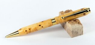
I am a great fan of tripple eee but still give a couple of coats of CA see this pic of a recent pen.

Kind regards Peter.
 

Attachments

  • DSCF8461.JPG
    DSCF8461.JPG
    35.5 KB · Views: 155
Last edited:

wouldentu2?

Member
Joined
Jan 27, 2011
Messages
899
Location
Oak Creek WI
All the above are excellent critiques, pay attention to them. I see a lot of artistic expression in the pens but pay more attention to the directions as far as fit. With a good pen I should never feel a sharp edge either from the material or the kit.
Try the CA finish to 12000 Micromesh and then work your way back down to arrive at a shine you like.
There is a limit to the thickness of the wood on the clip end or will not fit on a pocket, notice the difference in the clips for the slimline and the streamline, you will see what I mean. Keep up the good work, I see a couple of subtle shapes I am going to use on a pen today.
 
Top Bottom