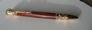
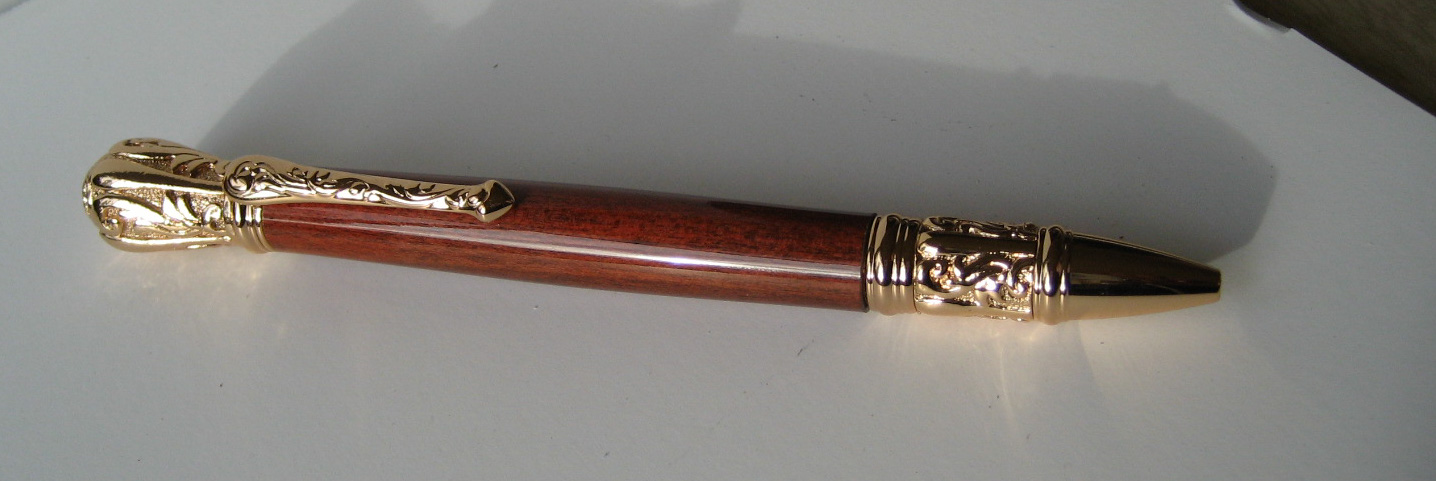
Tudor in Redheart

Signed-In Members Don't See This Ad

CREID

Member
Joined
Jul 23, 2008
Messages
3,009
Location
Vancouver, wa
Nice pen. They are substantial, aren't they :) The gold is a lot more showy than the antique finishes, IMHO.

The gold is a little flashy and makes it look kinda, at a loss for the right word but anyway, I think it would look great in the antique pewter, if they make it in that, I never looked.

Curt
 

CREID

Member
Joined
Jul 23, 2008
Messages
3,009
Location
Vancouver, wa
Redheart is my most favorite wood visually, Olive for turning though.

This was my first time with Redheart and it was stabilized. I have turned Purpleheart before and didn't like the look of it. Of course with purpleheart just wait a while and it will change color. The Redheart looks great to me. I don't remember where I got the blank. I would imagine Woodcraft though.

Curt
 

CREID

Member
Joined
Jul 23, 2008
Messages
3,009
Location
Vancouver, wa
Thanks dthayer

Also I went and looked at the images on the PSI website and the Antique Pewter and Brass look a lot better. Every once in a while I do a gold pen and am usually let down, except for the slimlines, they look good in gold.

Curt
 

CREID

Member
Joined
Jul 23, 2008
Messages
3,009
Location
Vancouver, wa
Nice pen. They are substantial, aren't they :) The gold is a lot more showy than the antique finishes, IMHO.

I guess I should have looked at your post again before I became at a loss for a word, showy would be about right and yes the antiques finishes look better on the PSI website, like I said in an earlier post, sometimes I just feel the need to do gold.
Thanks for you comments. If you mean substantial as in how big they are, yes it is, but not as big as the Phoenix, now that is a large pen, but a nice looking large pen.:)

Curt
 

J Michael

Member
Joined
Jun 21, 2011
Messages
90
Location
North Richland Hills, TX
Very nice pen, Curt. Yeah, the gold does look a little ... uh ... the antique brass and pewter do look better. Only thing that I don't like about that kit is the center of balance is so high, and it weighs so much, that I find it very uncomfortable to write with.
 

CREID

Member
Joined
Jul 23, 2008
Messages
3,009
Location
Vancouver, wa
Very nice pen, Curt. Yeah, the gold does look a little ... uh ... the antique brass and pewter do look better. Only thing that I don't like about that kit is the center of balance is so high, and it weighs so much, that I find it very uncomfortable to write with.

Yea, some of these kits are large and weigh a lot. Personally I think they are better for decorative items on a desk and or conversation pieces. Don't get me wrong though, I think these types of kits are cool and fun to make, and will appeal to a whole new section of the peoples.

Curt
 

CREID

Member
Joined
Jul 23, 2008
Messages
3,009
Location
Vancouver, wa
I'll say it: The gold looks a little je ne sais quois.

Ok, i'll admit it. I had to google that. Here is what I came up with, a pleasant quality that is hard to describe.:) Don't know if that is what you meant as far as pleasant, but the gold is a little hard to describe, the opinion is always in the eye of the beholder and for me anyway the gold isn't to my liking. Not saying it is ugly, but I am going to order one of these in Antique Pewter and I think that will be much nicer. Thanks for you comment.

Curt
 
Top Bottom