Pleasing Pen Proportions (Capped pens)

Signed-In Members Don't See This Ad

soligen

Member
Joined
May 11, 2010
Messages
1,085
Location
Sterling Heights, Michigan
I recently commented in another thread about the ration of pen cap to pen body, so I thought I'd elaborate here and see what you guys think.

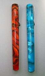
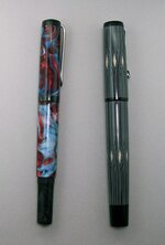
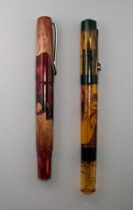
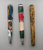
I think most of us are familiar with the rule of thirds. It is applied for aesthetics in a number of fields, and I think we would do well to apply it to pen design as well. A direct adoption of the rule would suggest that a pen cap be 1/3 of the overall length of the pen. I think this would make for a cap too short to house a comfortable section, so I am proposing a different ratio, but sill based on the rule of thirds. I think a good size for the cap is 2/3 the length of the pen body, or said another way, the pen body is 1.5 times the length of the cap.

Through this evening, I am going to follow up this initial post with a series of pictures with pens of my own that both hit this target, and some that miss. Let's see of if my proposed ratio hold up to all your opinions.

All comments are welcome, but I'd like them focused on the proportions of the pen, and not the color, blank, or other aspects.

I am going to start with some of my kit-less pens, then wrap up with how this applies to kit pens.
 
Signed-In Members Don't See This Ad

soligen

Member
Joined
May 11, 2010
Messages
1,085
Location
Sterling Heights, Michigan
Lets start with the most direct comparison I could find in my collection. These 2 pens are of the same design, and the caps are almost identical in size. You can see that the blue pen has a longer body and overall length than the Orange pen. Disregarding color, which has the more pleasing proportions?

There is some invisible text below. If you high-light it with your mouse, you will see which one follows the 2/3 rule.

The orange pen has a cap that is 2/3 the length of the body.
 

Attachments

  • DSCN1603.jpg
    DSCN1603.jpg
    47.3 KB · Views: 323

AlanZ

Member
Joined
Mar 2, 2009
Messages
266
Location
Oradell, NJ
It's not surprising that the "Golden ratio", as it's called, is 1.618 to 1.

This ratio is used in all sorts of composition, man-made and in nature.
 
Last edited:

soligen

Member
Joined
May 11, 2010
Messages
1,085
Location
Sterling Heights, Michigan
Here are 2 pens that meet the 2/3 rule. The caps are 2/3 the length of the body. Additionally, the postable finial of the blue & red pen is 2/3 the length of the as the main part of the body.
 

Attachments

  • DSCN1605.jpg
    DSCN1605.jpg
    46.5 KB · Views: 246

soligen

Member
Joined
May 11, 2010
Messages
1,085
Location
Sterling Heights, Michigan
Here are 2 pens that don't follow the rule. The body is too short on the red one, and too long on the Ancient Amber pen.

On the ancient amber pen, I always had a feeling that the black band on the blind cap was a bit thick, but I left it as is because it is hiding the threads beneath it. After taking all the measurements today, I found out that if I left everything else the same, but reduced that black band by~ 3/32" then this pen would me much closer, and also the blank band would end up being about 1/3 of the length of the clear portion of the blind cap.
 

Attachments

  • Pleasing Pen Proportions.jpg
    Pleasing Pen Proportions.jpg
    43.6 KB · Views: 244

691175002

Member
Joined
Jan 31, 2012
Messages
28
Technically rule of thirds applies to photographic composition (AKA the location of points of interest) while the golden ratio applies to the relative size of two parts.

For the size of a pen cap to body, you should be using the golden ratio which slightly different from 2/3.
 

soligen

Member
Joined
May 11, 2010
Messages
1,085
Location
Sterling Heights, Michigan
Let's take a look at some kit pens. This picture shows, from left to right, a Triton, a Jr. Victor, and a closed end modded Church Hill.

Note that when I took measurement on these I used the center of the center-band instead of where the body & cap joined because I thought it to be more of a visual focal point.

I really like the styling of the Triton kit, but the body simply looks out of proportion to me. Taking the measurements, the body would need to be 1/2" longer to make the cap 2/3 body length.

The Jr Victor kit is more typical of the length of other Jr. kits. I think the longer body make a more pleasing proportion, but it is still too short based on wanting a cap 2/3 the length of the body.

The Church Hill is very close to the proposed ratio. (The body is only about 1/32" too short)

If you like this ratio rule, adn want to make a closed end Jr. pen, I think a body length of 3.25" will be very close to these proposed proportions.
 

Attachments

  • DSCN1602.jpg
    DSCN1602.jpg
    65.1 KB · Views: 221

soligen

Member
Joined
May 11, 2010
Messages
1,085
Location
Sterling Heights, Michigan
Alan & Ryan, do you have any pen examples you can post using the Golden Ratio?

I never planned any of these ratios on any pen, I was just observing what seemed to work the best in my own pens. I think it would be educational for everyone to compare to golden ratio pens.
 

691175002

Member
Joined
Jan 31, 2012
Messages
28
Both ratios are relatively similar, but I think you will find your pens actually use the golden ratio:
scaled.php

The blue rectangle is the golden ratio and the red rectangle would be 2/3rds of the entire pen.

Here is a rendering of a pen where almost everything is based on the golden ratio (cap length, clip length, position of band) but the perspective is kindof wonky:
scaled.php
 

Haynie

Member
Joined
May 20, 2011
Messages
3,516
Location
Page Arizona
Been thinking about this one a lot as I venture into the kitless world. Personally I like the golden ratio look.

Have you thought about the visual effect of the clip and finial? Especially the trend for kitless pens to have very high finials.
 

Xander

Member
Joined
Feb 11, 2012
Messages
373
Location
Arizona
Personally I think all this "ratio" stuff is a lot of hooey. They all look OK to me.

Now where did I put them darn glasses ?:glasses-nerdy:
 

soligen

Member
Joined
May 11, 2010
Messages
1,085
Location
Sterling Heights, Michigan
Both ratios are relatively similar,

Maybe I'm not doing the math right - with a golden ratio, given how big my cap needs to be, the body gets longer than I want.

Here is what I'm doing:

Cap ~ 2.3"
Body = 2.3 * 1.618 = 3.72
Pen OAL is then about 6", but I am targeting 5.25 - 5.5"

Working the other way, a 5.5" pen would need a cap of about 2.1". I don't think I've ever gotten a cap that short. I may need to re-think some things.
 
Last edited:

691175002

Member
Joined
Jan 31, 2012
Messages
28
I've measured two pens I consider to have good proportions: The twsibi 530 and the aurora hastil. The numbers vary from the golden ratio (only the cap/full length is close) but are extremely similar between the two pens:

Cap / Full Length (Golden ratio: 0.38 )
0.4, 0.41

Clip / Full Length:
0.29, 0.3

Section / Full Length:
0.17, 0.18

Finials:
2.3mm, 4mm

Most of the numbers seem to be partially determined by space requirements - There isn't enough room for the nib and clip in a cap that follows the golden ratio.

I've never done the actual measurements before but now that I see how consistant they are across two pens (that have both won modern design awards) I will probably be using those numbers.
 

soligen

Member
Joined
May 11, 2010
Messages
1,085
Location
Sterling Heights, Michigan
I've measured two pens I consider to have good proportions: The twsibi 530 and the aurora hastil. The numbers vary from the golden ratio (only the cap/full length is close) but are extremely similar between the two pens:

Cap / Full Length (Golden ratio: 0.38 )
0.4, 0.41

Clip / Full Length:
0.29, 0.3

Section / Full Length:
0.17, 0.18

Finials:
2.3mm, 4mm

Most of the numbers seem to be partially determined by space requirements - There isn't enough room for the nib and clip in a cap that follows the golden ratio.

I've never done the actual measurements before but now that I see how consistant they are across two pens (that have both won modern design awards) I will probably be using those numbers.

Very cool! These numbers are pretty much exactly what I am proposing. I was suggesting (post #1) that the cap be 2/3 of the body (not the OAL). In other words, the cap is 2/5 of the pen OAL, which is the same as a Cap / Full length of .4

So, I think I'm right in there :)

Getting down to .38 will, as you say, be difficult as the section will start to get shorter than what I think will be comfortable in the hand, or the full length will get too long.
 
Last edited:

Curly

Member
Joined
Nov 20, 2010
Messages
4,849
Location
Saskatoon SK., Canada.
Denis if you have access to some of the classic pens that have big followings it would be interesting to see how their proportions compare to your "thirds" rule and the Golden Mean/Rule/Ratio (Phi?). Maybe Mike or Linda can chime in with some comparisons. I think that for the most part you are approximately right but when you try to make pens to 1/32 or 3/32 one way or the other in length your getting a little futzy. I also feel that without also considering the diameters of the pen, shapes and the materials visual weight the pen is made of, all of which have a profound effect on the aesthetics as a whole, the pen will be lacking.

:rolleyes: Now I will have to add Phi Rules to my next Lee Valley order and the vendors will need to sell blanks to suit pens made to the aesthetic lengths needed when playing in the kitless realm.
 

butchf18a

Member
Joined
Dec 3, 2010
Messages
503
Location
woodland, wa
seems like a lot of majoring in minors when we all know the only acceptable proportions are the universal standard for a cap is 3.97 x the cap internal diameter squared. The nib end thus, obviously, becomes 5.7 times the square root of the cap length.

jmoicbw-bidi
 

joefyffe

Passed Away Aug 19, 2018
In Memoriam
Joined
Mar 29, 2010
Messages
1,316
Location
Indianapolis (almost Zionsville) Indiana
seems like a lot of majoring in minors when we all know the only acceptable proportions are the universal standard for a cap is 3.97 x the cap internal diameter squared. The nib end thus, obviously, becomes 5.7 times the square root of the cap length.

jmoicbw-bidi

And I thought Injunears just drove trains! LOL:biggrin::biggrin:
 

Robert111

Member
Joined
Apr 12, 2011
Messages
1,127
Location
Saratoga Springs, NY 12866
Interesting discussion. As someone pointed out, the Golden Mean applies to length/width ratio. So judging from Soligen's pens, the 1.5/1 ratio for cap to pen looks good to me.

However, when you have a lower finial, as on postable pens, the ratio question is moot. The pens in Post 7 are an example. The Churchill just looks so much better than the Triton and Junior. It's not a ratio thing. It's more the very presence of the metal lower finial that harms the design. It's such an incongruous element, it just offends the eye.

Nonpostable lower finials are much more in harmony with the lines of the pen. The pens in Post 4 are another example. The (gorgeous) pen on the right has a distinct lower end, but it's a contributing element in the design repeating the color band at top and center and giving some visual weight to the bottom end.
 

jjudge

Member
Joined
Nov 27, 2004
Messages
252
Location
Centerville, OH, USA
Folks -- we're talking *visual* composition.

If you use busy, swirly blanks where the cap/body join "melts" together visually ... then I cannot even vote on which pens are visually balanced.

Apart from that ... diameter/width factor in.
A 1/3 - 2/3 length looks like heck, when the body is out of proportion.

We need an art teacher in here (Shawn!), as the answer is more complicated than simply pen to cap length -- except as a general rule-of-thumb.
 

ctubbs

Member
Joined
Sep 12, 2010
Messages
3,588
Location
Murray, Kentucky
Last time I checked the "Rule of Thumb", it was broken. The most important aspect of pen body / cap length for me is how it fits in my hand when I try to put ink on paper. I have large hands but prefer a slim but long instrument. Golf pencils are a lost cause for me. The pen must fit my finger tips and the body absolutely must extend past where my thumb joins to the hand. Anything less is most uncomfortable. The thing I see of my pens is the finial while it rest in my pocket.

However, let me add that some pens are just plain out of proportion. I do not know what it should be, but when it is wrong it is obvious. This is a great discussion and very helpful, but rules of aesthetics are suggestions at best and oft changed on a whim. The pens shown here are all within the good range. If it is pleasing to the eye, fits my hand and marks the paper well, it is a good pen. The human eye is a precision measuring instrument, when joined with the hand, the pair are hard to out perform. We are making art. If we want precision stamped plastic, Wal-Mart sells them by the gross for far less than our kits cost. Just make your eye and hand happy and you have created a great pen. My $0.02
Charles
 
Top Bottom