In general it is a great shot. There are a few tweaks that can be done to improve it, IMHO.
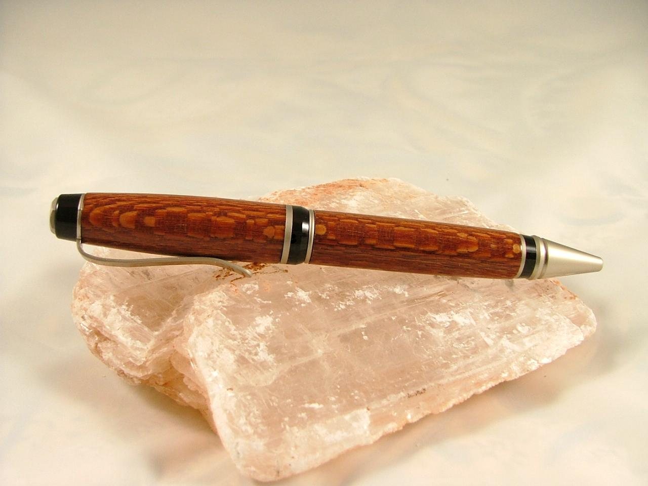
Is that a satin gold kit or satin silver? If silver you need to do a custom white balance because it looks overall too yellow. If satin gold then you should change your background so not everything is the same color scheme so people can see that the settings are correct and that IS the color of the pen.
To show off the shine you need a third light coming in from the front/upper through the opening of the tent. The unsoftened light will cause the reflection you want.
For the pen, it looks like you might be just a hair underturned at the nib and at the clip. Either that or your turning was spot on and the CA built up until you are slightly proud. At the lower-side of the centerband you have the square/sharp edge of your lower barrel meeting up with the top of the curve of the center band leaving you a V that is seeable and feelable. If you either turn it down to the base of the curve or just soften the corner so you have curve meeting curve it will look better.
Focus is spot on. If you look at the quartz you can see you have an inch or so on either side of the pen that is in focus. You could use that to rotate the pen a bit for more "tension" in the photo that draws attention better.
Lighting is spot on too.
Lastly, and it is a nit that can be argued all day: most people hold the pen in the right hand with the point on the left. So having the pen in the picture facing the other way can come across as just a bit "odd".
Great job. Look forward to seeing more of your work, both photography and turning!!
GK