First Jr. Gent II Pens

Signed-In Members Don't See This Ad

rebfan04

Member
Joined
Dec 15, 2010
Messages
65
Location
Flowood, MS
Take a look and tell me what you think. Tasmanian Burl and Tru-stone. I am a newbie to this hobby. Thanks for all the helpful info over the last month. Don't be gentle. Heck the pictures were about as hard to take as doing the pens. You guys do some fabulous work!
Roger
 

Attachments

  • Tas1.jpg
    Tas1.jpg
    30.6 KB · Views: 206
  • Trustone BlackGold.jpg
    Trustone BlackGold.jpg
    63.4 KB · Views: 203
Signed-In Members Don't See This Ad

G1Pens

Member
Joined
Oct 4, 2010
Messages
1,859
Location
Atlanta, GA area (Dacula)
Awsome pens.

My only comment on the photos.....the white blinds in the first photo need to go. In any photography, your eye is drawn to the white. If you have an all white background that is not really true, but when you have light/white areas in a photo your eyes will keep going back there. That is such a spectacular pen, you need to keep the focus on it. I think the setting is awesome and the lighting is spot on. If only those white blinds were not there.
 

Eyeshooter

Member
Joined
Dec 2, 2010
Messages
52
Location
Western NH
Very nice pens and I agree about the photos. White draws the eye away from the pen and the background for the Trustone is too busy with the pen under lit. However, as your question was about the pens, very nice job!

John
 

Brooks803

Member
Joined
Sep 13, 2009
Messages
5,632
Location
Aiken, South Carolina
They both look great Roger. I agree about the white blinds. You have a great shine on them both. Nice shape and the fit is spot on. Keep up the good work!
 

ctubbs

Member
Joined
Sep 12, 2010
Messages
3,588
Location
Murray, Kentucky
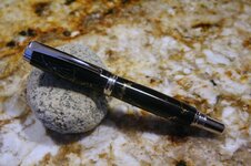
Roger, your pens are right where you want them, fit and finish are spot on. The lighting on the photos are a good starting point. Make a sketch of where they are now and then move one at a time and take a shot, make a sketch, make the shot, make the sketch, you get the drift. Keep accurate notes on each shot so you can repeat the good ones.
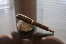
The shot of the burl was taken on a reflective surface, not a mirror, but a reflective surface with two surfaces that both reflect. Not good. Distracting. You are trying to show the pen, not the glass table top or the blinds in the background. Find some colored cloth or paper, keep it smooth so no folds or wrinkles end up in the material, to use for your background. One color at a time. Busy backgrounds gather the eye and carry it away from the intended subject.
You have the focus and exposure down pretty well. The composition is good. Take the good, improve the not so good, take many photos and notes on each so you can tell what you did on each shot. Practice all you can and your photos will get better. I hope you take this suggestion in the manner it was sent. Respectfully.
Charles
 
Top Bottom