Displaced Canadian
Member
I'm thinking of using better blank materiels instead of using flashier kits to make a more valuable product. I guess my question is what creates more value the blank or the kit?

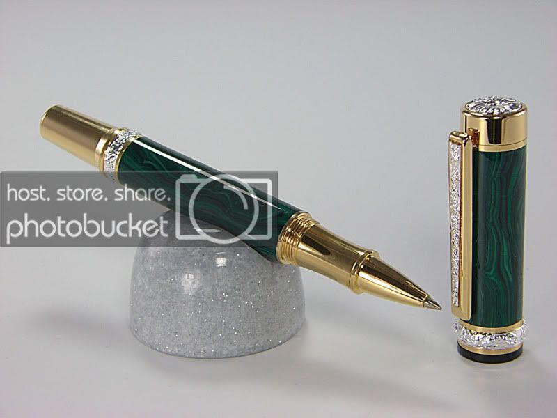
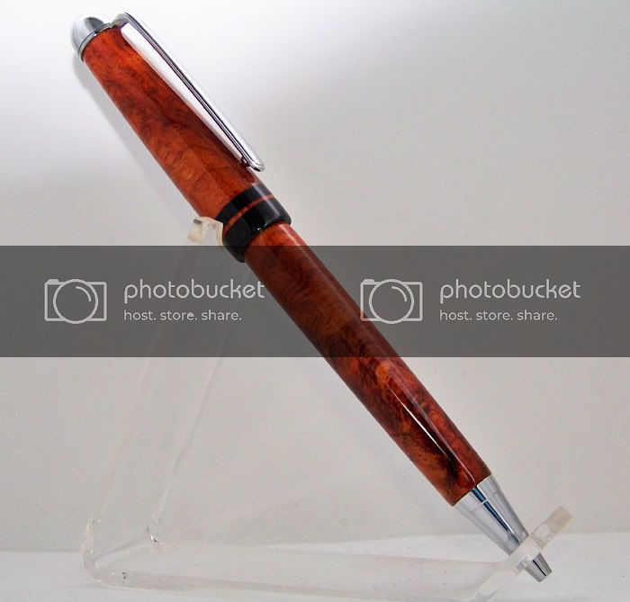
There's always going to be exceptions what we all say, but I think the blank outweights the kit in most cases. I also agree with Mike that simplicity is key. Overly ornate kits distract from the overall elegance that you try create with matching kits with blanks. That's why I always alter my majestics bc they are just so ugly with that stupid crystal and the finial design. And since I have something for show & tell here's my example of simple yet elegant. Amboyna burl with Ebony accents:
