
Cloven
Member
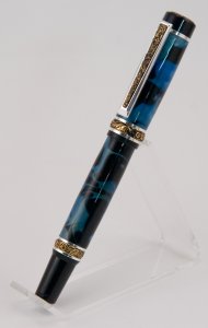
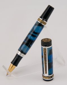
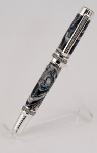
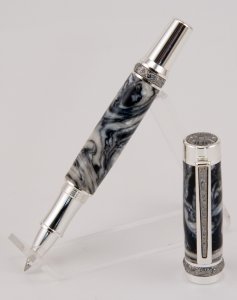
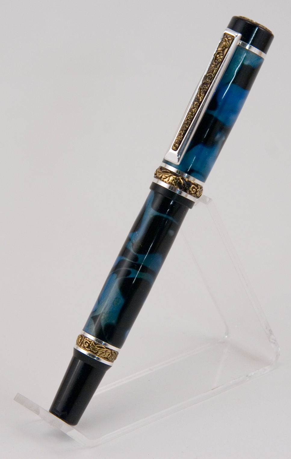
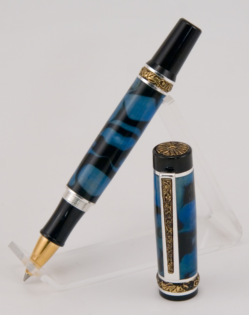
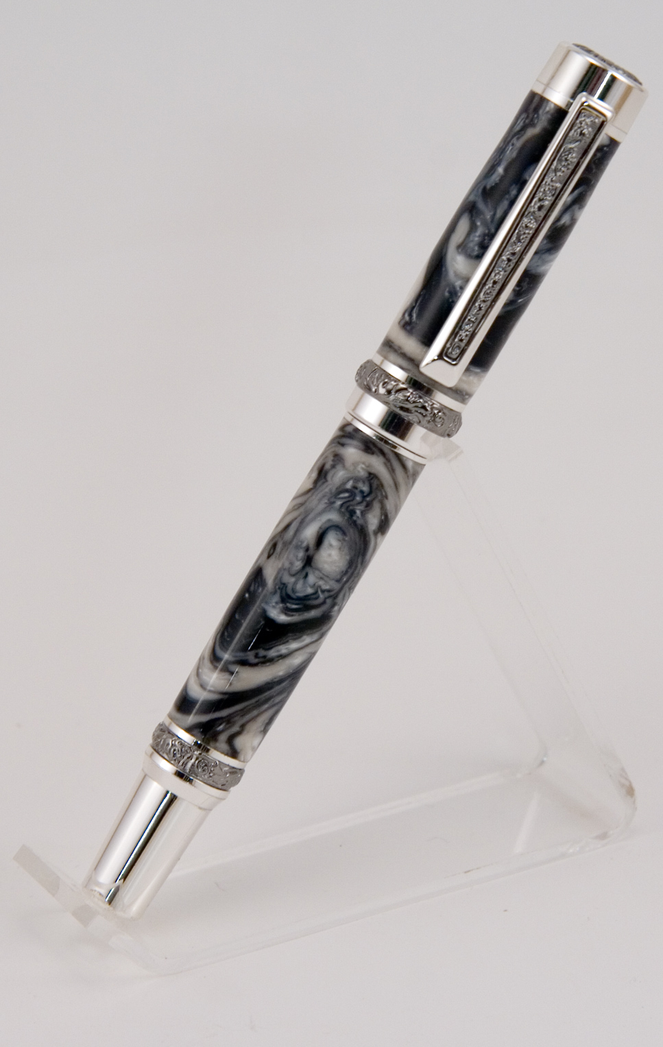
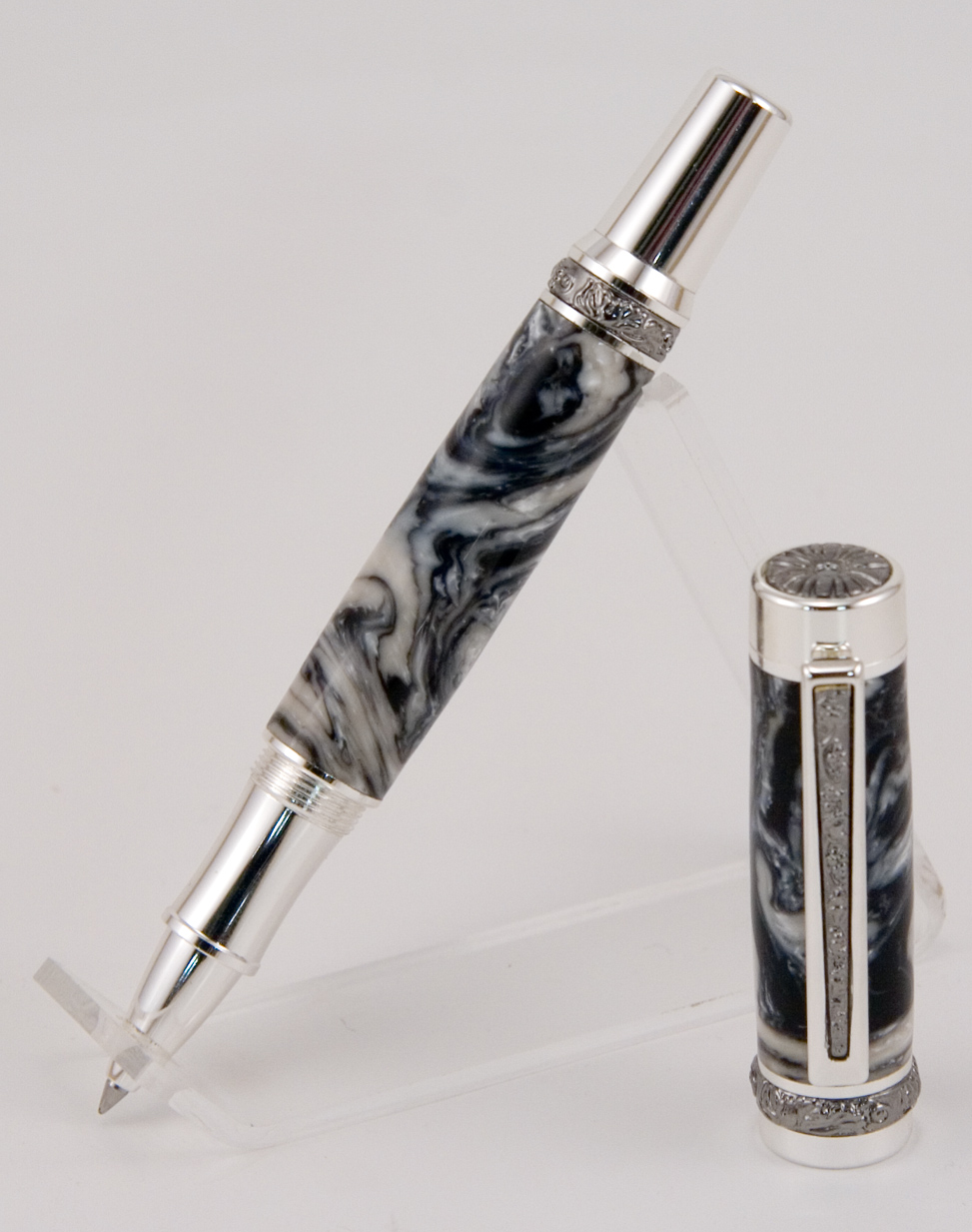
The first is a Cambridge I got from Lee Valley in London with an acrylic blank I got there, and the second is a Canadiana from William Wood-Write with a Lava Lamp Oreo blank. The Canadiana is just the Cambridge Hybrid, so these are going together in the same thread. I really like how the black and white Canadiana came out, but I'm a bit disappointed in the blank I used with the Cambridge. It turns out the blue that was in it was semi transparent, so the yellow of the brass tube is bleeding through the finished product. This wasn't at all apparent on the blank, so I hadn't reverse painted the drilled hole. It's not bad, it's just not what I had in mind when I put it together. The Oreo Canadiana, however, is spot on what I had in mind. The more I do, I realized I don't like acrylic acetate that much. The two pink ones I did on the faith/hope/love were good, but the two others (the orange stratus and this blue/black Cambridge) I just wasn't happy with the colour saturation and transparency issues. I love the Lava and Pearl acrylics, just not the generic ones. I recognized that they are decent and certainly can make great looking pens, they're just not quite for me and my own personal design aesthetics.
I like the two toned leaf designs in the original Cambridge, but I like the all metal parts of the Canadiana/Cambridge Hybrid more.
What do you all think? Comments, even just a quick "I think the blue/black works well" are welcome.
I like the two toned leaf designs in the original Cambridge, but I like the all metal parts of the Canadiana/Cambridge Hybrid more.
What do you all think? Comments, even just a quick "I think the blue/black works well" are welcome.
Last edited: