Turquoise w/Black Marble on Rhodium Venus

Signed-In Members Don't See This Ad
See more from InvisibleMan

InvisibleMan

Member
Joined
Feb 13, 2011
Messages
716
Location
San Jose, CA
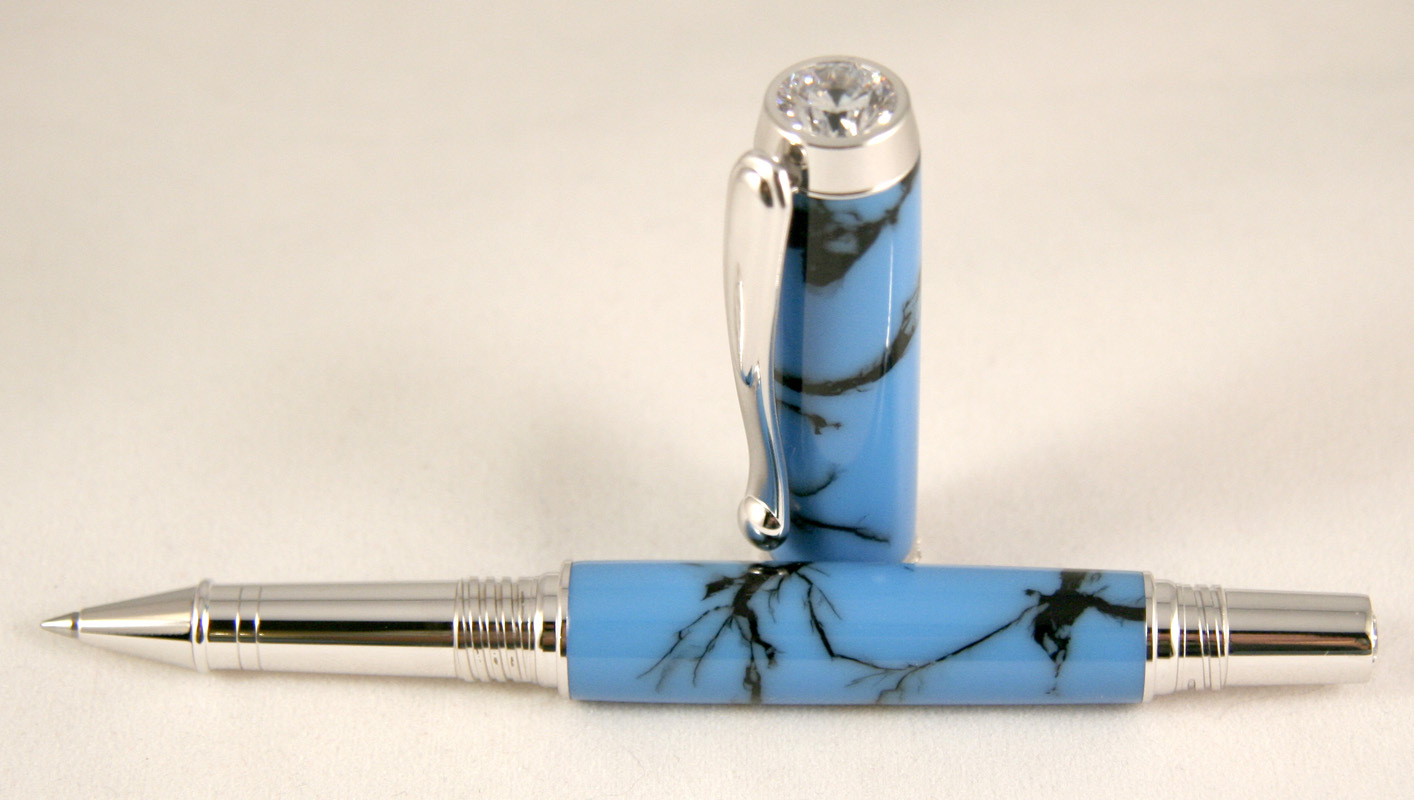
Finished this one up tonight - Turquoise w/Black Marble on a Rhodium Venus. Turned, wet MM through the roster, polished with One Step.

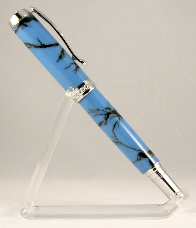
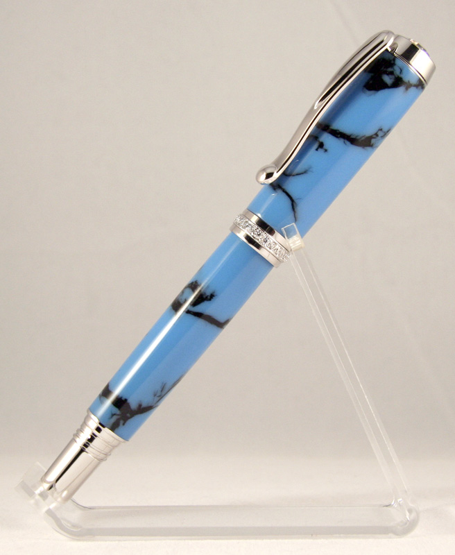
I've wanted to try the Venus, and I think I like it. My wife likes it, so hopefully it'll sell. It's a pricey bugger:rolleyes:.

All comments welcome:eek:.

1_Turquoise_with_Black_Marble_Venus_small.jpg
1_Turquoise_with_Black_Marble_Venus_2_small.jpg
1_Turquoise_with_Black_Marble_Venus_3_small.jpg
 
Signed-In Members Don't See This Ad

InvisibleMan

Member
Joined
Feb 13, 2011
Messages
716
Location
San Jose, CA
thanks! I really need to work on my photos. The third one is blurry. It looks a bit over turned, but it isn't in real life, although it does sort of curve to the hardware. I don't care for how I did it much - habit left over from all the pencils I've been working on.
 

InvisibleMan

Member
Joined
Feb 13, 2011
Messages
716
Location
San Jose, CA
Very Nice!
Is that Tru-Stone?

Thanks!

No, I've been working on PR pours that look like tru-stone. This is one of them. I posted a burgundy/gold pen a couple weeks ago that's similar. I love how tru-stone looks, but like turning and cleaning up after PR better:). These are a good compromise, cheaper to make, and I can do any color combo I want.
 

Texatdurango

Member
Joined
Apr 23, 2007
Messages
4,649
Location
Show Low, Arizona
Very Nice!
Is that Tru-Stone?

Thanks!

No, I've been working on PR pours that look like tru-stone. This is one of them. I posted a burgundy/gold pen a couple weeks ago that's similar. I love how tru-stone looks, but like turning and cleaning up after PR better:). These are a good compromise, cheaper to make, and I can do any color combo I want.

Now that's some impressive casting! Just glancing, I thought it was tru stone, you've done an excellent job imitating the tru stone look.

I too like the Venus pen and have made and sold a few. At a recent show I met another turner who had about a dozen on display and I commented about them being "ladies pens" when he said that he sold more to men than women! I thought that was interesting.
 

InvisibleMan

Member
Joined
Feb 13, 2011
Messages
716
Location
San Jose, CA
Very Nice!
Is that Tru-Stone?

Thanks!

No, I've been working on PR pours that look like tru-stone. This is one of them. I posted a burgundy/gold pen a couple weeks ago that's similar. I love how tru-stone looks, but like turning and cleaning up after PR better:). These are a good compromise, cheaper to make, and I can do any color combo I want.

Now that's some impressive casting! Just glancing, I thought it was tru stone, you've done an excellent job imitating the tru stone look.

Very Nice!
Is that Tru-Stone?

Well I just inserted my foot into my mouth after reading this. I said to myself "Well Duh!" then I read his response.

I forsee a new artist on exotic's.....LOL

Awesome job.

Thanks guys! Ah, nice that people have to at least ask the question! I won't admit to how much resin I went through trying to nail the process:rolleyes:. I'm pretty happy with it now though.

Looks very nice. Try reducing your pics. before posting them.

Agree, they are still too large. I reduced them to 800px height I think, but probably 500 or 600 would be better?
 

Texatdurango

Member
Joined
Apr 23, 2007
Messages
4,649
Location
Show Low, Arizona
Looks very nice. Try reducing your pics. before posting them.

Agree, they are still too large. I reduced them to 800px height I think, but probably 500 or 600 would be better?

I usually use 600 px as the larger of the two dimensions and the photos fit on a screen well and you can still see nice detail. I grabbed yours and re sized them to:
516 x 600, 492 x 600 and the biggest improvement was down to 600 x 340.

In my opinion, seeing the whole photo at once without having the monitor set at a high resolution makes seeing the pens more enjoyable. Your last photo really shows the blanks off!

I wouldn't mind seeing some other colors!
 

InvisibleMan

Member
Joined
Feb 13, 2011
Messages
716
Location
San Jose, CA
I usually use 600 px as the larger of the two dimensions and the photos fit on a screen well and you can still see nice detail. I grabbed yours and re sized them to:
516 x 600, 492 x 600 and the biggest improvement was down to 600 x 340.

In my opinion, seeing the whole photo at once without having the monitor set at a high resolution makes seeing the pens more enjoyable. Your last photo really shows the blanks off!

I wouldn't mind seeing some other colors!

OK, 600 px is what I'll use next time. Here's the other color I've photographed so far: http://www.penturners.org/forum/f13/new-marble-google-page-ranking-pour-jr-gent-96433/

I have orange w/black and black w/gold, but haven't gotten a photo yet. The orange/black pen "disappeared" and haven't turned the black one yet. I just got more resin in, so it should be a fun and busy weekend:biggrin:

edit: I forgot - I also have some bad pictures of early prototypes in my photo album.
 
Last edited:
Top Bottom