TonyL Pens

Signed-In Members Don't See This Ad
See more from TonyL

TonyL

Member
Joined
Mar 9, 2014
Messages
8,915
Location
Georgia
Hi Folks:

Well, since mid-March 2014 (when I first got started), I made close to in not more than 400 pens. However, it wasn't until a few weeks ago, that I started keeping any of them; I sell about a fourth and the rest are gifts or auction donations.

So here is some of my work.

Quite frankly, I am more interested in what you don't like, than what you like. I understand that it's all one's opinion, but there are some very experienced opinions out there. I am only going to grow as a turner if I focus on the opportunities for improvement. You can't insult me - no need for euphemisms or sugar-coated deliveries.

Maybe you can tell me how to rotate these. I didn't upload them sideway..at least not intentionally.I don't have this problem with my Android phone; I wonder if it is an iPhone thing?

Left to right:

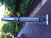
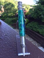
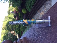
1 Magnetic Graduate, Brooks blank
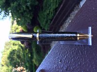
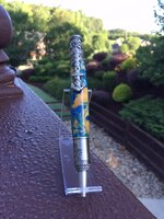
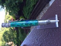
2 Nautical Earth Inlace front T(turned yesterday the Local IAP meeting)
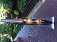
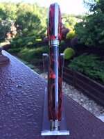
3 Same as, but side shot. I wish I placed the clip on the more solid side..too late :)
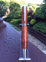
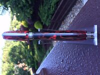
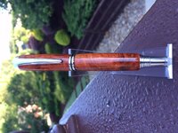
4 Jr II Amboyna burl CA finish. This one was one of the 2 of every 10 that some reason continued to cloud up at the ends
despite ensuring all ends are sealed, and everything else that I regularly do was performed.
 

Attachments

  • Red and Black Brooks Blank Magnetic Graduate.jpg
    Red and Black Brooks Blank Magnetic Graduate.jpg
    230.2 KB · Views: 404
  • Nautical Inlace Earth.jpg
    Nautical Inlace Earth.jpg
    222.6 KB · Views: 385
  • Nautical Inlace Earth Side.jpg
    Nautical Inlace Earth Side.jpg
    215.6 KB · Views: 360
  • Gent II Amboyna.jpg
    Gent II Amboyna.jpg
    223.7 KB · Views: 362
Last edited:
Signed-In Members Don't See This Ad

Krash

Member
Joined
Feb 10, 2014
Messages
1,259
Location
Albuquerque, NM
I love your work. You make very nice and attractive pens.

The one thing I see in all four of these pens is it looks like they are all under turned at the bushings. It may be the pen kits or shadows from the pictures though. If they are under turned, you could work on getting that joint tight and flat.

Great job tho Tony!
 

TonyL

Member
Joined
Mar 9, 2014
Messages
8,915
Location
Georgia
More of TonyL's work

Here are the rest of today's pics:
 

Attachments

  • Gent II Amboyna.jpg
    Gent II Amboyna.jpg
    223.7 KB · Views: 214
  • Black and White Cigar.jpg
    Black and White Cigar.jpg
    219.6 KB · Views: 233
  • Atrax TS Black and Gold.jpg
    Atrax TS Black and Gold.jpg
    216.7 KB · Views: 218
  • Le Roi Royal Gun Mental.jpg
    Le Roi Royal Gun Mental.jpg
    229.7 KB · Views: 236
Last edited:

TonyL

Member
Joined
Mar 9, 2014
Messages
8,915
Location
Georgia
I love your work. You make very nice and attractive pens.

The one thing I see in all four of these pens is it looks like they are all under turned at the bushings. It may be the pen kits or shadows from the pictures though. If they are under turned, you could work on getting that joint tight and flat.

Great job tho Tony!


Thank you. It's the angle...I was on crouching down and shooting-up. If anything, I always turn and finish slightly proud of the hardware. I saw the same thing in the photos though. I really have no patient taking pics.

But, please, don't withhold, you all may find flaws in turning or matching that are NOT part of the photos. Like, "Tony, please remove the bird poop from the scene.". That may have been nice for just the nautical shot - adds authenticity! LOL.


Wait..I mis- read your reply. They are under-turned by a fraction of a hair (the rest is the angle). You have a great eye. As long as I can't see the ends protruding from around the hardware (from a birds-eye view), I am fine and prefer that - it is intentional. But your comment is spot on. Thank you.
 

hilltopper46

Member
Joined
Jun 28, 2006
Messages
2,401
Location
East Troy, Wisconsin, USA.
"slightly proud of the hardware" is what underturned means. I agree that a number of these are that way.

Your finishes look good.

One thing I don't like is that your pictures are all "sideways". Maybe it's just my brain, but I have to turn my head to really "see" the pen, and that makes my neck hurt.

I'm impressed at the number of pens you have turned in the short amount of time you have been doing this.
 

TonyL

Member
Joined
Mar 9, 2014
Messages
8,915
Location
Georgia
Yes, I mis-read underturned (for overturned)...my fault. I have no idea why the pictures are sideways. I have two cell phones. my Samsung doesn't do this; my iPhone (which I took these with does). I will ask Jeff why.

As far as the number of pens...I was gainfully unemployed for 8 months Jan 2015 to mid-Aug 2015...I could only take so many naps :). Since I started my new job in August, I average less than 3 a week now. Thanks Tony.
 
Last edited:

plantman

Member
Joined
Jan 2, 2012
Messages
3,437
Location
Green Bay, Wi
Toni; I thing all of your pens turned out great !! I like the nautical one best because it looks as though the blank is a map with the oceans surrounding it. Most people are led to believe that your joint between blank and fitting should be perfectly level. I think it depends on the design of the pen and fittings. If I have a kit that has bands composed of several round rings, I will turn the blank to the max size and round over the ends in order to make the bands stand out more. Sometimes I will leave the top blank the same thickness if the final is much smaller and make a crown to show off the final. Some pens need, by design, to be flush. It's all in the eye of the beholder and the maker themselves. Jim S
 

TonyL

Member
Joined
Mar 9, 2014
Messages
8,915
Location
Georgia
Thanks Jim. Yes, the h/w on the Nautical pen is rounded so I did not turn proud of that round OD.

If my the bushing or hardware calls for .495, I will finish at .498 to .500. I will also meet the bushing/hardware (mainly h/w, because you never know about trusting bushings), but as a very short radius in between the material and the hardware. This allows me to meet the h/w,, but look slightly proud.

Keep the comments and criticisms coming. This is not about flattery' it's about improvement.

Thanks!
 

dogrunner

Member
Joined
Mar 23, 2014
Messages
365
Location
mi
they look nice. don't go by bushing for your size measure the kit parts your using and go by them I seen kit vary as much as .005
 

skiprat

Passed Away Mar 22, 2022
In Memoriam
Joined
Oct 19, 2006
Messages
7,812
Location
In a Skip in Wales
Can't help with the iPhone thing.....I just dropped them in Picasa3 and rotated them.
I like the first one a lot, under turned but nice. Very good finish on all though.
I don't like straight-on pics. Much prefer diagonal across the photo.
For me, the background detracts from the cool pens.

You did ask.....:biggrin:

Edit; The Brooks one is the one I like........your 1st , my last pic...
 

Attachments

  • Gent II Amboyna.jpg
    Gent II Amboyna.jpg
    224.3 KB · Views: 199
  • Nautical Inlace Earth Side.jpg
    Nautical Inlace Earth Side.jpg
    215.8 KB · Views: 189
  • Nautical Inlace Earth.jpg
    Nautical Inlace Earth.jpg
    222.9 KB · Views: 168
  • Red and Black Brooks Blank Magnetic Graduate.jpg
    Red and Black Brooks Blank Magnetic Graduate.jpg
    230.7 KB · Views: 206
Last edited:

Charlie69

Member
Joined
Apr 12, 2013
Messages
189
I like the Graduate with Brooks blank best also. For the people I have gifted roller balls to the Graduate is always preferred over the jr Gents because it's proportions are so nice. It provides a nice looking pen and a good writing experience. Ultimately a nice writing tool is what I'm looking to make and with Kits already being as fat as they are... under turning only adds to a persons perplexity over the girth of a pen. Folks I give pens to aren't used to writing with a pen that has a 14, 15mm o.d.. Nor do they want to walk around at work with a huge pen in their pocket. I just put my calipers on a Pentel RSVP sitting on my desk and it's 9.68mm. That's what people want to write with or something slightly larger. The Sierra pen sitting here is 12.68mm o.d. and for a pen that is an everyday carry that's as big or bigger than most people want.

Take that for what it's worth.

It's more of a personal preference but I enjoy the looks of a pen with straight lines. The under turning gives the pens a slight oval shape.

Beautiful finish on all of them.
 

keithbyrd

Member
Joined
Sep 2, 2011
Messages
2,493
Location
Mount Wolf, PA
Tony,
Great finishes and great blanks - nothing to add = I can only concur with the above - straight simple lines are always more pleasing to the eye at least to me! I think Charlie69 was spot on with comments about girth. You do a great job on the finish!
 

TonyL

Member
Joined
Mar 9, 2014
Messages
8,915
Location
Georgia
Thank you for the comments, opinions, improvements for suggestions, likes and most importantly, dislikes. I do agree with the the fatter pen comment. The ones that I make for others are thinner and straighter. All the ones that I have shown are my own personal pend. Despite have pretty thin fingers, my penmanship is better with the fatter body. I also like aesthetic of a concave pen, but that is my own taste. I am learning much from everyone's comments. :).
 

Simsonicole

Member
Joined
Apr 4, 2015
Messages
146
Location
Perth, Western Australia
Love no 1 - I am a big fan of the Lava Flow look. #2 + 3 - Fantastic Nautical. I am making a Nautical for my brother at the moment...he is a CO in the RAN but am having trouble finding the right blank. Have done it with a Buckeyed Burl...but it doesn't really go with the whole Nautical theme. No 6 is super funky and I LOVE no 8. Very visually appealing! Nice work Tony :)
 

TonyL

Member
Joined
Mar 9, 2014
Messages
8,915
Location
Georgia
Thank you. The ships used to be made of wood, especial the one on the nib. I should have displayed the anchor against the dark green park of the blank. It gets lost among the lighter colors. Just my personal taste. Thanks again.
 

BradG

Member
Joined
Jul 10, 2011
Messages
1,733
Location
Blackpool -UK
Never trust bushings, only rely on them to center your tubes on the mandrel and take your measurements with a caliper/vernier. As time goes by with all that turning and sanding, those bushings will become smaller in size... misleading you on how much left there is to take off. buggered a few pens up in the early days because of this!
 

vakmere

Member
Joined
Mar 25, 2014
Messages
594
Location
Philly
Looking at the photos sideways is a pain in the neck (pun), turn them vertical. Other than that the blanks and kits match nicely, then again, seeing them in person will reveal more then a photo. Same with me.
 

Sandsini

Member
Joined
May 11, 2014
Messages
437
Location
Lake Arrowhead, California
Tony,
I think some of the pens are slightly underturned with an inflated look to them and I think they would be a little more elegant if if they were more slender. However, I also believe that some single tube kits benefit from a mild ovaling of the material to make the lines of the pen more graceful.

Your workmanship is very nice, the finishes are great, and I think you have a real talent in putting materials and styles together. I really like what you do.
 

TonyL

Member
Joined
Mar 9, 2014
Messages
8,915
Location
Georgia
Thank you. I am going to experiment with a slender look. I have made some that way in beginning, but prefer the convex (oval). I will make and post. Thanks!
 

Charlie_W

Member
Joined
Nov 16, 2011
Messages
5,918
Location
Sterling, VA USA
Hi Tony,
First of all, superb finish on your pens!

Now for the other stuff!
I too had the same issue with sideways pics from iPad and iPhone. If you edit and simply crop...even a little bit, the pic will ship and display correctly.

As for the proud, rounded over ends of the blanks....not my preference. If you go for and nail dead on a fit to the components that will mimic the curvature of the hardware, the pen will flow better to the eye and the discerning buyer will see that you can indeed turn the blanks to exacting specs.
I usually turn to about .003 larger than the hardware then my wet sanding, polish and buff will bring it to my target hardware size consistently.

Also, when you have a blank proud of the hardware, a pen with a cap can have problems as the cap can extend over onto the lower blank (with some pens) and bind leaving a rub mark.
Great work! You have come a long ways in your turning! Keep it up!
 

MarkD

Member
Joined
Jan 24, 2011
Messages
2,293
Location
Sayre, PA
Nice Pens Tony. Your finish is suburb. I agree with others that some of the blanks are just proud of the components. They had some good advice for you. When I'm finished with the pen I run my finger over the transition between the blanks and the components and want to feel a nice smooth transition with no ridges and especially not feel a sharp metal edge.
 

TonyL

Member
Joined
Mar 9, 2014
Messages
8,915
Location
Georgia
Thanks Mark. Looking forward to making more of your hemlock blanks. I will post when I am done.
 
Top Bottom