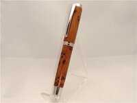
Thuya Burl

Signed-In Members Don't See This Ad
See more from Crickett

Crickett

Member
Joined
Mar 22, 2009
Messages
569
Location
Saskatoon, SK CANADA
I would like this pen to be critiqued, it's thuya burl on a rhodium Jr. Gent.

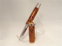
Am I correct in the placement of the "more figured" part of the blank on the lower part of the pen? When the cap is on the grain matches.

Thanks for taking the time to comment.
 

Attachments

  • DSC02674.JPG
    DSC02674.JPG
    75.4 KB · Views: 258
  • DSC02679.JPG
    DSC02679.JPG
    79.2 KB · Views: 219
Signed-In Members Don't See This Ad

phillywood

Member
Joined
May 10, 2010
Messages
2,067
Location
San Antonio, TX, 78250, USA
Marla, very nice looking pen. I think you were right in thinking putting the most figured part on the bottom, since I was thinking that when you hold the pen in your hand to write then you can still appreciate the fine figured in the blank.
 

turbowagon

Member
Joined
Sep 2, 2009
Messages
1,067
Location
Tucson, AZ
Looks great from here... fit and finish look excellent as far as I can see. Nice straight-barreled form.

I think you could have went either way with the more-figured portion, so I think you made a fine choice.

I love Thuya burl... the smell reminds me those crank pencil sharpeners we used to use back in elementary school.


- Joe
 
Joined
Dec 17, 2008
Messages
286
Location
Canada
Hi Marla. Great work as usual. I do like the non postables. You should have done a matching finial to balance out the appearance of the lower barrel. It's not too late!
 

johnnycnc

Member
Joined
Feb 27, 2006
Messages
3,612
Location
columbus, IN, USA.
That's a beauty, Marla!
I think the more figured part looks fine on the lower, as the user will be holding it
and looking at it more...maybe! On the cap would perhaps get covered by the clip.
Either way it's a nice pen, and your photos are good too!
 

dexter0606

Member
Joined
Jun 11, 2009
Messages
525
Location
Cambridge, ON
Marla
Nice looking pen! That's the orientation I would have used, for what that's worth.
And a very nice finish. It must have taken you a long time to build up that CA finish! And then all that extra time to MM and polish! :wink:
But seriously, it's really nice
 

Crickett

Member
Joined
Mar 22, 2009
Messages
569
Location
Saskatoon, SK CANADA
Thanks guys!!! I appreciate your comments.

Hi Marla. Great work as usual. I do like the non postables. You should have done a matching finial to balance out the appearance of the lower barrel. It's not too late!

Nope, too late for a MacFinial, the pen is already assembled. :wink: The non-postables are my favourite as well, they don't have the threads to take away from the appearance of the pen.

Marla
Nice looking pen! That's the orientation I would have used, for what that's worth.
And a very nice finish. It must have taken you a long time to build up that CA finish! And then all that extra time to MM and polish! :wink:
But seriously, it's really nice

Why thank-you Jeff, I was up all night applying the plastic look and finishing!! :tongue:
 
Top Bottom