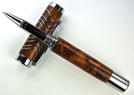
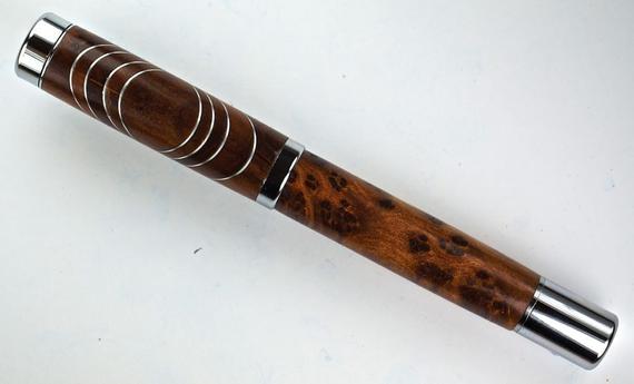
OK you have now stepped up even further up the creative ladder so we are going to have to throw some critism out there as you continue. Love this concept and yes it has been done before. My critique is the spacing of the layers. You need to be more aware of thickness unless this is the look you went for then excuse my thoughts. But from what I am looking at symatry is what you were after but failed a bit. Great idea though and love the combination. Look forward to more of your work. ( I do need to get spell check here)
")
Just my opinion
Just noticed another nitpicking item. When taking a photo of a pen like that you need to show the entire cap so we can appreciate the design. The lower body blocks the cap. I like to stand the cap up and take my photos from 3/4 frontal instead of straight down. Gives the pen depth of field. Again just my opinion