Three in Tru-stone

Signed-In Members Don't See This Ad
See more from SteveJ

SteveJ

Member
Joined
Jul 11, 2012
Messages
3,375
Location
Grand Junction, Colorado
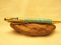
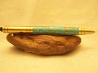
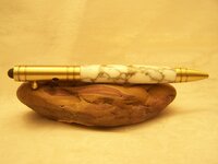
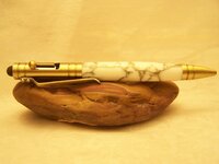
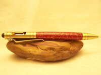
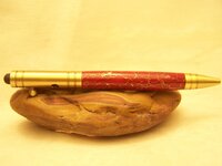
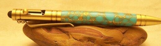
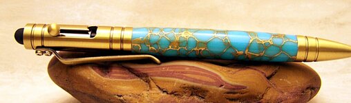
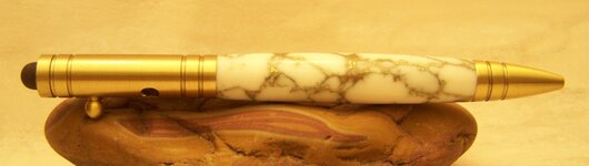
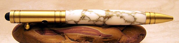
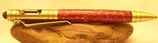
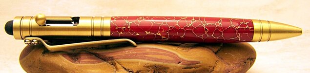
These were commissioned by my father-in-law as a follow-up from an order he placed for a number of stylus'. I decided to include one from Tru-stone that Mike Hirsch (Indiana-Parrothead) graciously sent me after a conversation on the phone. He immediately gave it away and then regretted it since in his opinion it was the nicest pen he's gotten from me.

So he ordered three more!

Let me know what you think of the pictures, I'm working on improving them!
 

Attachments

  • 100_5049.jpg
    100_5049.jpg
    147.4 KB · Views: 240
  • 100_5050.jpg
    100_5050.jpg
    147.5 KB · Views: 185
  • 100_5051.jpg
    100_5051.jpg
    144.2 KB · Views: 229
  • 100_5052.jpg
    100_5052.jpg
    149.3 KB · Views: 158
  • 100_5055.jpg
    100_5055.jpg
    149.2 KB · Views: 197
  • 100_5056.jpg
    100_5056.jpg
    143.1 KB · Views: 153
Signed-In Members Don't See This Ad

plantman

Member
Joined
Jan 2, 2012
Messages
3,437
Location
Green Bay, Wi
Steve; Pens look fantastic !! However, the yellow/gold background is washing out the gold fittings on the pens. Also your overhead lighting is causing a reflection line across the top of your pen and shadows under your stone. Better photos could be optained with right front, left front, and back lights. As far as your choise of props goes, something a little smaller might help. When looking at the photos my eye goes directly to the buldge on the stone, and I think the color is a little to close to the red pen. This is only ment to be constructive and not to fault in any way, please take it as such. Jim S
 

magpens

Member
Joined
Feb 2, 2011
Messages
15,911
Location
Canada
I love those pens !!!!! The Tru-stone you used is, on all 3 pens, a lovely complement to the antique brass finish.
 

mark james

IAP Collection, Curator
Joined
Sep 6, 2012
Messages
12,752
Location
Medina, Ohio
I agree with all that Jim and Mal stated above! Try a white background (I got a poster board sheet at Hobby Lobby I think. Large - maybe 24" x 36" ???).

The basic shots look in focus, so that's fine!

And... the pens look very nice. I love Tru Stone. I have about 8 blanks left, but am hoarding them to sell when we have to pay $500/blank :eek:
 

SteveJ

Member
Joined
Jul 11, 2012
Messages
3,375
Location
Grand Junction, Colorado
Steve; Pens look fantastic !! However, the yellow/gold background is washing out the gold fittings on the pens. Also your overhead lighting is causing a reflection line across the top of your pen and shadows under your stone. Better photos could be optained with right front, left front, and back lights. As far as your choise of props goes, something a little smaller might help. When looking at the photos my eye goes directly to the buldge on the stone, and I think the color is a little to close to the red pen. This is only ment to be constructive and not to fault in any way, please take it as such. Jim S

Thanks for the comments. It is interesting that the background ended up looking yellow/gold since it is a white background. I was surprised that the white one came out so white in light of the way the background ended up looking. I used a wedding runner as the background/light box. Maybe it is too thin?

I appreciate the comments on the props, I will switch to something smaller. I was trying to get away from the acrylic single pen stand.

Thank you for your comments.
 

KCW

Member
Joined
Dec 18, 2014
Messages
382
Location
Lincoln, NE
Steve; Pens look fantastic !! However, the yellow/gold background is washing out the gold fittings on the pens. Also your overhead lighting is causing a reflection line across the top of your pen and shadows under your stone. Better photos could be optained with right front, left front, and back lights. As far as your choise of props goes, something a little smaller might help. When looking at the photos my eye goes directly to the buldge on the stone, and I think the color is a little to close to the red pen. This is only ment to be constructive and not to fault in any way, please take it as such. Jim S

Thanks for the comments. It is interesting that the background ended up looking yellow/gold since it is a white background. I was surprised that the white one came out so white in light of the way the background ended up looking. I used a wedding runner as the background/light box. Maybe it is too thin?

I appreciate the comments on the props, I will switch to something smaller. I was trying to get away from the acrylic single pen stand.

Thank you for your comments.

If the background is supposed to be white, the problem is with your white balance.
 

SteveJ

Member
Joined
Jul 11, 2012
Messages
3,375
Location
Grand Junction, Colorado
That's what I thought, but the white pen came out actually white. That is why I wondered if the yellow was coming from bleed through of the "tent" material. I was using standard light bulbs as the light source.

Obviously photography is not my strong suit, but I am trying to get better using the equipment I already have (I don't really want to purchase another camera!)
 

SteveJ

Member
Joined
Jul 11, 2012
Messages
3,375
Location
Grand Junction, Colorado
I'm not using any photo program - those are the raw pictures! I just recently downloaded GIMP but haven't yet given it a try. I also own Corel's photo program.
 

SteveJ

Member
Joined
Jul 11, 2012
Messages
3,375
Location
Grand Junction, Colorado
Here are some comparisons after editing the photos in GIMP 2.

I added White balance (Color-Auto-White Balance)
And then I added Unsharp Mask (Filters-Enhance- Unsharp Mask)

I attempted to adjust lighting levels as per Sylvanites tutorial, but couldn't figure out how to do it in GIMP (his tutorial uses Photoshop Elements).

Let me know what you think and what else (other than get rid of the props, which I will do with my next set of photos). Thanks for your comments.

The originals may be cropped slightly differently, but other than cropping I made no other changes to the originals here and posted above.
 

Attachments

  • 100_5049.jpg
    100_5049.jpg
    78.6 KB · Views: 102
  • turqoisebalanced.jpg
    turqoisebalanced.jpg
    108.3 KB · Views: 90
  • 100_5051.jpg
    100_5051.jpg
    67.1 KB · Views: 99
  • Whitebalanced.jpg
    Whitebalanced.jpg
    86.7 KB · Views: 111
  • 100_5055.jpg
    100_5055.jpg
    84.9 KB · Views: 113
  • Redbalanced.jpg
    Redbalanced.jpg
    93.6 KB · Views: 93
Top Bottom