Stripes and Burls

Signed-In Members Don't See This Ad
See more from wizard

wizard

Member
Joined
Aug 27, 2009
Messages
3,569
Location
Houston, Texas
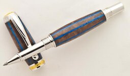
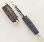
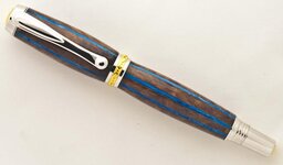
Made it earlier today. It's a Stripes and Burls blank with Sky Blue Resin from ElMostro on a 22K Jr. Statesman Rollerball. Hard to photograph. Looks better in person. Has a high gloss CA finish which doesn't show in the pictures very well. As usual, comments welcome but most of all thanks for just looking. Doc:)

P.S. I couldn't stand the pictures as they looked so different from the pen so I tried a new background and they came out looking more representative of what the pen actually looks like. Thanks for looking. Doc:)
 

Attachments

  • Stripes and Burls_2.jpg
    Stripes and Burls_2.jpg
    30.1 KB · Views: 110
  • Stripes and Burls_1.jpg
    Stripes and Burls_1.jpg
    30.1 KB · Views: 152
  • Stripes and Burls.jpg
    Stripes and Burls.jpg
    28.6 KB · Views: 114
Last edited:
Signed-In Members Don't See This Ad
Joined
Jun 28, 2010
Messages
1,830
Location
Pineville, Louisiana
Beautiful pen my friend. I think you made the other striped pen a week or two ago also. I really like the look of color through wood.
I am only telling this to you, but your stripes are not lined up from body to cap. Unless the cap just is not tight.:rolleyes::biggrin:
 

wizard

Member
Joined
Aug 27, 2009
Messages
3,569
Location
Houston, Texas
New pictures

I couldn't stand the pictures as they looked so different from the pen so I tried a new background and they came out looking more representative of what the pen actually looks like. So I replaced them above. Thanks for looking. Doc:)
 

wizard

Member
Joined
Aug 27, 2009
Messages
3,569
Location
Houston, Texas
Beautiful pen my friend. I think you made the other striped pen a week or two ago also. I really like the look of color through wood.
I am only telling this to you, but your stripes are not lined up from body to cap. Unless the cap just is not tight.:rolleyes::biggrin:

"I think you made the other striped pen a week or two ago also."


Brian, I don't remember making a striped one a week or two ago but with my memory...:rolleyes:

"I am only telling this to you, but your stripes are not lined up from body to cap. Unless the cap just is not tight."

Tightened the cap. Check out third picture. A little better:rolleyes:. Brian, Thanks for looking:). Doc
 

ToddMR

Member
Joined
May 3, 2010
Messages
1,715
Location
Columbus, OH
I am digging it Doc. NICELY executed for sure. I think you did very well with the stripes. I personally know how stripes aren't always easy to make look good. I am impressed.
 

PenPal

Member
Joined
Nov 29, 2006
Messages
2,708
Location
Canberra, A.C.T., Australia.
Doc,
Did not have the previous pics to compare but if I may accept your invitation once more.

Pic 1. The tension between the burl and the blue is released with the blue appearing as a stream of azure blue moving ocean yet captured and held in the pen itself.

Pic 2. The pen top attention focuses on the top and coloured band that sometimes overpowers some pens in the form of bling but no it is softly stated with this design. Having the previous picture we are already familiar with the bottom section. Proportions change giving strength to the top.

Pic 3. Completes the trio normalising the whole, love the gentle undulations in the blue, this separates the two halves yet completes the pen.

Most restfull peaceful pen a real pleasure to view indeed among the special of pens you have made.

Kind regards Peter.
 

wizard

Member
Joined
Aug 27, 2009
Messages
3,569
Location
Houston, Texas
Doc,
Did not have the previous pics to compare but if I may accept your invitation once more.

Pic 1. The tension between the burl and the blue is released with the blue appearing as a stream of azure blue moving ocean yet captured and held in the pen itself.

Pic 2. The pen top attention focuses on the top and coloured band that sometimes overpowers some pens in the form of bling but no it is softly stated with this design. Having the previous picture we are already familiar with the bottom section. Proportions change giving strength to the top.

Pic 3. Completes the trio normalising the whole, love the gentle undulations in the blue, this separates the two halves yet completes the pen.

Most restfull peaceful pen a real pleasure to view indeed among the special of pens you have made.

Kind regards Peter.

Peter, Your analytic and thoughtful description of the artistic aspects of all pens, not just mine, stands out. Moreover, your written delivery of your observations is done with such eloquence. You are an amazing individual!
Regards, Doc
 
Top Bottom