A standard Panache and a Panache wannabe

Signed-In Members Don't See This Ad
See more from skiprat

Status
Not open for further replies.

skiprat

Passed Away Mar 22, 2022
In Memoriam
Joined
Oct 19, 2006
Messages
7,812
Location
In a Skip in Wales
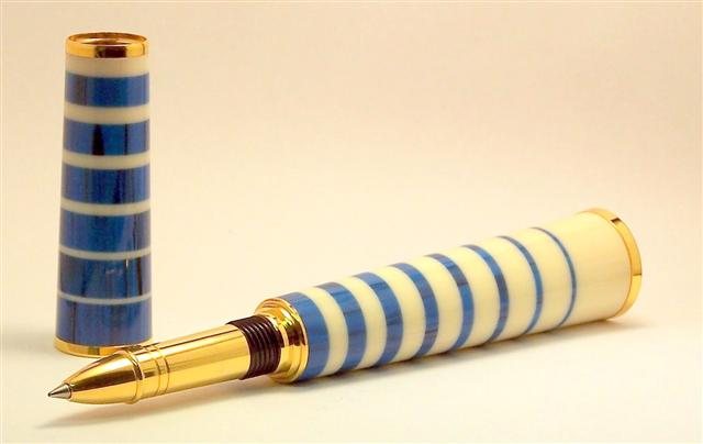
I can't remember the name of the blue stuff ( perhaps malachite?) but the white is alt ivory. This design is my wifes. I didn't like it at first, but now I think it's ok.

2007112720436_kpen5.jpg


200711272053_kpen4.jpg


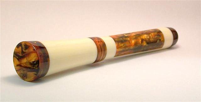
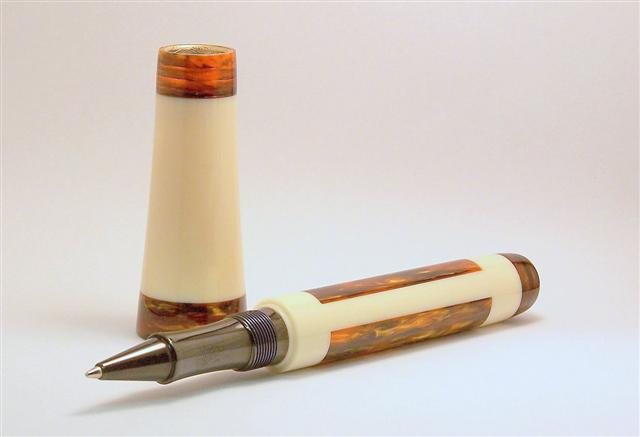
Here I'm just playing around with an old kit nib. Alt ivory and antique gold acrylic.


2007112720751_ant2.jpg


2007112720829_ant1.jpg


Comments and critisism welcome[8D]
 
Signed-In Members Don't See This Ad

Scott

Member
Joined
Dec 12, 2003
Messages
2,689
Location
Blackfoot Idaho
Wow Steve! These are very cool! Keep this up, and pretty soon we won't be able to talk to you! [8D]

Scott.
 

skiprat

Passed Away Mar 22, 2022
In Memoriam
Joined
Oct 19, 2006
Messages
7,812
Location
In a Skip in Wales
Thanks guys. Isn't it strange? I honestly didn't think these would get any attention.[:D][:D]

Andy, yep it is the cobalt I think now too. Malachite is green I think?

LanceD, thanks. I have two secret weapons that are improving my pics.
Both from this site; Someone reccommended Picassa and Gregg Ketell gave me some tips.
 

les-smith

Member
Joined
Oct 2, 2006
Messages
1,158
Location
Oklahoma
Steven, I really enjoy looking at you stuff. Those look great, a real treat to look at. Very much worthy of a "Featured Photo" spot. (hint to Jeff).
 

skiprat

Passed Away Mar 22, 2022
In Memoriam
Joined
Oct 19, 2006
Messages
7,812
Location
In a Skip in Wales
Originally posted by R2
<br />Gorgeous pens. The blue and white is particularly attractive.[:)][:)][:)]
Actually it reminds me of my mothers old milk jug![:D][:D]

The blue and white milk jug could be original Cornish Ware, very very collectable now[;)]
 

skiprat

Passed Away Mar 22, 2022
In Memoriam
Joined
Oct 19, 2006
Messages
7,812
Location
In a Skip in Wales
I got a couple of e-mails about the threads in the cap, and as Chuck Key has asked here, I'll try and explain.
I took the normal insert that was from same pen as the nib. The plating was worn through.
I pressed the insert into the cap tube then turned all but a tiny shoulder off of the metal. The insert was then flush with the tube. The shoulder would still stop the insert from being pushed too far into the tube. I then discovered that I didn't have the correct drill for the tube (14.5mm) I do have a 14mm so I used that, and did away with the tube altogether. There is plenty of material in this cap to support the threads even without the tube.
I also step drilled the cap. To make the pen and cap close flushly, I put the small shoulder on the pen ( this also got rid of the abrupt diameter change) Now I had to shorten the threads in the cap so the pen would go all the way in. I just used a a countersink bit by hand.
Here's a pic I've just taken,


2007112875911_capdetails.jpg
<br />
 

Ron Mc

Member
Joined
Feb 2, 2005
Messages
2,138
Location
USA.
I absolutely LOVE the first pen!!
Very well done. Tell your wife she came up with a winning design.
 

Randy_

Member
Joined
Nov 29, 2004
Messages
5,701
Location
Dallas suburb, Texas, USA.
Steven: Nicely done. Both pens outstanding. My personal preference is for the gold and white. I like to color combination and the shape.

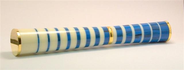
A suggestion if I might. The big chunk of white at the end of your wife's pen caught my eye immediately and sort of unbalances the symmetry of the pen. Looks like you ran out of length and put in a double layer/thickness of the ivory to fill up the length. If you ever make another pen of similar design, you might want to think about keeping the white layers all the same or similar thickness. (Just on the while end.) Reduce the thickness of the thick white segment by half and add another white segment at the other end of the pen(at the nib) to compensate for the loss. some might not agree; but i think that modification would improve the overall look of the pen.
 

skiprat

Passed Away Mar 22, 2022
In Memoriam
Joined
Oct 19, 2006
Messages
7,812
Location
In a Skip in Wales
Randy, you are correct, but it was a bit of a compromise. All the segments are 0.5mm less than the next same colour with the exception of that one. I played around for ages trying to get the balance right, for the whole pen and cap. The cap was easy, as I just trimmed the tube fractionally to make them fit. There was too much on the white end to trim but not enough to add one more thinner blue one.
the smallest stripes are 1mm. I tried to do 0.5mm ones, but they kept breaking as I parted them off.

Thanks again for all the great comments.
 

ed4copies

Local Chapter Manager
Joined
Mar 25, 2005
Messages
24,527
Location
Racine, WI, USA.
Hey Skippy,

Just back from a show, so thought I would tell you that closed end version is actually NICE. (I think the penache is WAY too big - so this is a REAL compliment). The blue and white effect is also cool, but the kit is huge - not your fault, I just don't care much for it.

IF you happen to have a pic of the "closed end" standing up, please e-mail it to me - this COULD be my future use of the kit.

Thanks,

Ed
 

Randy_

Member
Joined
Nov 29, 2004
Messages
5,701
Location
Dallas suburb, Texas, USA.
Originally posted by R2
<br />Could not disagree more Randy. Perhaps if you take another look at the overall design you will see why steve has done the pen that way.

Hey Russ: I did take another look at the pen after my first post and realized that some of what I suggested was a little off target. It did escape me, originally, that the pattern was a single pattern carried through the full length of the pen rather than be restricted to each of the two individual parts. I had intended to revise my original comment; but got interrupted and never got back too it. Nonetheless, I stand by my original comment that the one white piece is too large and detracts from the visual balance of the pen.

Steven: These little mechanical conundrums are fascinating to me. I did a little math work on your design and an Autocad drawing to see what would fit the Panache and was totally frustrated as nothing would work. I just reread your original post and discovered that you were incrementing in 1/2 mm steps. I was doing my calculations in 1 mm increments.[:(!] I'm going to go back and redo the work and see what kind of solution develops. There has to be a way to make this work.

Just to make sure I fully understand your pattern, could you conform a couple of things for me.

1. Do you recall how much you shaved off the cap tube.

2. Do you recall the approximate length of the one long white piece that got this discussion started?

3. The thinest layer is 1mm thick and each layer increases by 0.5mm. There are 14 layers of each color and the thickest layer would be 7.5mm excepting the bigger white one.

When I have a satisfactory solution, I will pass it along to you in case you decide to make another one......which I think would be a fine thing to do since it is such a good looking pen.
 
Signed-In Members Don't See This Ad
Status
Not open for further replies.
Top Bottom