Something a Little But Different

Signed-In Members Don't See This Ad
See more from Sandsini

Sandsini

Member
Joined
May 11, 2014
Messages
437
Location
Lake Arrowhead, California
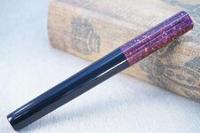
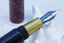
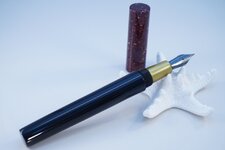
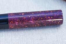
Here's a Kitless FP I made out of a material from a BOB I received as a loser train "winner." The material was labeled Stardust and it is a burgundy color with gold flecks. I thought I would give it a shot and since there wasn't enough to do both the body and the cap, I accented it with black resin as I often do. Once I had the cap turned I thought it might be interesting to make the section in gold to accent the flakes in the Stardust. It's certainly polarizing, some people like it and others don't!

The shape was a new one for me, and I think it is weirdly pleasant.

Sorry about the typo in the title. It's a little BIT different!
 

Attachments

  • DSC01746.jpg
    DSC01746.jpg
    180.6 KB · Views: 195
  • DSC01719.jpg
    DSC01719.jpg
    105.3 KB · Views: 156
  • DSC01718.jpg
    DSC01718.jpg
    89.3 KB · Views: 164
  • DSC01742.jpg
    DSC01742.jpg
    188 KB · Views: 146
Last edited:
Signed-In Members Don't See This Ad

OZturner

Member
Joined
Aug 5, 2013
Messages
6,663
Location
Sydney. NSW. Australia
Excellent Pen, Eric.
I must be weird also, as I like the Gold Section,
It is quite a surprise when you open the Pen.
Great Proportions, and Profile,
Love the Black, and Burgundy Stardust Combination, reminds me of a Tuxedo with the Black Trousers, and Burgundy Jacket.
Superb Fit and Finish.
Congratulations,
Brian.
 

Sandsini

Member
Joined
May 11, 2014
Messages
437
Location
Lake Arrowhead, California
Thanks guys.
Brian, I like the reaction I get when someone uncaps a pen and sees a section in an accent or complementing color, but sometimes it isn't "Oh, wow!" but "Oh, my..."

Anyway... now I'm going to picture Tom Jones in tight black slacks and a glittery burgundy jacket with wide lapels, open to reveal a gold lame waistcoat, whenever I look at this pen... That's an outfit I would have ROCKED in the 70's but now it would just be silly.

Thanks for the nice feedback.

Eric
 

BSea

Member
Joined
Dec 28, 2009
Messages
4,628
Location
Little Rock, Arkansas
Overall, I like the pen. I'm kinda on the fence about the section. But I honestly don't have another suggestion other than black. I don't think the section in the same material as the cap would look better, and trying to match the main color would clash unless it was a perfect match. Maybe a metal section?

I do like the shape. I think it has just enough of a taper/form to make it interesting.

And beautiful threads too. Sometimes I don't think people pay enough attention to that detail.

Great Job! :good:
 

Sandsini

Member
Joined
May 11, 2014
Messages
437
Location
Lake Arrowhead, California
Bob,
That's how I feel about it too. Kind of on the fence. On one hand I like it and on the other I think it's kind of garish. I think if the flecks in the Stardust were silvery and the section was done in a similar metallic resin, but silver, I think it would be a lot easier to swallow.

Thanks for the nice comments.

Eric
 
Top Bottom